
It almost always starts with a photo: someone standing on Takeshita-dori, in faded pink and mint green, a plush toy on the backpack, the sneakers two sizes too soft for the concrete. No loud statement, no hard edge. Just a cloud of pastel that stands out among Tokyo's blocks of black streetwear, as if it had accidentally fallen out of an 80s cartoon.
Fairy Kei is a pastel Kawaii style from the Harajuku scene that draws its entire DNA from 1980s pop culture: faded candy colors, retro toys, soft silhouettes and a dreamy, almost surreal undertone. To understand the look, it helps to place it on the wider Harajuku streetwear map — there, Fairy Kei is one of many offshoots of Japanese street style.
In the rest of this guide we go through it step by step: where the style comes from, how the color rule works, which core pieces you need, how to set it apart from neighboring substyles and how to make it wearable in Germany — without it looking like a costume.
Definition
Fairy Kei explained: pastel Kawaii with 80s DNA
At its core, Fairy Kei is a feeling, not a rulebook. The style wants to carry lightness, nostalgia and a childlike, dreamy mood — without looking like a costume or actually childish. That is the fine line the look stands or falls on. Too much fantasy print, and it tips into fancy dress. Too little, and it is just a pastel everyday outfit.
The name itself says a lot: in Japanese, Kei means something like style or type, and Fairy points to the fairy-tale and delicate. Put together, the term describes a fairy-like look. Unlike strictly defined styles such as Lolita, there is no silhouette rule and no petticoat requirement here. Fairy Kei is deliberately looser, closer to everyday wear and easier to carry.
This very openness is what makes it attractive for beginners: you do not need an expensive designer wardrobe, just an eye for color and a few soft, playful pieces. The rest comes from the combination. Fairy Kei rewards collecting, mixing and slowly building a wardrobe more than the one big purchase.
Origin
Where Fairy Kei comes from: Tokyo, 80s pop and secondhand
The most common search question about the style is simply: where does Fairy Kei come from? The short answer: from the meeting of American 80s pop culture and the Japanese secondhand culture of the 2000s. Washed-out US toy brands, cartoon merch and faded pastel textiles landed by the container-load in Tokyo vintage shops — and a young Harajuku scene turned it into a look of its own.
One defining idea was that the faded, slightly broken and nostalgic is exactly what is beautiful. A T-shirt whose print is already half washed out does not look defective in Fairy Kei, but perfect. This aesthetic of gentle decay sets the style apart from smooth, new fast fashion in pastel. Fairy Kei wants patina, not perfection.
Through blogs, early photo communities and later Pinterest and Instagram, the look spread from Tokyo across the whole world. Today it is long past being a purely Japanese phenomenon; it is a global alternative style with local scenes — in Berlin, Cologne and Leipzig too.
Important to understand: Fairy Kei was never a brand or a collection, but a grassroots movement. That also explains why there is no fixed list of rules — only a handful of principles the scene developed together over years.
Color
The Fairy Kei color palette: why pastel is the basic rule
If Fairy Kei has a single hard rule, it is this: the palette has to look faded. So which colors does Fairy Kei actually use? At the center are baby pink, mint green, lilac, baby blue, butter yellow and cream white. What matters is not the pure color but its saturation — everything stays soft, milky and slightly washed out.
Neon colors, saturated primaries and hard contrasts are the fastest way to miss the look. A bright pink destroys the dreamy mood just as much as a pure, hard black. Where black appears at all, it is a rare accent or in a strongly toned-down form — never a load-bearing surface.
A practical trick: always combine several pastel tones in one look instead of staying with one color. Three to five faded tones that blur into each other create the typical cloud effect. A single pastel tone on an otherwise neutral base, by contrast, reads more soft-minimalist than truly fairy-like.
80s
Pop era as the base
3–5
Pastel tones per look
Tokyo
City of origin
Once the palette is right, the rest gets easier almost automatically. Color is rightly the first criterion in Fairy Kei — a look with perfect pieces but wrong tones reads as something else at once.
Anyone coming from the Y2K corner recognizes a lot of overlap: soft tones and playful motifs matter there too. The difference lies in the source of nostalgia — Y2K looks to the early 2000s, Fairy Kei to the 80s.
Distinction
Fairy Kei vs. Yume Kawaii, Decora and Mori Kei
Few styles are confused with their neighbors as often. The second most common question is therefore the difference between Fairy Kei and Yume Kawaii — and right after that, the distinction from Decora and Mori Kei. All four belong to the kawaii-oriented Harajuku family, but set different priorities.
In short: Yume Kawaii pushes the fantasy further into the surreal, Decora stacks accessories to the limit, and Mori Kei swaps candy for forest. Fairy Kei sits in between as the pastel, 80s-nostalgic middle. The overview below sorts the four cleanly.
If you are wondering which corner your own look leans into: count your accessories. If it stays airy and pastel, you are at Fairy Kei. If it gets dense and loud, you drift toward Decora. Both are entirely legitimate — only the label changes.
Wardrobe
The core pieces of a Fairy Kei wardrobe
Fairy Kei can be broken down into a manageable number of building blocks. On top, oversized sweaters, soft crewnecks, washed-out graphic shirts with 80s motifs and loosely draping cardigans dominate. Everything is allowed to be a little too big — the body disappears into soft volume instead of being emphasized.
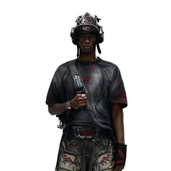
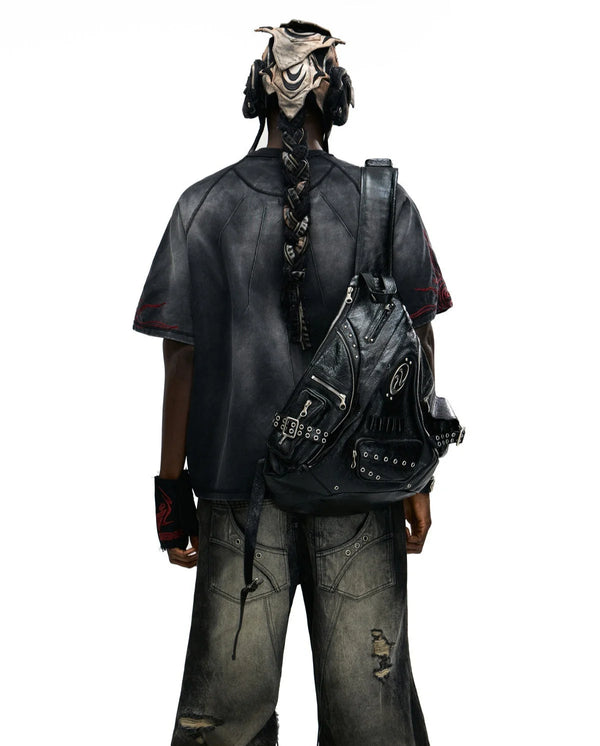
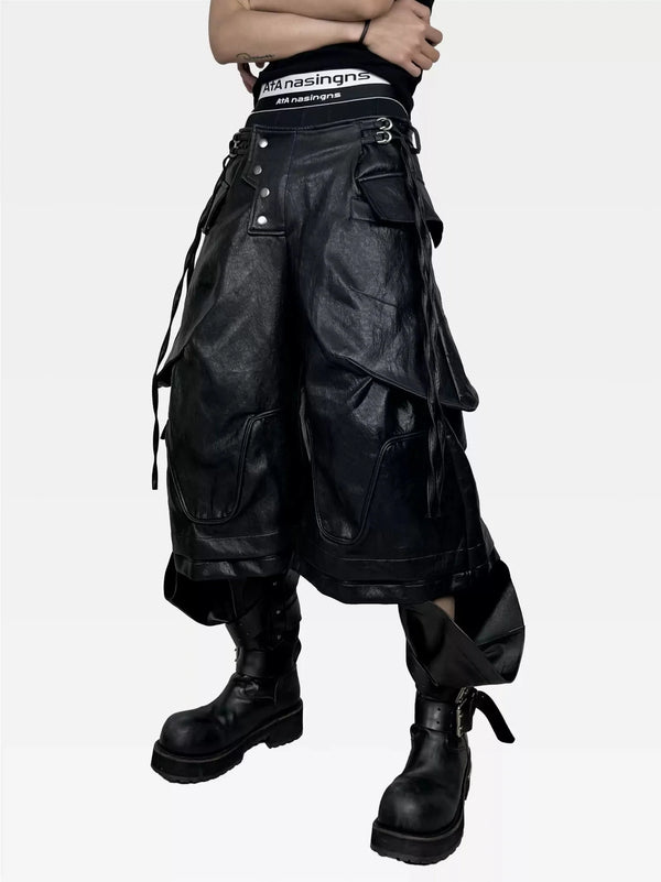
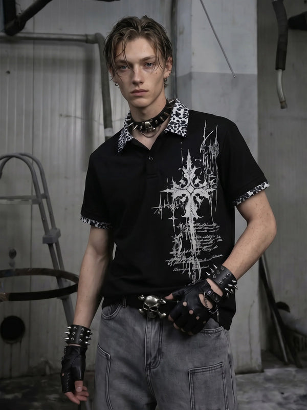
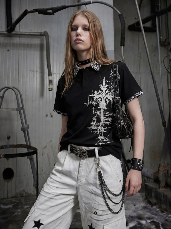
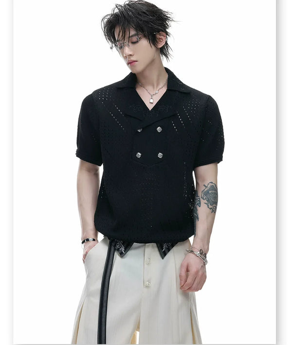
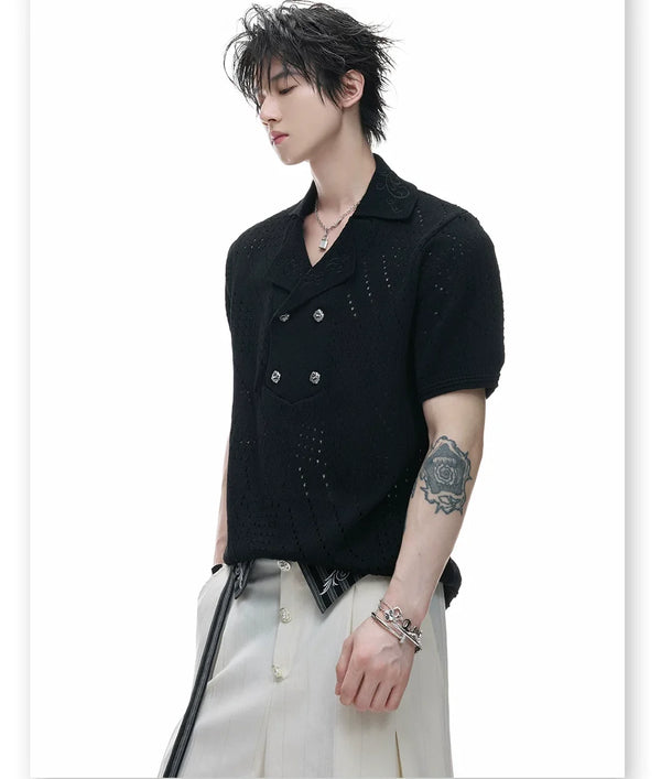
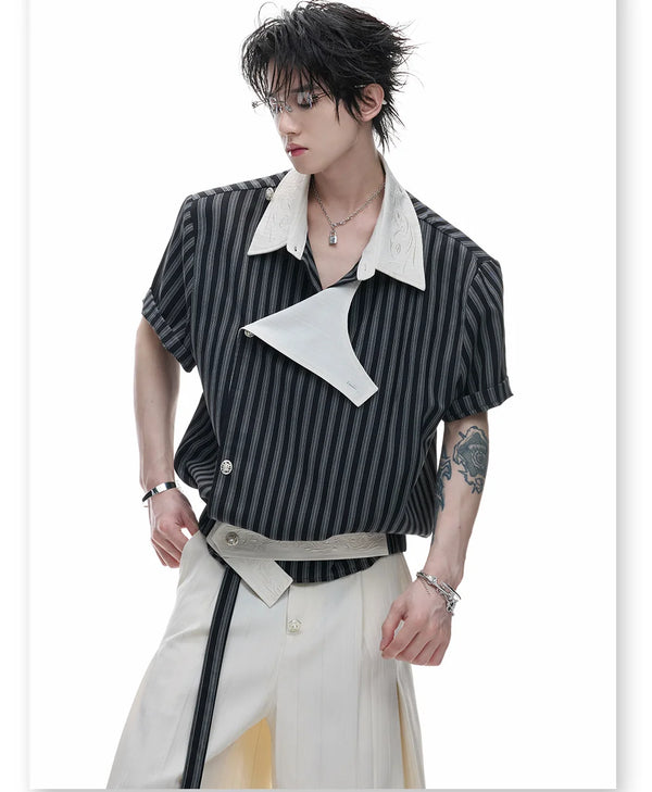
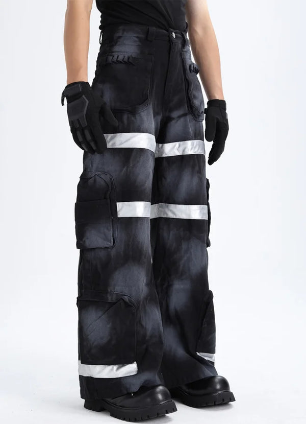
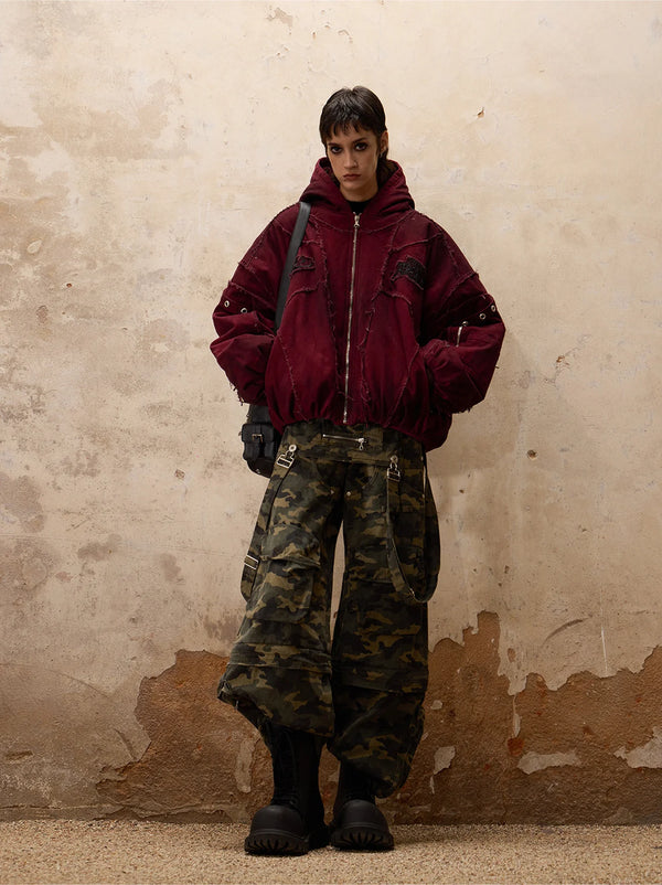
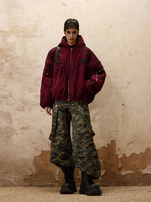
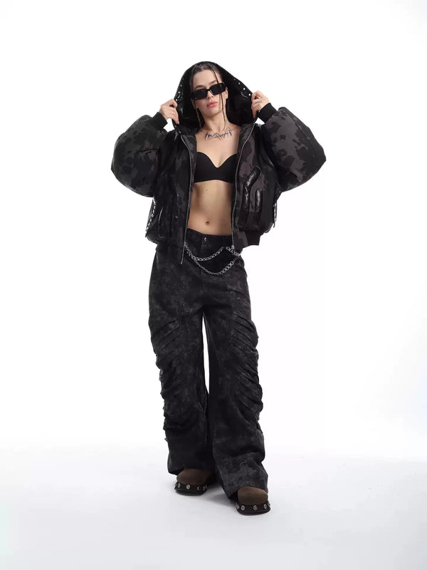
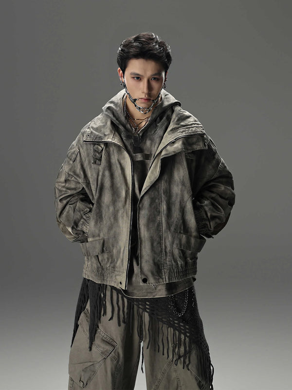
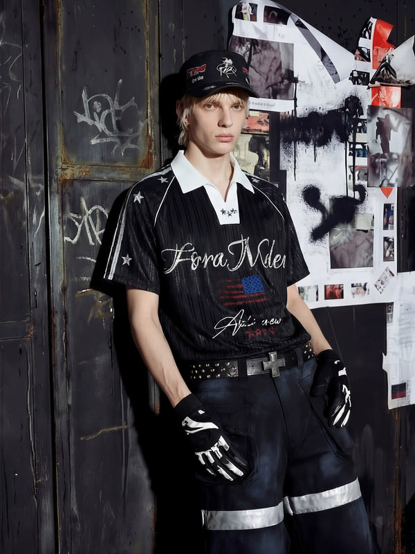
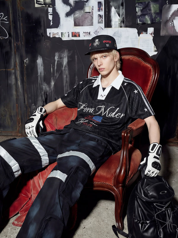
Fūga itself sits more on the darker, Y2K-adjacent edge of the Harajuku world. That is why our pieces work here as a soft layering base: a playful polo, a loosely draping longsleeve — you build the pastel layer and the retro toys on top. That is exactly how the look comes together anyway, layer by layer.
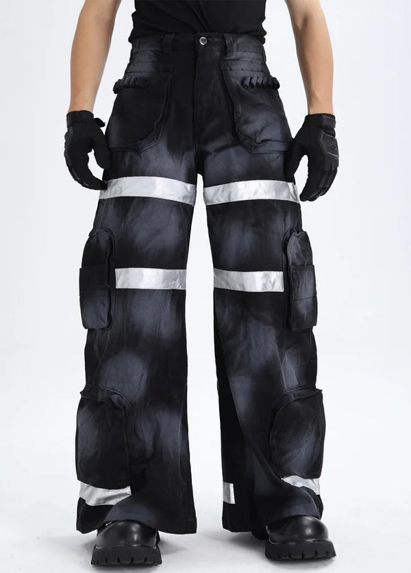
For bottoms, tulle skirts, short pleated skirts and wide-draping trousers are the classics. If you do not want to wear a skirt, reach for a comfortable wide-leg trouser in a muted tone — it brings the same flowing volume without looking like a costume. Tight, hard silhouettes, by contrast, rarely fit.
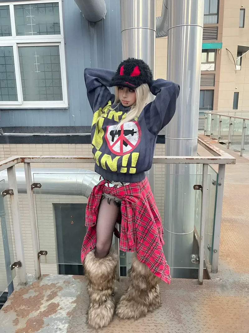
For shoes the rule is: flat and soft beats high and hard. Pastel sneakers, Mary Janes, platform slippers or plush boots fit the picture. High heels and heavy boots break the dreamy mood — they belong more in the Gothic or Punk neighborhood.
Silhouette
Silhouette and layering: soft volume instead of hard structure
Fairy Kei is a layered style. The typical silhouette rarely comes from a single statement piece, but from the skillful stacking of several soft layers. A cropped sweater over a longer shirt, a skirt underneath, plus legwarmers — every layer adds volume and color.
The trick with layering is to keep the proportions deliberately unbalanced. Soft and wide on top, flowing at the bottom, small breaks through color or texture in between. That creates the characteristic cloud effect, in which the body is suggested rather than emphasized.
Legwarmers are almost a signature here. They come straight from the 80s aerobics and pop vocabulary and bring exactly the nostalgia that carries the style. Over flat shoes and under a skirt, they close the silhouette off softly at the bottom.
People building the look for the first time often make it too flat. Dare to add one layer more than you think you need — Fairy Kei can take fullness, as long as the colors stay soft and the whole thing looks airy.
Accessories
Accessories: plush, bows and 80s toys
If color is the basic rule, then accessories are the soul of the style. This is where it is decided whether a pastel outfit actually reads as Fairy Kei or only as a soft everyday look. Plush toys on the backpack, bows in the hair, star clips, retro toys as charms — all of it keeps telling the 80s story.
Characteristic are references to US toy brands and cartoons of the 80s, often in a faded, secondhand-typical look. A worn plush toy feels more authentic than a shiny new one. This visible patina is intended and part of the aesthetic.
For jewelry the same applies: playful beats refined. Big plastic rings, star earrings, pastel pearl necklaces and anything with a faint echo of childhood fit better than fine, minimalist pieces. Quantity is allowed — as long as the look stays airy and does not tip into dense Decora.
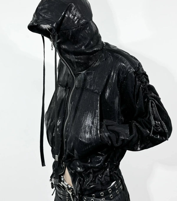
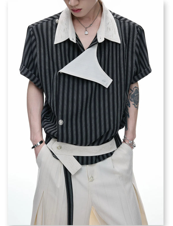
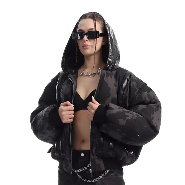
How that feels in motion is shown by the soft, playful handling of statement pieces on our channel — the same logic of volume and detail, just on the darker Fūga edge.
The basic idea carries straight over to Fairy Kei: a single striking detail pulls the whole soft outfit together. Start with one key accessory and build the rest around it.
Practice
Your first Fairy Kei outfit step by step
The easiest way in is a system, not a shopping trip. Instead of buying a complete wardrobe right away, you build your first look from four decisions: palette, base, silhouette, accent. In this order you rarely fall into the typical beginner traps.
Start with the color, then choose two or three soft base pieces, add a layer for volume and crown the whole thing with a single playful accessory. Only once this framework is set is it worth fine-tuning with further details.
This approach has a practical side effect: it makes the look affordable. Because Fairy Kei celebrates the secondhand aesthetic anyway, you can find almost everything at flea markets, in vintage shops and in classified listings. Usually only the base pieces and one or two favorite accessories are bought new.
Inspiration
Finding Fairy Kei inspiration: Pinterest, Tokyo street and more
A common search term is Fairy Kei on Pinterest — and for good reason. The style lives on visual references, and moodboards help enormously to train the eye for the right palette and the right proportions. Save twenty looks before you build your first own one.
Besides Pinterest, Instagram hashtags, Japanese street-style archives and the relevant community forums are worth it. If you have the chance, look at Tokyo street photography — there you see how the look is worn in everyday life, not just in a staged studio photo.
One last inspiration tip: collect not only outfits but also individual color combinations and accessory ideas. Often it is a certain pastel duo or a specific detail that tips a look — and that is exactly what is best read out of many references.
Anyone who wants to understand the larger frame Fairy Kei sits in will find plenty of context in the Japanese fashion of the 2000s — from there, many threads lead straight into today's Harajuku scene.
Range
Building Fairy Kei over Y2K pastel in the Fūga range
Be aware: Fūga is not a pure Fairy Kei shop. Our focus is on the darker, Y2K- and Opium-adjacent side of the Harajuku world. For a real Fairy Kei look, you therefore use our pieces as a load-bearing base layer and combine them with pastel secondhand finds and accessories.
That sounds like a compromise, but it is actually closer to the reality of the style than any complete purchase. Fairy Kei was always a mixed style — the most exciting looks arise exactly where different sources meet. A soft base piece in a muted tone forms the calm surface on which pastel and toys really start to glow.
Think in layers instead of finished outfits: the calm base from us, the pastel color layer from your wardrobe or the flea market, and one or two playful anchors on top. That keeps the look affordable and personal instead of looking uniformly bought.
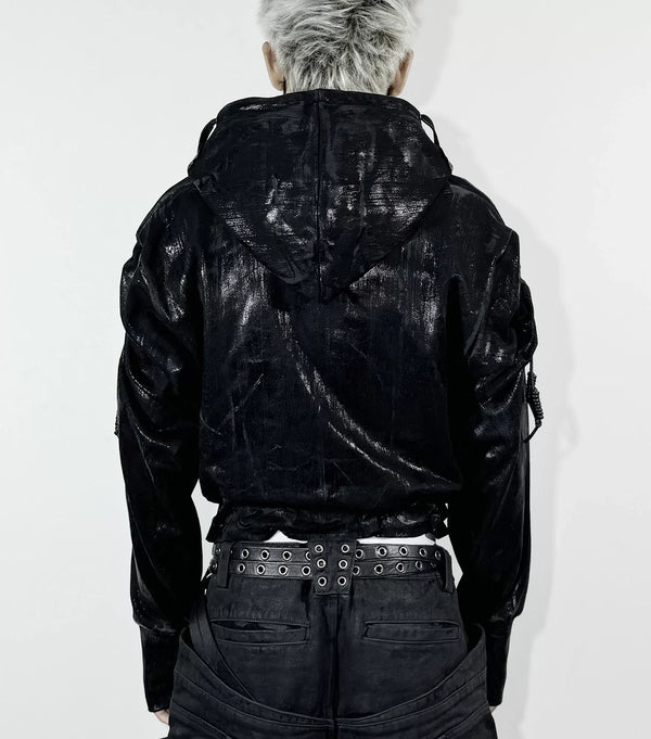
How a single statement piece carries a whole outfit you can see here too — the same idea, just on the hard edge of the spectrum.
Transfer that one to one: find your anchor piece, whether a plush charm or a pastel cap, and let the rest of the wardrobe stay calmer. A clear focus always works stronger than three competing statements.
Everyday
Wearing Fairy Kei in German everyday life
The honest question many beginners have: can you even wear Fairy Kei on the street in Germany? Yes — if you adjust the dose to the context. A full Tokyo street-style look stands out strongly in a German small town; a toned-down everyday version, by contrast, simply reads as playful and soft.
For everyday wear you reduce the fantasy elements and keep the palette and the silhouette. A pastel oversized sweater over wide-leg trousers, plus flat sneakers and a single playful accessory — that works in the café, at university and on the train, without a costume effect.
A weather note for German conditions: at its core, Fairy Kei is a fair-weather style. In winter you rescue the aesthetic with pastel knit layers, soft coats in muted tones and legwarmers — instead of swapping the palette entirely for dark functional clothing.
Mistakes
Common mistakes in Fairy Kei styling
Most failed Fairy Kei looks do not fail on budget, but on a few recurring thinking errors. Knowing them saves you a lot of frustration and wrong purchases. These five come up again and again.
The common thread behind all five points: Fairy Kei is a balance style. As soon as one element gets too loud — color, structure or quantity — the balance tips. When in doubt, going back one notch almost always lands you right.
Fairy Kei shares many of the balance principles with the Y2K cosmos next door — those who understand both worlds mix them confidently in the end.
Frequently asked questions
Frequently asked questions about Fairy Kei Fashion
To finish, the questions that come up most often around Fairy Kei in search engines and communities — answered briefly and directly.
Where does Fairy Kei come from?
What is the difference between Fairy Kei and Yume Kawaii?
What does Fairy Kei mean in Japanese?
Which colors belong to Fairy Kei?
Is Fairy Kei the same as Decora?
Where can you buy Fairy Kei in Germany?
In the end, Fairy Kei is less a checklist than an attitude: faded color, soft volume and a nostalgic look at the 80s. If you keep these three things in mind, you find your own way in — whether you start in Tokyo or in Bochum.
What do you think?
Tell us on @fuga_studios
About the author
Philipp Fuge — Founder · Berlin
Founder of Fūga Studios. Writes the journal himself. Berlin · Shanghai · Tokyo · Poznań — four cities, one logic.