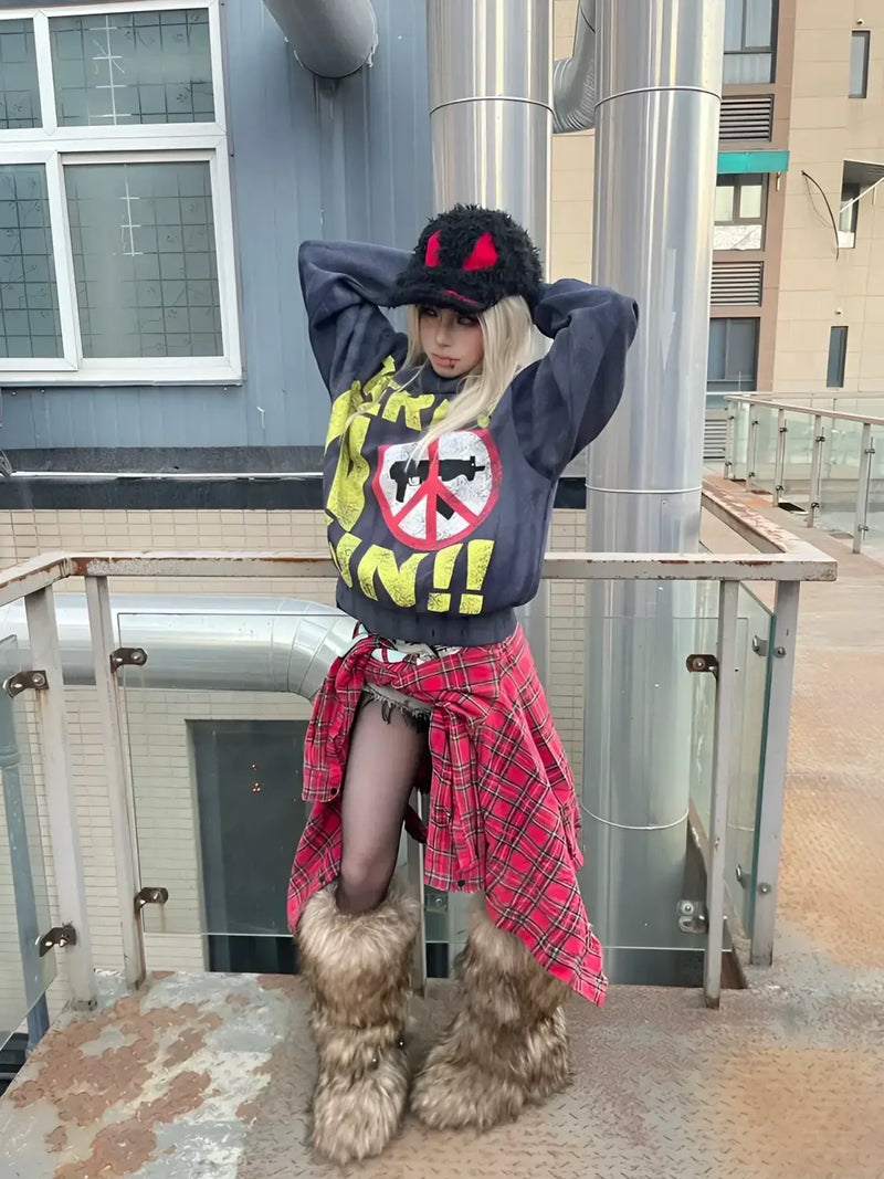

Tokyo, Laforet Harajuku, sixth floor. A girl with a white-painted face and black-lacquered nails pulls a corset jacket off the rack, turns it once into the light and hangs it back. Two metres away a boy tries on platform boots that make him ten centimetres taller. Outside, a music video plays across a building façade: five men in ruffled shirts, made up like porcelain dolls, holding guitars. Nobody here turns to look.
Visual Kei fashion is the clothing style that migrated from Japan's late-1980s rock scene into the streets of Harajuku. It combines dramatic make-up, elaborately styled hair, deliberate androgyny and materials like patent leather, leather, lace and mesh into a look that was born on stage and still measures itself there today.
That places Visual Kei differently within the fabric than most of the styles we sorted in the Harajuku streetwear guide. Decora, Gyaru or Fairy Kei emerged on the street and spread from the bottom up. Visual Kei ran the other way round: the stage first, then the audience, then the neighbourhood. Anyone who wants to understand the look therefore has to start with the bands, not with the clothing racks.
Definition
What is Visual Kei fashion?
Visual Kei is first a movement of Japanese musicians, then a style. In the mid-1980s bands realised that their appearance on stage deserved the same attention as the sound, and began to stage themselves as complete visual figures: make-up, hair, costume, set. Whatever of that became fashion was a side effect. Fans copied their bands' looks, first at concerts, then in daily life, then shops in Harajuku and Shinjuku stocked what these fans were after.
So the question of whether Visual Kei is a clothing style is answered with both yes and no. Yes, because there is a clearly recognisable vocabulary you can buy in a shop and wear on a Tuesday. No, because the basic unit was never an outfit but a band. A Visual Kei look without the matching music is like a stage set without a play: technically complete, but missing the reason it looks the way it does.
1989
Year the term appears on X Japan's album BLUE BLOOD
6
Variants that still structure the scene today
40 Jahre
unbroken scene history since the first wave
Word origin
What does Visual Kei mean in English?
Visual Kei is written ヴィジュアル系 in Japanese and reads vijuaru kei. The first part is the English word visual, transcribed into katakana. The second part, 系, means system, direction or lineage and is used in Japanese to mark style families. Translated literally, Visual Kei therefore means visual style direction, and in the looser sense the direction in which appearance is what counts.
This syllable kei turns up constantly in Japanese fashion, and it is the key to the whole vocabulary. Fairy Kei, Mori Kei, Jirai Kei, Oshare Kei, Angura Kei all work by the same pattern: a descriptive word plus kei makes a style family. Once you have understood that, you can work out half of Japan's fashion terms yourself instead of learning them one by one.
Androgyny is the point where Visual Kei differs most clearly from Western rock aesthetics. Glam rock played with images of gender and staged the break. Visual Kei treats it as a given and moves on to the next question. For European viewers that is often the irritating part, and for many the liberating one too.
Building blocks
Visual Kei style: what the look is built from
As different as the bands look, the components repeat. Visual Kei style works with a manageable box of means that has stayed remarkably stable since the early 1990s. What changes is colour, quantity and hardness, not the principle. Anyone who knows these components recognises the style even when two outfits seem to have nothing in common.
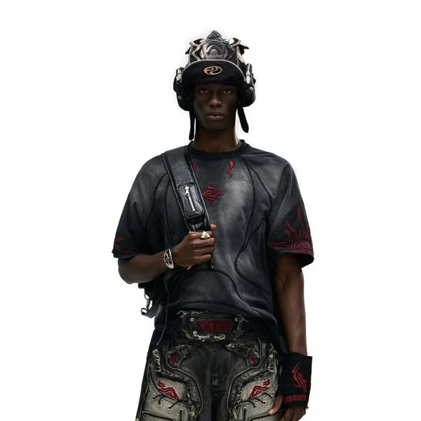
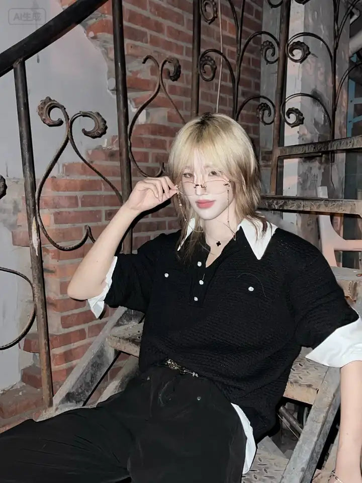
The first rule: the face is part of the outfit. In Visual Kei, make-up is not an addition but the load-bearing layer. Pale base, heavily drawn eyes, defined brows, dark lips or the opposite of that. Without this layer, even the most elaborate garment stays a costume piece. With it, it becomes a figure.
- Make-up as foundation – pale skin, hard eye line, contoured cheeks. The contrast matters more than the colour.
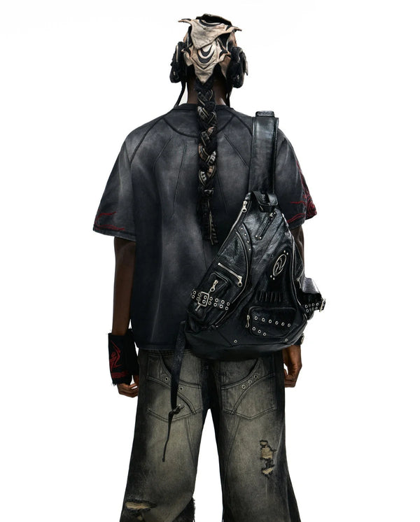
- Hair architecture – teased, layered, asymmetrically cut, often in unnatural colours. The hair gives the head a silhouette.
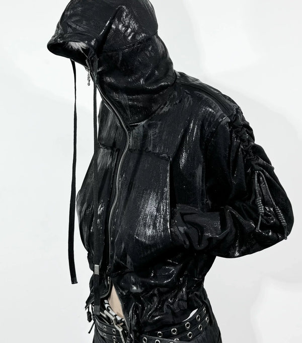
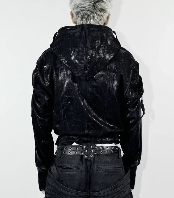
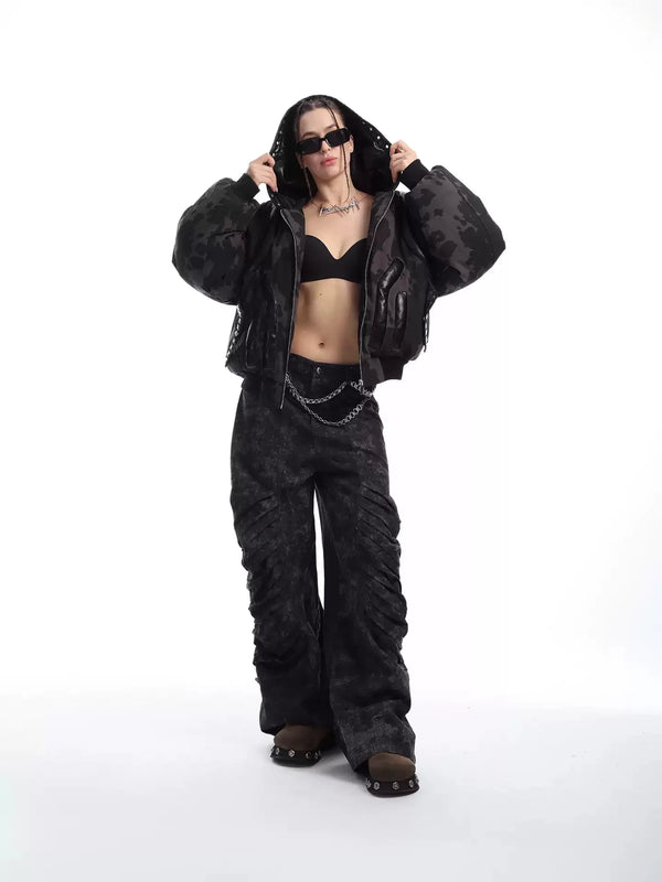
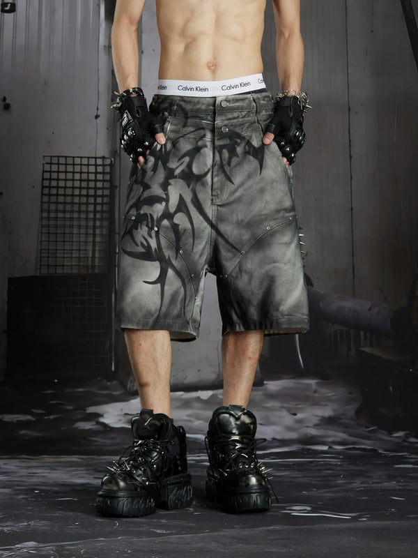
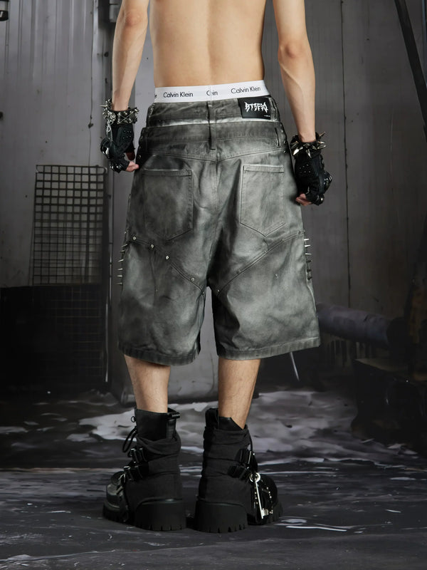
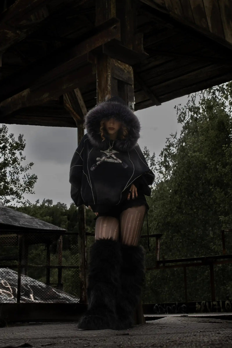
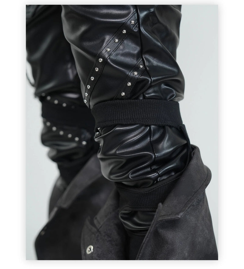
- Hard materials – patent leather, faux leather, mesh, PVC, studs. They reflect stage light and work from twenty metres away.
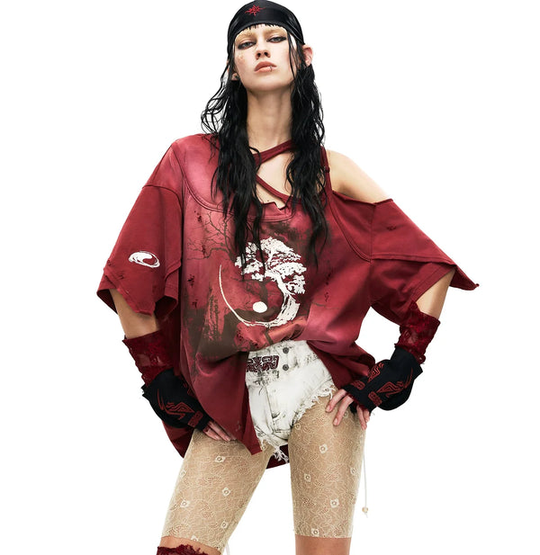
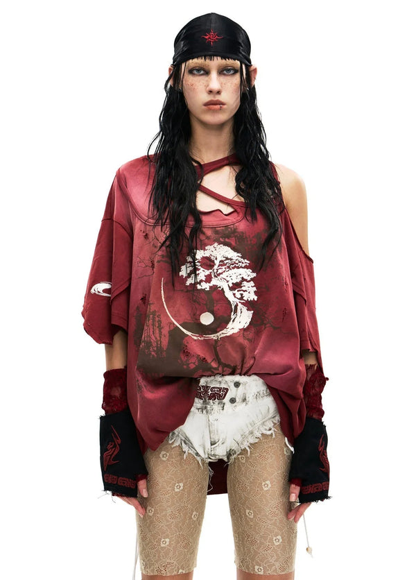
- Soft counterparts – lace, chiffon, ruffles, velvet. Without them the look tips into pure punk vocabulary.
- Asymmetry – one sleeve long, one short, one leg tight, one wide. Symmetry is considered boring.
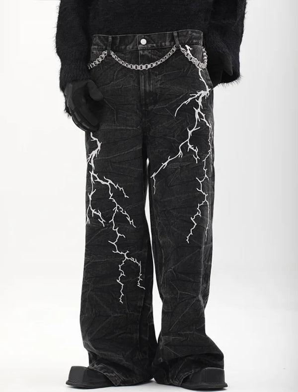
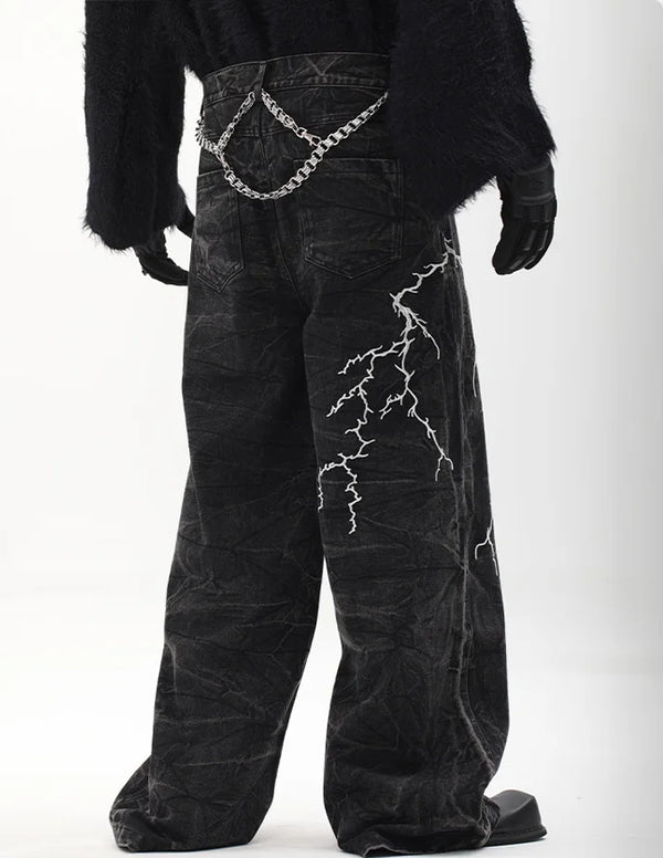
- Hardware – buckles, straps, chains, rings, harnesses. They structure surfaces that would otherwise look empty.
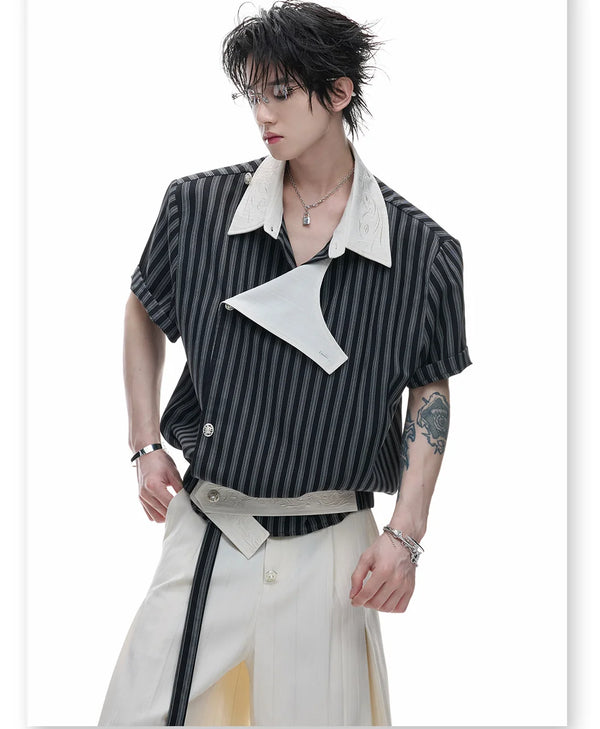
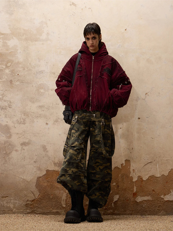
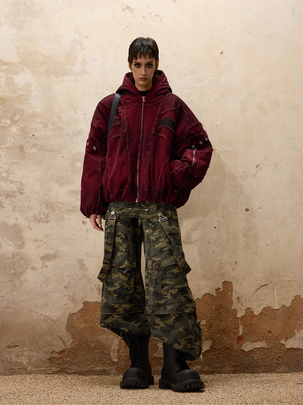
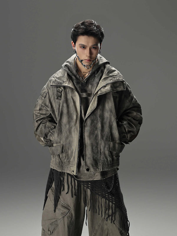
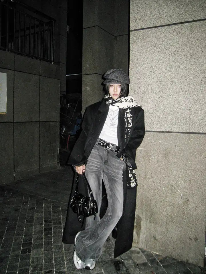
The second principle is layering. A Visual Kei outfit rarely consists of three pieces. Shirt over longsleeve, waistcoat over shirt, jacket over waistcoat, plus belt, harness and chains. This density is the real difference from Western rock fashion, which usually works with a single strong silhouette and keeps the rest quiet.
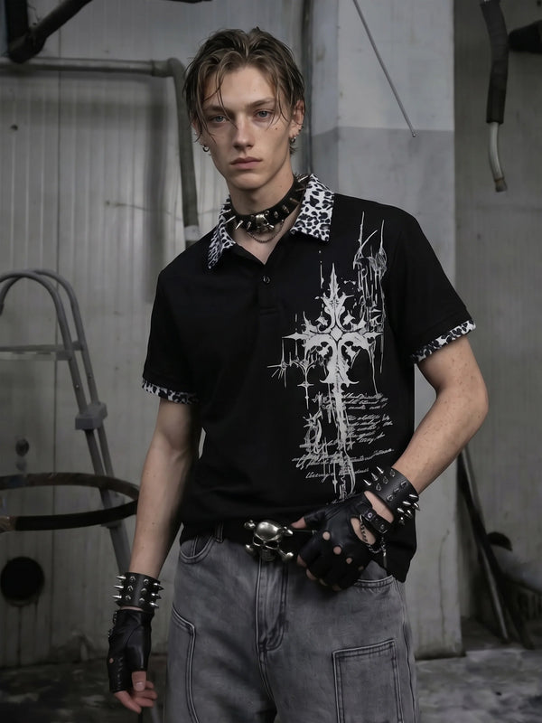
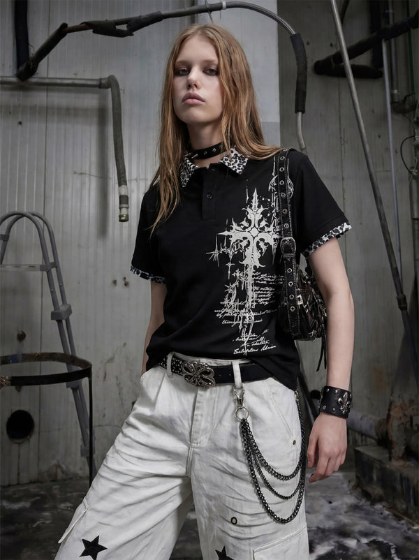
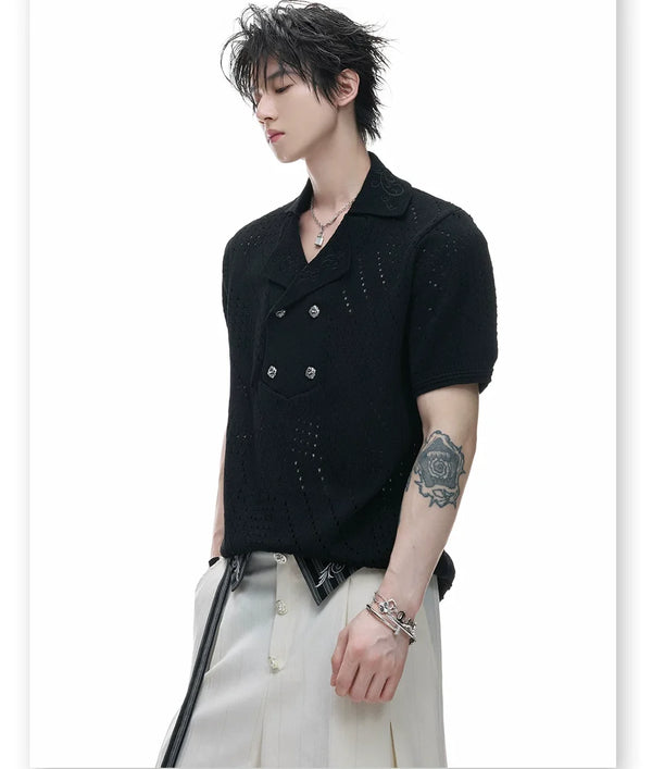
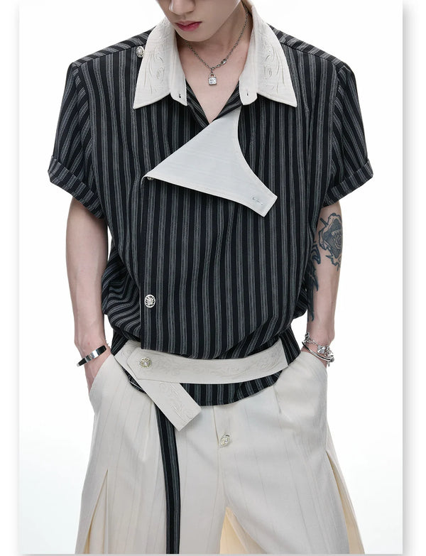
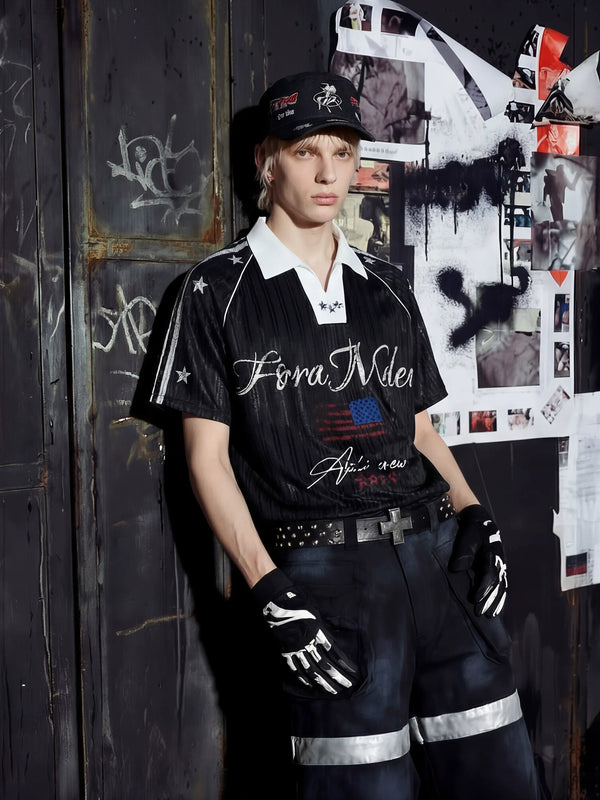
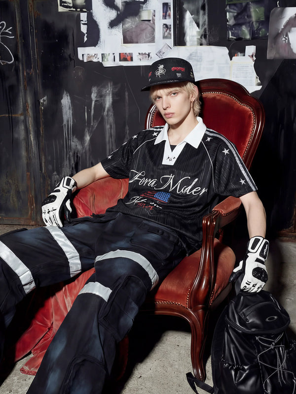
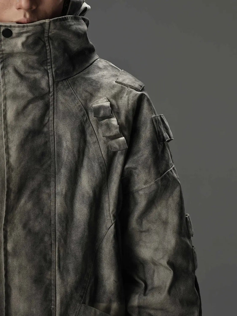
For getting started, the top layer is the most important decision. A top with collar work, tribal graphics or an unusual seam line carries a whole look without any effort needed underneath. What does not work are large logo prints: they pull the eye onto a brand instead of the silhouette.
Iterations
The six variants of Visual Kei
Within the scene, Visual Kei is not an umbrella term but an ordering system with clear subdivisions. The labels come from the scene itself, not from marketing, and they mostly describe a combination of region, decade and visual volume. Six variants are enough to place practically any band.
Anyone who cannot decide between the variants has actually already understood the thing. The scene never expected you to sign up for a department. It expects the decision to be visible, whichever one it is.
Visual Kei is one of several subcultures that developed in the same neighbourhood and constantly borrowed from one another. Knowing the neighbours also helps you understand where the boundaries run and why in some places they blur completely.
Origin
Visual Kei bands: who defined the look
No bands, no fashion. The history of Visual Kei can be told through a handful of groups that each opened a new direction and thereby also posed the clothing question anew. Anyone who wants to know why a particular look looks the way it does almost always finds the answer in a discography.
- X Japan – coined the term itself in the late 1980s. Their slogan Psychedelic Violence Crime of Visual Shock on BLUE BLOOD from 1989 counts as the scene's birth certificate.
- Buck-Tick – active since 1983 and never fixed stylistically. They showed that you can change the look completely every few years.
- Luna Sea – in the late 1980s brought a more elegant, less loud variant into play and thereby opened the door to the mainstream.
- Malice Mizer – the most theatrical group of the 1990s. From their orbit came the link between Visual Kei and Lolita fashion.
- Dir en grey – from 1997 the harder side. Their path from heavy costume to reduced stage clothing is exemplary for the whole scene.
- the GazettE – from 2002 the face of the second wave. Streetwear-adjacent silhouettes instead of costume, without giving up the ambition.
One figure deserves a mention of their own: Mana of Malice Mizer. He consistently appeared in feminine-coded clothing, refused on principle to speak in interviews, and founded his own label in 1999. The terms Elegant Gothic Lolita and Elegant Gothic Aristocrat go back to him. With that, a person from the band scene named and helped define an entire branch of Japanese street fashion.
Motion is the part photos never show. A Visual Kei outfit is built for dynamics: coats that open, chains that swing, fabric that follows along. Anyone who only pays attention to the still image when buying often picks the stiffer variant and later wonders why the look falls flat.
Music
Is Visual Kei metal?
No. Visual Kei is not a musical style but a form of presentation, and that is the most frequently misunderstood point of the whole scene. Under the umbrella you find bands playing speed metal next to groups making synth-pop, next to ballad formations, next to hardcore projects. The common denominator lies in the staging, not the sound.
For the clothing question this is decisive. Anyone who treats Visual Kei as a metal offshoot automatically ends up with studs, band shirts and leather jackets, and wonders why the result looks like a rock festival. The real difference lies in lace, ruffles, cut and make-up: all elements that classic metal vocabulary precisely does not contain.
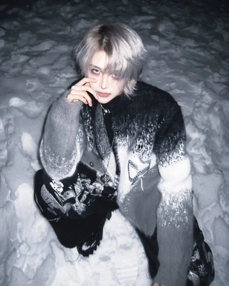
This shift from motif to form is why Japanese rock fashion works outside of concerts too. An elaborately cut cardigan with a colour gradient carries the same message as a band shirt, but does not give it away at ten metres, and can be combined with something completely different the next day.
Placing it
Is Visual Kei J-Fashion?
Yes, but with one important restriction. J-Fashion is the umbrella term for Japanese street-fashion styles, and Visual Kei is practically always included there. Within this collection, though, it is the only large entry that did not emerge on the street. Lolita, Decora, Gyaru, Fairy Kei and Mori Kei were invented by their wearers. Visual Kei was invented by artists and adopted afterwards.
In practice that means two things. First, Visual Kei has no rulebooks of the kind the Lolita scene has maintained over decades. Nobody checks whether the silhouette is correct. Second, the range is wider, because every band supplies its own template instead of everyone agreeing on a shared form.
Gothic and Visual Kei share large parts of the material vocabulary, but come from different directions. The comparison is worth it because it shows which parts of a dark wardrobe are universally usable and which carry a clear origin.
Geography
Visual Kei and Harajuku: where stage and street meet
Harajuku is not the birthplace of Visual Kei, but the place where it became buyable. The bands came from live houses in Shinjuku, Nagoya and Osaka. The trade grew up in Harajuku, above all in the Laforet department store, where the relevant labels gathered on the same floors over the years. Anyone who wanted the look went there.
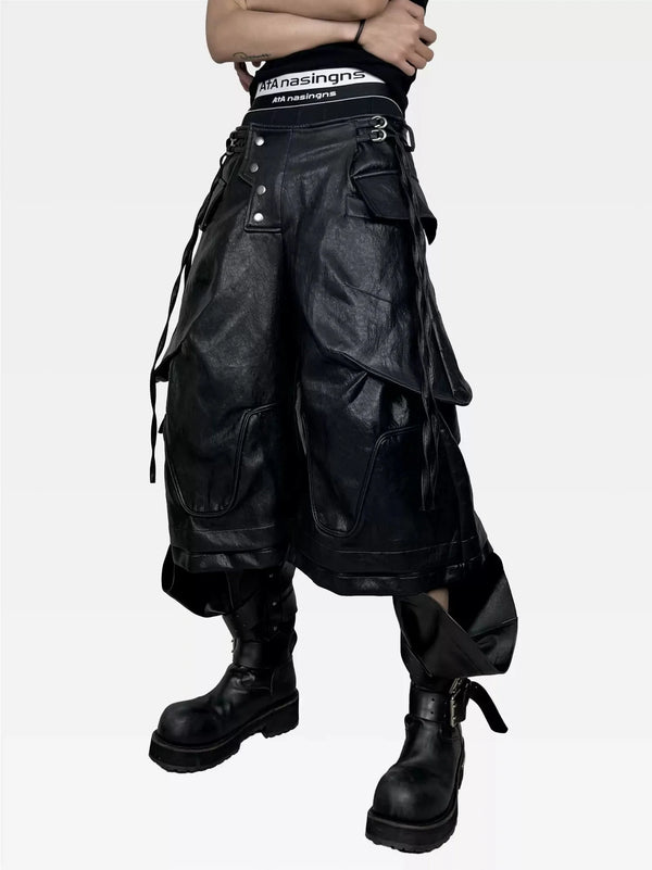
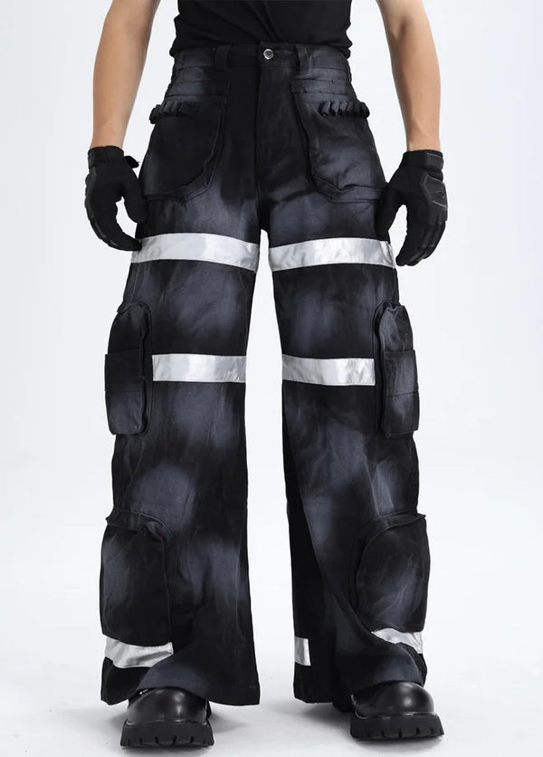
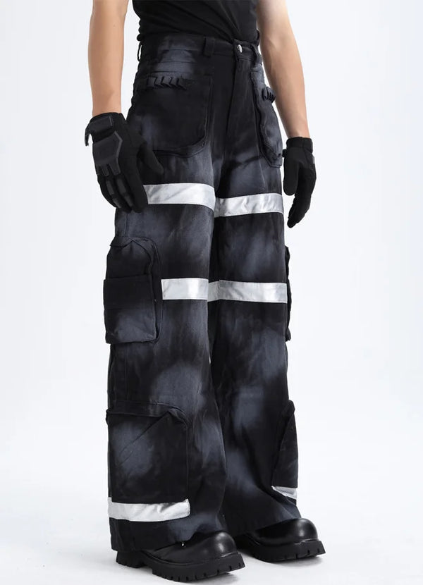
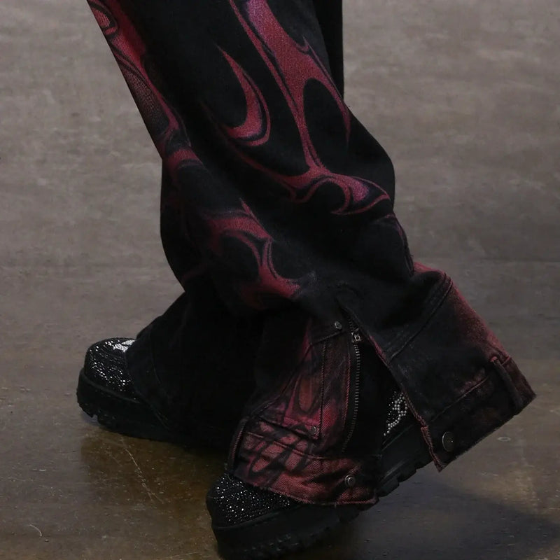
The trousers decide the silhouette. Visual Kei almost never works with a straight standard width: either they sit tight and make the top look large, or they fall wide and make the upper body narrow. Layering details like patch pockets or straps additionally supply the structure that plain fabrics otherwise lack.
Labels
Visual Kei brands: the labels behind the look
Stage costumes are tailored, everyday clothing is bought. Between these two poles, an entire retail landscape has grown up in Japan over the years, offering exactly what fans are after: wearable translations of stage looks. Some of these labels shape the look to this day more strongly than individual bands.
- Moi-même-Moitié – founded by Mana in 1999. Coined the terms Elegant Gothic Lolita and Elegant Gothic Aristocrat, and with them a whole style family.
- h.NAOTO – label of designer Naoto Hirooka, from the early 2000s probably the best-known name for dark Harajuku fashion with asymmetry and strap work.
- SEX POT ReVeNGe – since the late 1990s the more punk side: safety pins, tartan, hard graphics, noticeably cheaper than the designer floor.
- Algonquins – long a fixture for studs, faux leather and industrial details in the Harajuku trade.
- atelier BOZ – responsible for the aristocratic variant: long coats, waistcoats, cuts that recall theatre more than rock.
Anyone searching in Europe will rarely find these names on the rack. Import is expensive, the sizes are calculated for Japanese fits, and several of these labels have heavily reduced their range over the years. More practical is the reverse route: gather the components individually and establish the origin through cut and material instead of the label.
Distinction
Visual Kei, Jirai Kei, Decora and Lolita compared
Four Japanese style families that constantly get muddled online because they share colours and materials. The differences do not lie in the wardrobe but in origin and purpose. Once you have separated them cleanly, you shop much more precisely afterwards.
Lolita is the most formal of the four. The silhouette is defined: knee-length bell skirt over petticoat, blouse, matching accessories. Gothic Lolita shares the colour palette and the leaning towards lace with Visual Kei, but follows a fixed blueprint. The point of contact is historically documented, because Mana connected both worlds, but that changes nothing about Lolita being a form and Visual Kei an attitude.
Decora works against everything Visual Kei stands for: maximum colour, layered plastic accessories, childlike motifs, no drama. Jirai Kei is the youngest entry, emerging in the 2020s around Tokyo's nightlife districts, recognisable by the black-and-pink combination, bows and doll collars. Visually it borders on dark kawaii fashion, not stage rock, even though the colour world overlaps.
Anyone looking for the transition between the two worlds finds it in Gothic Lolita. There the materials of Visual Kei meet the silhouette discipline of the Lolita scene, and both sides lose remarkably little of their character in the process.
Practice
Building a Visual Kei outfit for everyday wear
The stage look cannot be transferred one to one, and it does not have to be. Stage clothing is built for distance, for spotlights and for ninety minutes. Everyday clothing is built for close-up view, for daylight and for fourteen hours. Between the two lies a translation, not a reduction.
The most practical rule is: one stage element per outfit. A jacket with visible strap work, or platform boots, or a harness, or the make-up. Not everything at once. The rest stays dark, well cut and quiet. What results reads to outsiders as a considered wardrobe and to those in the know immediately as what it is.
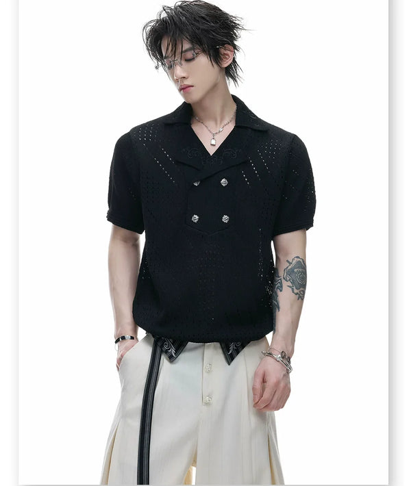
The second practical point concerns the weather. Layering is pleasant in a Japanese spring and an imposition in a German high summer. Anyone who wants to wear the look year-round builds the density through texture instead of layers: a mesh top under a short-sleeved shirt supplies the same complexity as three layers, without the warmth.
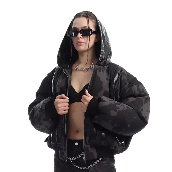
A jacket is the most efficient entry point, because it sits over everything and leaves the rest of the wardrobe unchanged. Fur, mesh or patent leather supply the material statement that makes Visual Kei, and can be worn over plain dark basics you already own.
What goes wrong
Common mistakes in Visual Kei styling
Most failed attempts fail not because of missing pieces but because of the wrong order and too much ambition at once. Five patterns turn up so regularly that they can be named in advance.
The common denominator is impatience. Visual Kei looks like effort and therefore tempts you to show all the effort at once. The scene itself took forty years to build its vocabulary. A wardrobe may take two seasons.
Material contrast is the quickest way to make a dark outfit interesting. Distressed next to smooth, matt next to glossy, heavy next to see-through. These contrasts work even when the whole palette consists of a single shade.
Buying
Buying Visual Kei: how to spot usable pieces
The market for dark Japanese fashion is full of pieces that convince in the product photo and fall apart on unpacking. Because the look relies heavily on hardware and structure, build quality decides more here than with plain clothing. Four checkpoints are enough to sort out most bad buys in advance.
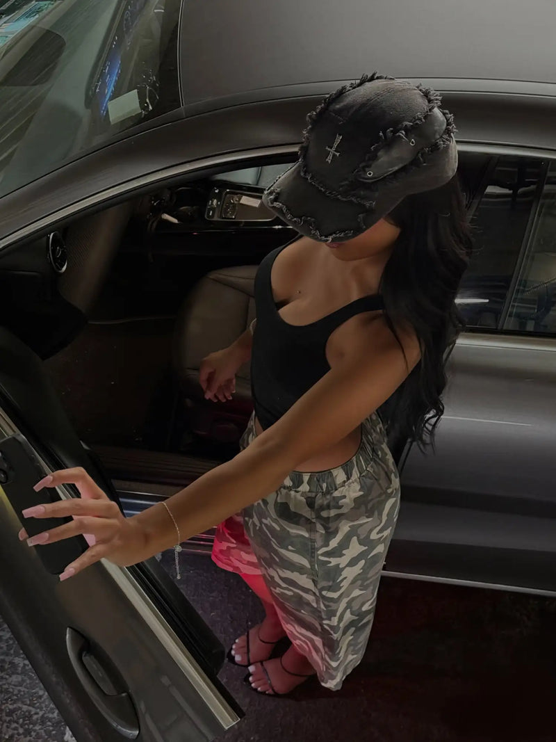
Accessories are the cheapest way to shift an existing wardrobe towards Visual Kei. A belt with a cross fitting or a chain on the trouser pocket changes the statement of a plain black outfit more than an additional top ever could.
FAQ
Frequently asked questions about Visual Kei fashion
The following questions come up most often on this topic, mostly because music and fashion are inseparably linked in the term. We answer them briefly and without scene vocabulary.
Is Visual Kei a clothing style or a musical genre?
What does Visual Kei mean in English?
Is Visual Kei J-Fashion?
Is Visual Kei metal?
Do you have to wear make-up for Visual Kei?
What is the difference between Visual Kei and Jirai Kei?
What does the 3-3-3 rule in fashion say?
That leaves the question of what remains of a forty-year-old stage aesthetic today, once you take it out of Tokyo and set it down in Berlin, Vienna or Zurich. The answer is less spectacular than the photos suggest.
What remains is a method: build clothing so that it works from a distance and holds up close. The rest is taste.
What do you think?
Tell us on @fuga_studios
About the author
Philipp Fuge — Founder · Berlin
Founder of Fūga Studios. Writes the journal himself. Berlin · Shanghai · Tokyo · Poznań — four cities, one logic.