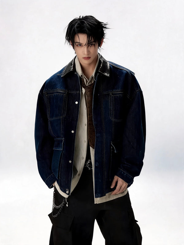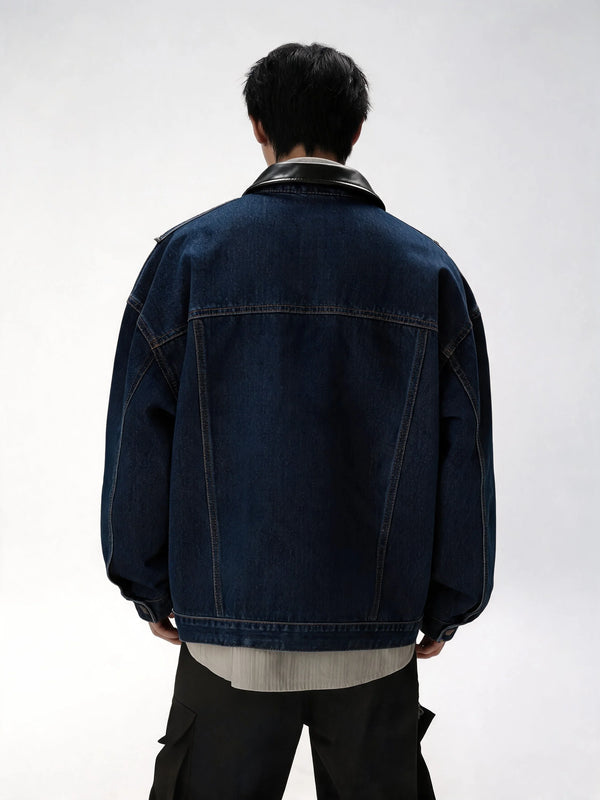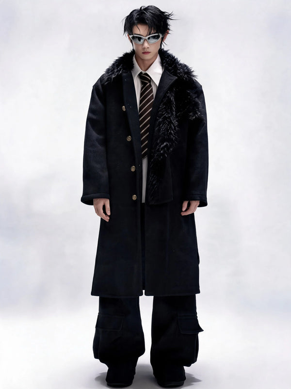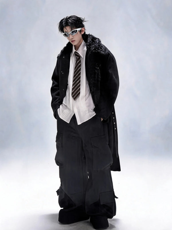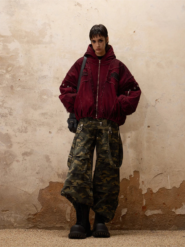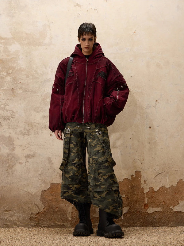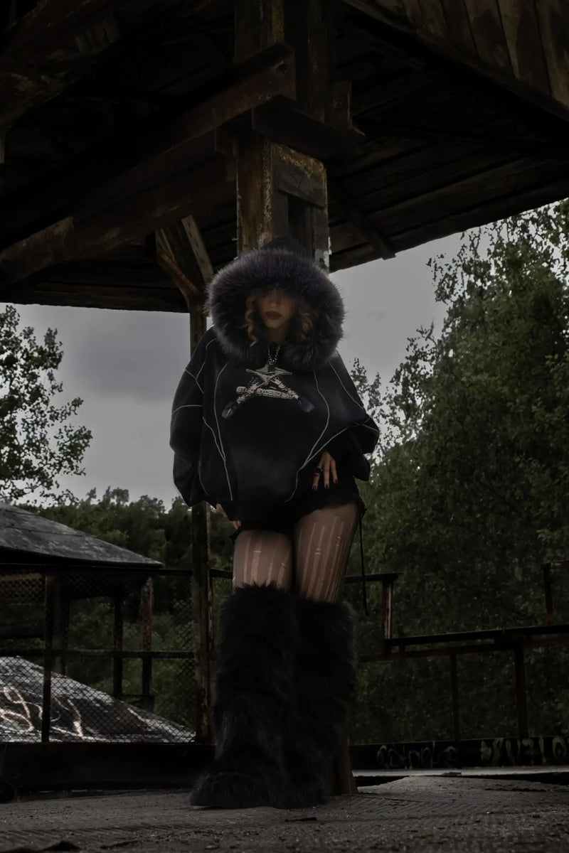

A leather jacket hangs over a chair in an old Kreuzberg kitchen. On the back a hand-painted A in a circle, three safety pins on the collar, a row of studs on the shoulder that someone set with pliers and a lot of patience. No logo, no price tag, no explanation. Still, anyone who sees the jacket knows at once what it stands for. That is exactly what signs do: they speak before the person wearing them opens their mouth.
Punk fashion symbols are the signs and pieces that make punk style recognisable at a glance: safety pin, anarchy A, studs and spikes, padlock chain, tartan, bondage straps, skull, Union Jack, patches, mohawk and combat boots. Each of them originally had a clear, mostly provocative meaning. For the full overview of codes, pieces and attitude, see our Punk Fashion Guide. Here it is about the meaning of every single symbol and about how to wear it today.
The map
Punk Fashion Symbols: Why the Scene Speaks in Signs
Punk had a problem from the start that was its strength at the same time: no money, no industry, no advertising. Anyone who wanted to belong could not buy a look, they had to build it. And whoever builds something themselves needs a language that says a lot with little material. That is how the signs of the scene came about: cheap, quick to make and unambiguous.
Most of these signs appeared within a few years. In New York, Richard Hell wore torn shirts held together with pins from 1975 on. In London, Vivienne Westwood and Malcolm McLaren opened the shop SEX at 430 King's Road in 1974, which became Seditionaries in 1976. That is where bondage straps, tartan and provocative prints got their punk meaning. A year later the vocabulary was complete and travelled the world on record sleeves, photos and fanzines.
1974
SEX opens at 430 King's Road
1976
Anarchy in the U.K. is released
1977
God Save the Queen and the pin through the lip
To place the individual signs faster, it helps to sort them into families. Almost every punk symbol belongs to one of five groups, and each group has its own base meaning that still carries today when you wear the piece.
Sign number one
The safety pin: the most important punk symbol
If you had to name a single punk fashion symbol, it would be the safety pin. It is the cheapest piece in the whole scene and at the same time the one with the strongest statement. Originally it was a pure fix: a shirt rips, trousers split at the knee, and instead of buying a replacement you pin the hole shut. Out of shortage came a statement. Clothing that is broken and worn anyway says loudly that you do not care about new goods and consumer rules.
Richard Hell was already using the pins in New York before the British boom. Johnny Rotten took them up in London and made them a trademark of the Sex Pistols. The pin finally became an icon in 1977 through Jamie Reid, the band's graphic designer: his image of the Queen with a safety pin through her lip is still one of the best known pictures in pop culture. Some punks actually pushed the pins through ear and cheek, most wore them on collars, sleeves and trouser legs.
What is interesting is how fast fashion reacted. Zandra Rhodes showed dresses with rips and golden safety pins on the runway as early as 1977. Gianni Versace made a dress famous in 1994 that was held together only by large pins. For everyday wear today, one pin on the lapel or the hem is enough.
Politics on leather
The anarchy A: political punk symbol on jackets and walls
The A in a circle is older than punk. It comes from the anarchist movement and became popular in France in the 1960s as a recognition sign. The meaning is simple: A for anarchy, the circle often read as O for order, loosely following the idea that order without rule is possible. For most punks, though, the political theory behind it was secondary. What mattered was that the sign instantly set off every teacher, every police officer and every father.
With Anarchy in the U.K., the first Sex Pistols single from 1976, the word itself became a slogan, and the circled A moved onto leather jackets, school bags, toilet doors and house walls. It was the perfect punk sign: drawn in three seconds with a marker, impossible to misread. Later the anarcho punk scene of the 80s around Crass used the symbolism in a seriously political way.
Today the anarchy A is above all a sign of independence, less a political programme. Anyone wearing it should still know where it comes from. It works strongest not as a big print on the chest but small and handmade: painted on the inside of a collar, as a patch on a bag or scratched into a leather bracelet. The less it looks like merch, the more it looks like punk. How the early years shaped the sign is in our article on the founding period.
Metal as language
Studs and spikes: iconic punk elements made of metal
Studs and spikes are the hardware of the scene. They came to punk through the rockers and motorcycle clubs of the 50s and 60s, where studded belts and studded leather jackets had long stood for hardness. Punk took the principle over and made it radical: more metal, sharper shapes, and above all self-made. The typical punk jacket of the late 70s was not bought studded, it was fitted with studs piece by piece, often over months.
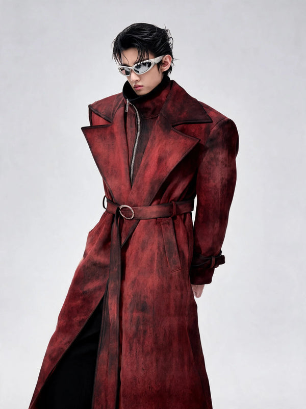
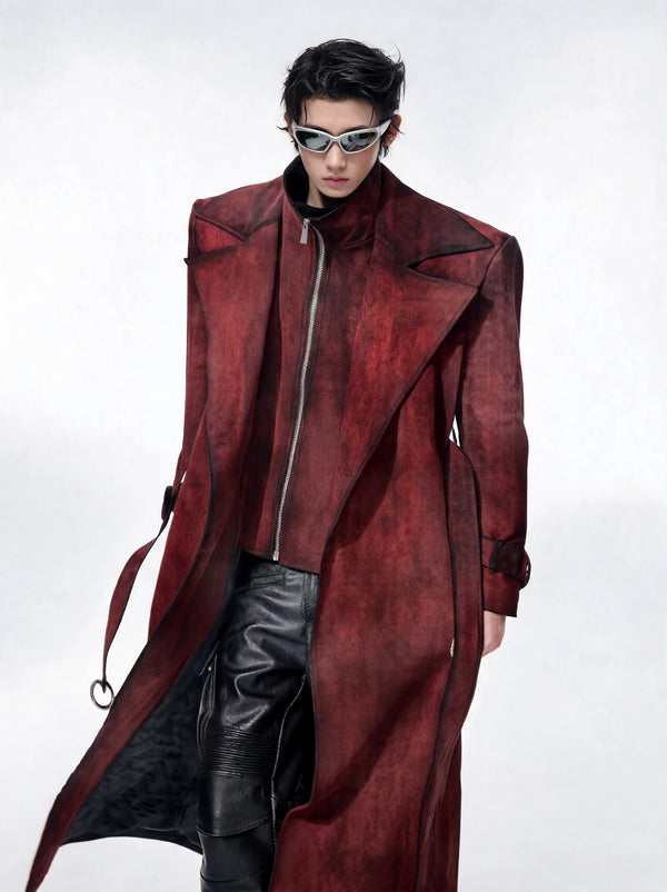
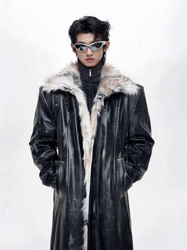
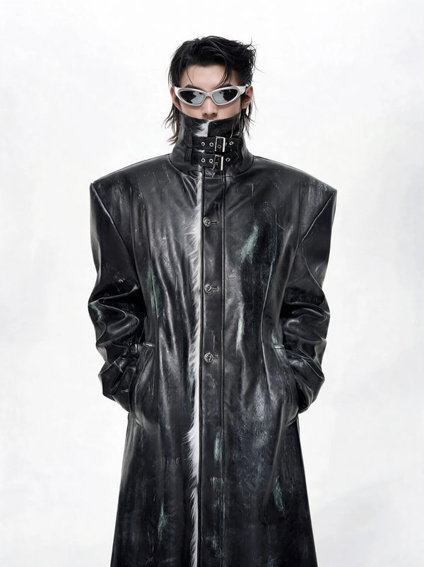
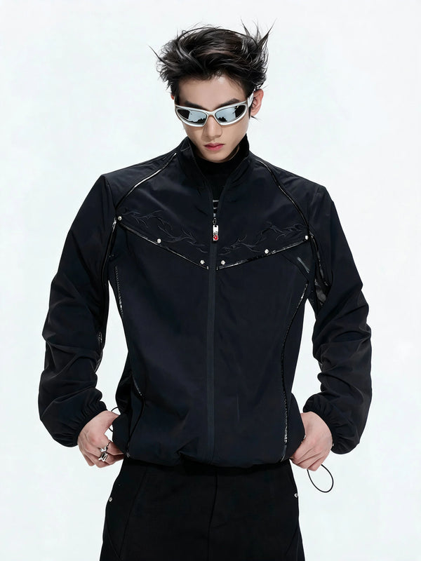
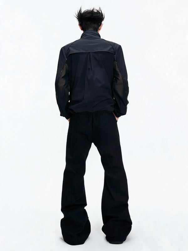
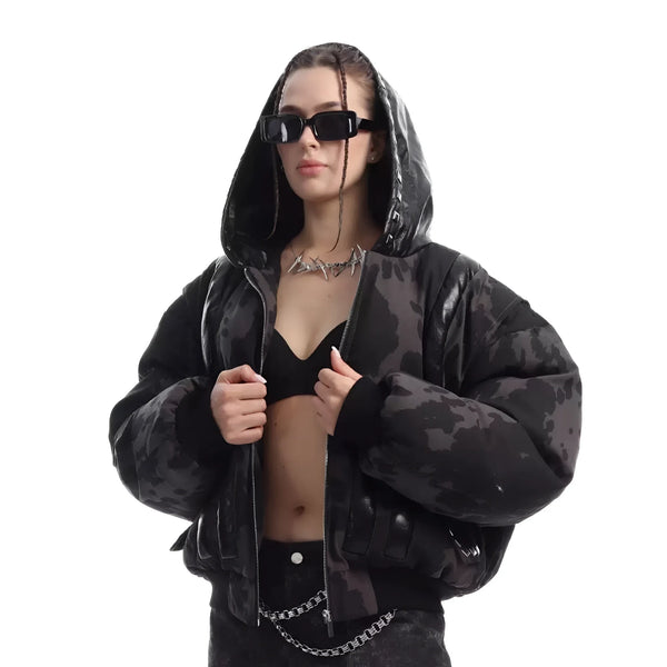
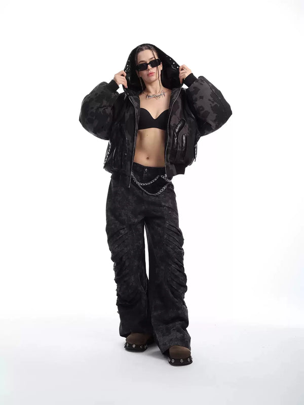
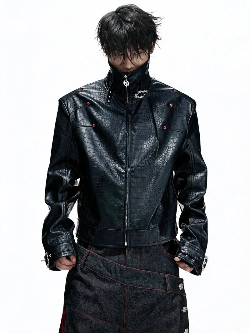
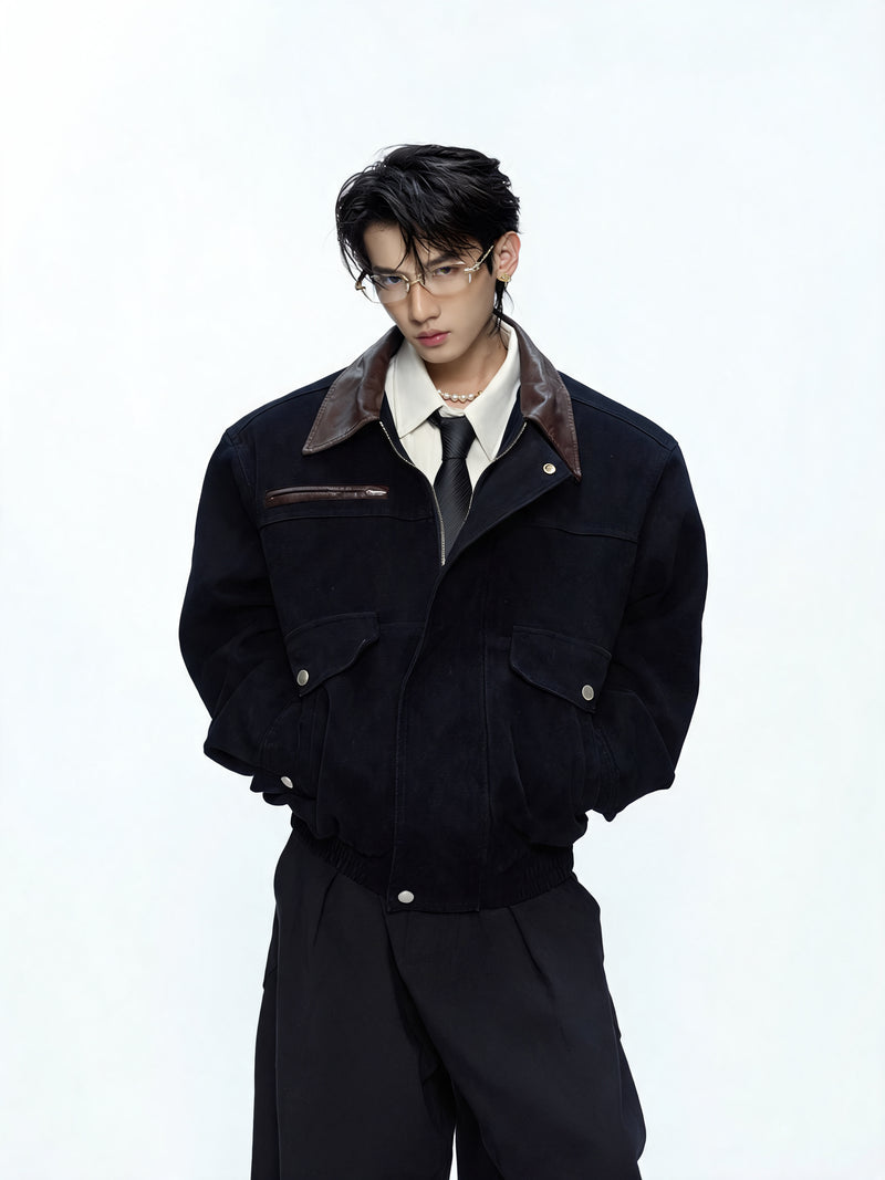
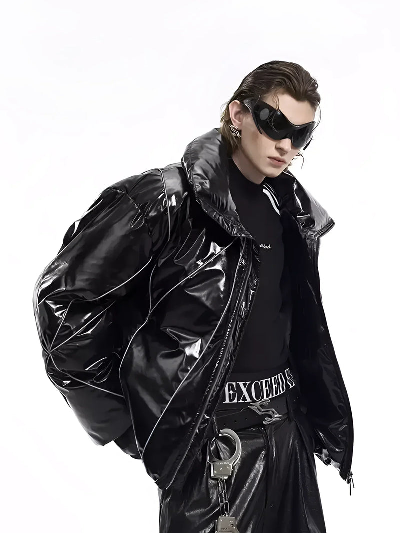
Today nobody has to pick up a pair of pliers to get that effect. A leather jacket with buckles or a few placed metal accents carries the same message, only quieter. Jackets in particular show how much a single detail does: a plain black jacket reads as neutral, the same jacket with buckles or a skull motif is punk immediately.
Both jackets follow the same logic as the studded originals: dark leather as the surface, metal or motif as the sign. If you start there, the rest of the outfit hardly needs further symbols, because the jacket already makes the statement on its own.
Sid Vicious
Padlock and chain: the punk symbol around the neck
No accessory is as closely tied to one single person as the padlock chain is to Sid Vicious. The Sex Pistols bassist wore a heavy chain with a padlock around his neck from 1977, and the image travelled the world. The meaning shifted depending on who told the story: some saw a nod to submission and bondage, others simply a provocation with hardware store material. All that is certain is that the padlock has been one of the best known signs of the scene ever since.
Chains in general are a core part of punk aesthetics. They stand for captivity and its opposite at the same time: whoever hangs chains on themselves decides what binds them. The main variants each have their own tone.
- Padlock chain: The 1977 original. Heavy, direct, unmistakable. Works best over a plain black shirt.
- Dog collar with ring: From the bondage corner of SEX and Seditionaries. Still one of the most provocative punk accessories.
- Wallet chain: Came into the scene through skate punk and hardcore. Meant as functional, today above all a sign on the hip.
- Spike chain and spike bracelet: The combination of chain and studs. Reads harder than any other piece of jewellery and needs little company.
What all the variants share is that they need weight to work. A thin silver chain is jewellery, a heavy chain with a padlock, ring or spikes is a sign. So if you work with chains, pick one strong piece instead of layering three weak ones.
King's Road
Tartan and bondage straps: punk symbols from the King's Road
Tartan is the best example of the reinterpretation punk did so well. In Britain the checked pattern stands for Scottish clans, for tradition, for school uniforms and the military. That is exactly why Vivienne Westwood and Malcolm McLaren picked it up. In their hands tartan became a fabric for torn trousers, bondage suits and skirts fitted with pins and straps. A symbol of order became a symbol of revolt, without the pattern itself changing at all.
The bondage trouser is the second big sign from that workshop. From 1976 Seditionaries sold trousers with a strap between the legs, with D-rings, zips and sometimes a fabric flap at the back. The reference to fetish clothing was intended: punk wanted to show that the limits of what you may wear on the street can be moved. Anyone walking through London in trousers like that provoked by their walk alone.
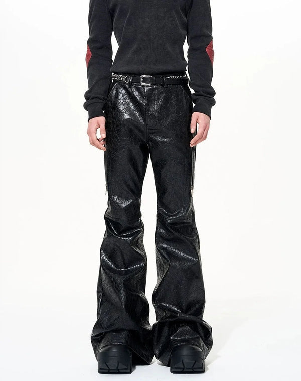
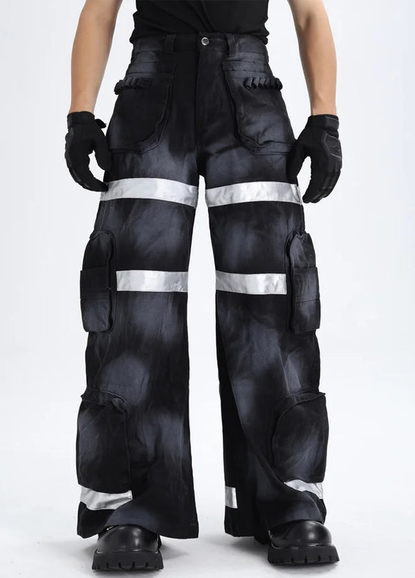
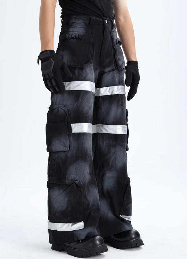
Both signs live on today, only more rarely as the complete package. Tartan turns up as a skirt, trousers or a scarf, bondage elements as straps, buckles and rings on trousers. On trousers, leather, studs or a graphic motif on a dark ground carry the same tension as the originals.
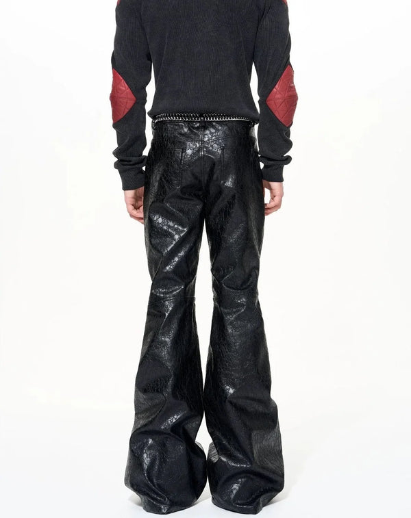
The spiderweb trouser carries its symbol directly in the leather, the flared trouser relies on studs. Both are modern ways of turning a trouser into a sign without becoming a bondage copy. A plain piece on top goes with it, so the symbol does not end up competing.
Shock and mockery
Skull and cross: punk aesthetics between shock and mockery
The skull is a sign punk did not invent but took over consistently. It came from the rocker world, from pirate flags and military badges. In punk it stood for transience, for No Future, for laughing at death. At the end of the 70s the Misfits turned a skull from an old 1946 film serial into their logo, and that Crimson Ghost skull is still on shirts in every shopping street today.
The cross works in a similar way, but with a different thrust. Punk rarely used religious symbols out of faith, mostly as mockery of church and authority. Upside down crucifixes, crosses made of studs or safety pins, crosses next to skulls: the aim was almost always provocation. In the early phase, though, the provocation partly went too far. Some early shirts combined religious signs with Nazi symbolism as a shock tactic. The scene later drew a clear line against that, most explicitly in 1981 with the Dead Kennedys song Nazi Punks Fuck Off, and anti-fascist patches became a fixed part of many jackets.
Today skull and cross are the symbols where punk, Gothic and darkwear overlap the most. The difference is made by the pieces around them: studs and rips pull towards punk, velvet and lace towards Gothic. What that looks like in motion is shown by the first clip.
@fugastudios Battle scars as a fashion statement 🔥 When your fit survived the apocalypse and kept it pushing #fugastudios #fashiontiktok #fypシ #alternativefashion #darkfashion #opiumcore ♬ Originalton - Fuga Studios
The look in the video works with traces instead of logos: rips, wear, dark layers. That is exactly the older meaning behind skull and safety pin, namely clothing that has survived something. Not a single symbol has to sit large on the chest for that.
Graphics as attack
Union Jack and ransom note type: punk graphics as a symbol
Some of the strongest punk symbols are not garments but graphics. The Union Jack is the clearest example. Jamie Reid took the British flag for the Sex Pistols Anarchy poster in 1976, tore it up and held the parts together with safety pins and clips. A national flag, the ultimate sign of belonging and pride, became the picture of a country falling apart.
Reid's typography was just as formative. For record sleeves and posters he glued letters together out of newspapers and magazines, in the style of a ransom note. The type fitted perfectly with a scene that produced its fanzines with a copier, scissors and glue. To this day that glued together lettering counts as a typographic punk sign you recognise immediately.
For fashion that means: punk graphics live on breaks. Collages, distorted flags, crooked type and copied motifs read punkier than any clean logo. How this graphic language developed over the decades is shown by our complete timeline.
The jacket speaks
Patches: the messages on the punk jacket
If the leather jacket is the canvas of punk, patches are the writing on it. Patches have been with the scene from the start because they are cheap, interchangeable and very personal. With band names you show what you listen to. With slogans you show what you stand for. A jacket full of patches is basically a biography worn on the body.
In the 80s especially, in anarcho punk and hardcore, the patch jacket became an art form of its own. The big patch on the back, the backpatch, was the most important element and usually showed the favourite band or a political motif. The main patch types each have their own statement.
- Band patch: The classic. Shows taste and belonging, best from bands you actually know.
- Backpatch: The large patch on the back. The central statement of the jacket, usually only one per jacket.
- Slogan patch: Political or ironic lines, often anti-fascist or anti-authoritarian. Short, direct, without explanation.
- DIY patch: Hand painted, stamped or stencilled. The most authentic patch, because it exists only once.
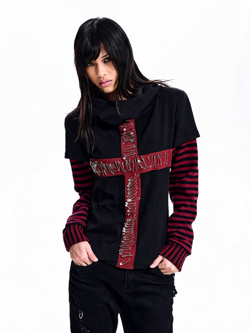
Today not every jacket has to be sewn full. A single motif on chest or back often carries more than twenty small patches. The same goes for tops: a shirt with a clear symbol, say a yin yang or a cross at the collar, works like a patch, only built in. This is exactly where you see how directly a motif can become a sign.
If you would rather get into punk symbolism through categories than through single pieces, here are the directions in which our range carries the signs of the scene forward. Each category stands for one of the symbol families above.
The body as a sign
Mohawk, eyeliner and hair colour: the body as a punk symbol
Not every punk symbol can be taken off. The mohawk, also called mohican, is the best known example of a sign that sits directly on the body. The upright brush in the middle of the head, often dyed and stiffened with soap, sugar or hairspray, became the image of the punk as such at the beginning of the 80s. Bands like The Exploited wore it in every photo.
Make-up was just as important. Thick black eyeliner, dark lips and a white powdered face came into the scene through figures like Siouxsie Sioux and Jordan and were quickly taken up by all genders. Hair dyed green, pink, blue or platinum was the cheapest way to set yourself apart visibly. The meaning was always the same: my body belongs to me, and I show it, even if it bothers someone.
Today the full mohawk has become rare, but the principle lives on in another form: shaved sides, dyed strands, a hard line of eyeliner with an otherwise plain outfit. The body sign works so well precisely because it needs no further hardware and the outfit around it is allowed to stay quiet.
From the ground up
Combat boots and laces: what the colours mean
The shoes are the foundation of every punk look and a symbol of their own at the same time. The classic eight eyelet combat boot came onto the market in the 60s and was originally a work shoe for postmen, police officers and factory workers. Through the skinheads and later punk it became the sign of the street: robust, heavy, made for gigs, demos and long nights. Creepers, Chucks and biker boots came along too, but no shoe stands for punk as much as the black lace up boot.
One detail still raises questions today: the colour of the laces. In parts of the skinhead and punk scene coloured laces did work as a code showing political or scene internal allegiance. The meanings were never consistent though, they shifted by city, country and decade, and some colours were taken over by right wing groups. If you do not want to signal something you do not mean by accident, black laces are the safe side.
This order is the reason good punk outfits look so self-evident. The base gives calm, the symbol gives direction. Whoever starts the other way round and collects symbols before the base is standing almost always ends up with an overloaded look.
Present
Wearing punk symbols today: iconic punk elements in everyday life
The big question with all punk fashion symbols is how to wear them today without looking like a themed party. The answer lies in the dose. The signs are known today, and that is exactly why one of them is enough to be understood. A safety pin on the collar, a chain with a padlock, a cross detail on the polo, that is enough.
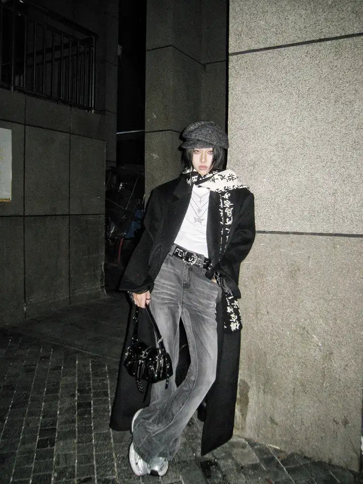
At the same time punk mixes more strongly with neighbouring styles today. Gothic, darkwear and streetwear share many symbols, from skull to cross, and the context decides how a sign is read. In Berlin you see this mix every night: club goers with a spike bracelet and wide trousers, a polo with a cross collar and a leather jacket, a tartan scarf with all black. Punk is no longer a uniform here, it is a toolbox.
This reduction is no betrayal of the originals, it is their logical continuation. The first punks wore their present, not the past. Anyone building a symbol into a modern look today does exactly the same. The second clip shows how a dark layered look still reads as punk without a single patch.
@fugastudios When your pants have more layers than your personality 🤎☀️ Opium Grunge Longsleeve + multi-pocket cargo pants = apocalyptic chic achieved#fugastudios #grungeaesthetic #cargopants #darkfashion #opiumcollection ♬ Originalton - Fuga Studios
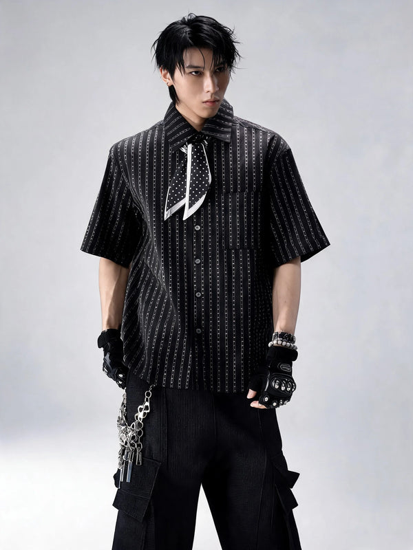
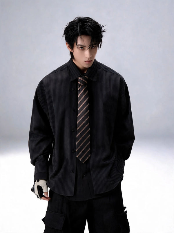
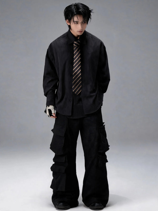
The outfit does without a pin, without an anarchy A and without studs and still carries the basic attitude: worn surfaces, layers, function instead of decoration. Whoever wants to reduce further ends up at the all black punk outfit, where material and silhouette alone carry the statement.
What goes wrong
Common mistakes when wearing punk symbols
Precisely because punk symbols are so well known, they are often used thoughtlessly. The result then looks like a costume from a party shop or, worse, sends a signal nobody wanted to send. Most missteps follow one of five patterns.
All five mistakes have the same solution: build a dark, structured base and then set one single, clear sign. The fastest way there is through accessories, because they carry the symbol language of the scene on the smallest surface, from the spike bracelet to the cross chain.
Questions
FAQ on punk fashion symbols
Finally the questions that come up most often around punk symbols, answered briefly. The detailed history of every sign is in the sections above.
What does the A in a circle mean for punks?
Why do punks wear a padlock as a chain?
Do lace colours have a meaning for punks?
Can you wear punk symbols without being a punk yourself?
Almost fifty years after the first safety pin through a torn shirt, the signs of the scene are still readable, on the street, in the club and on the runway. What has changed is the dose, not the meaning.
What do you think?
Tell us on @fuga_studios
About the author
Philipp Fuge — Founder · Berlin
Founder of Fūga Studios. Writes the journal himself. Berlin · Shanghai · Tokyo · Poznań — four cities, one logic.