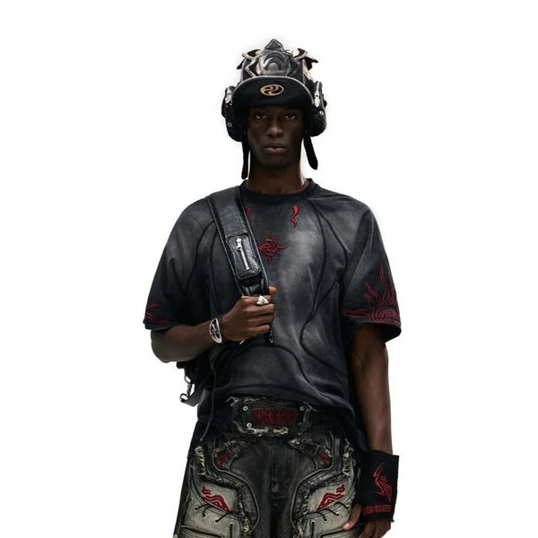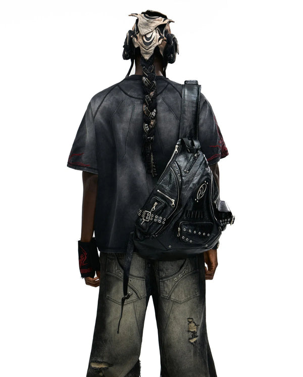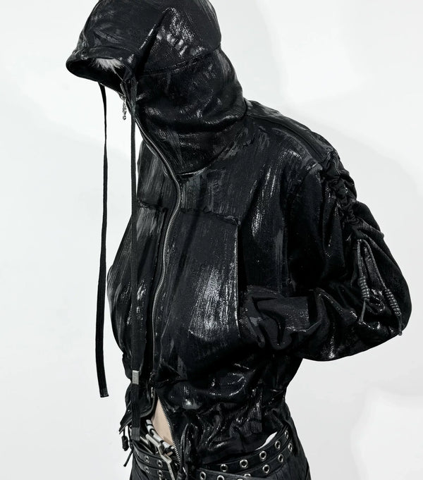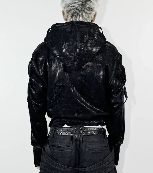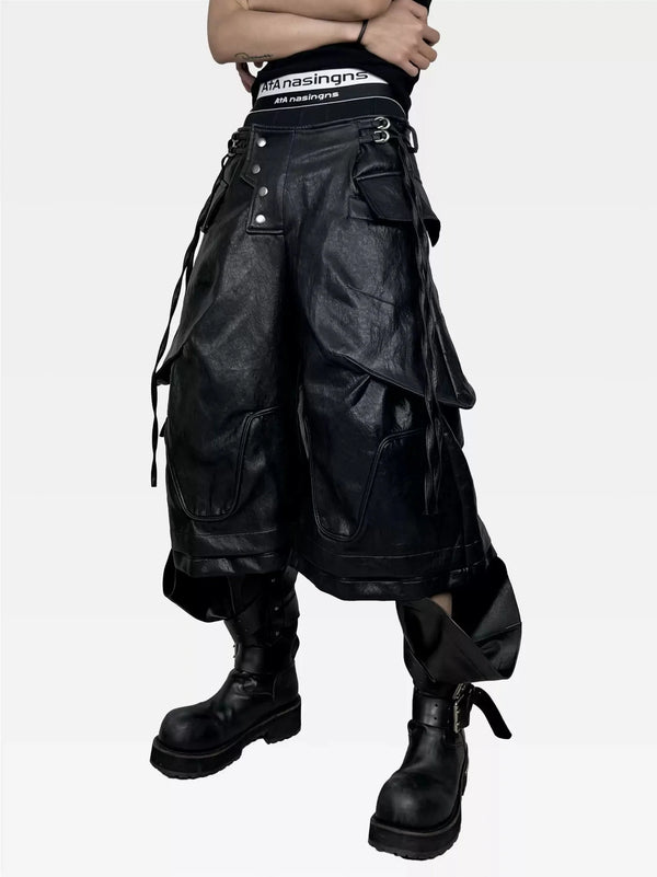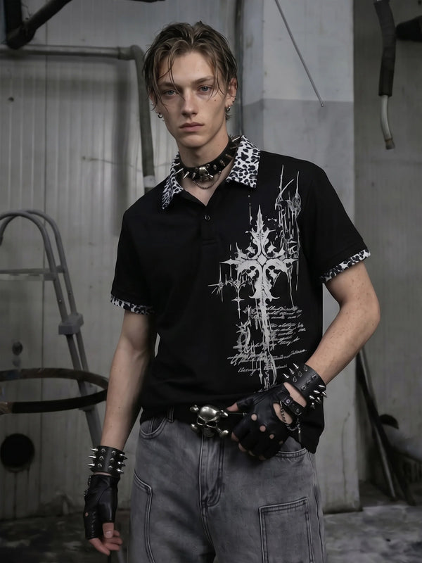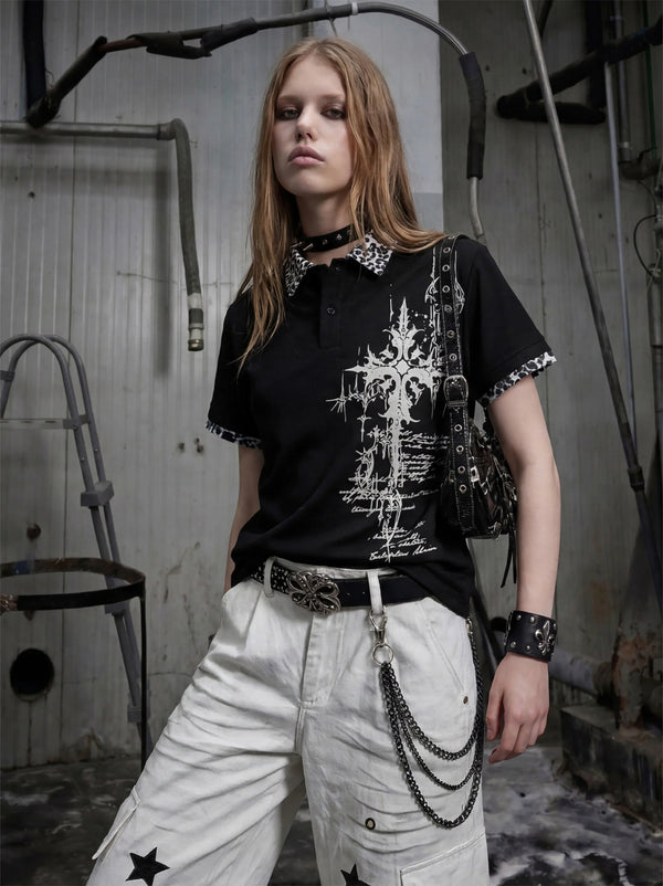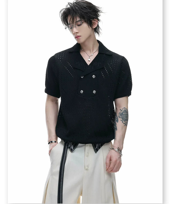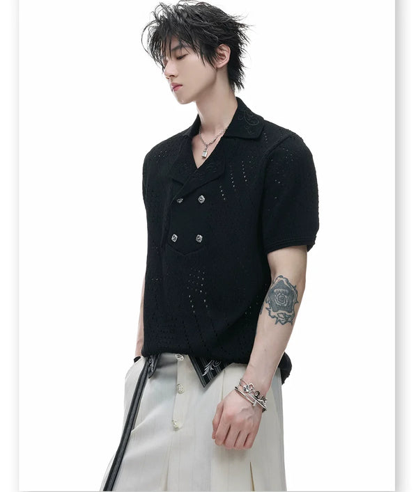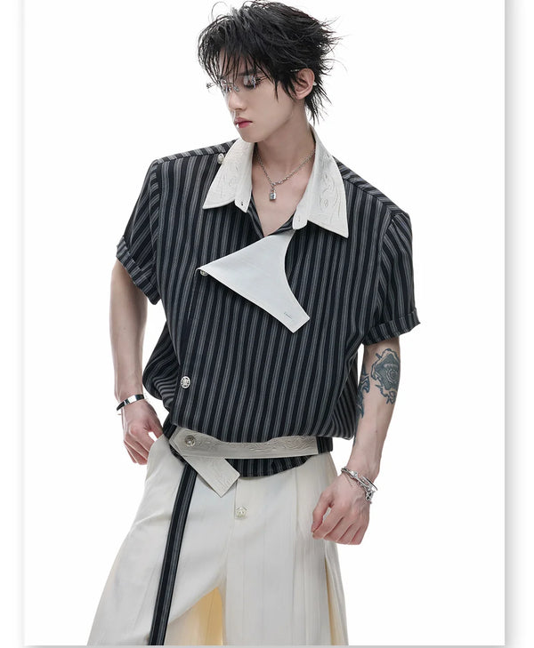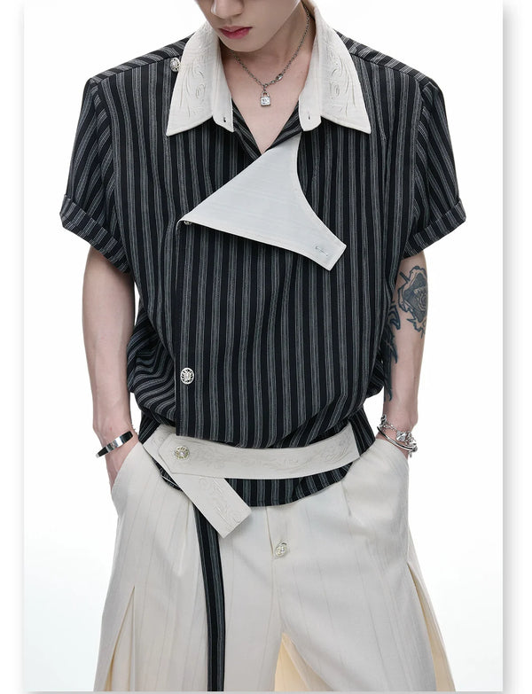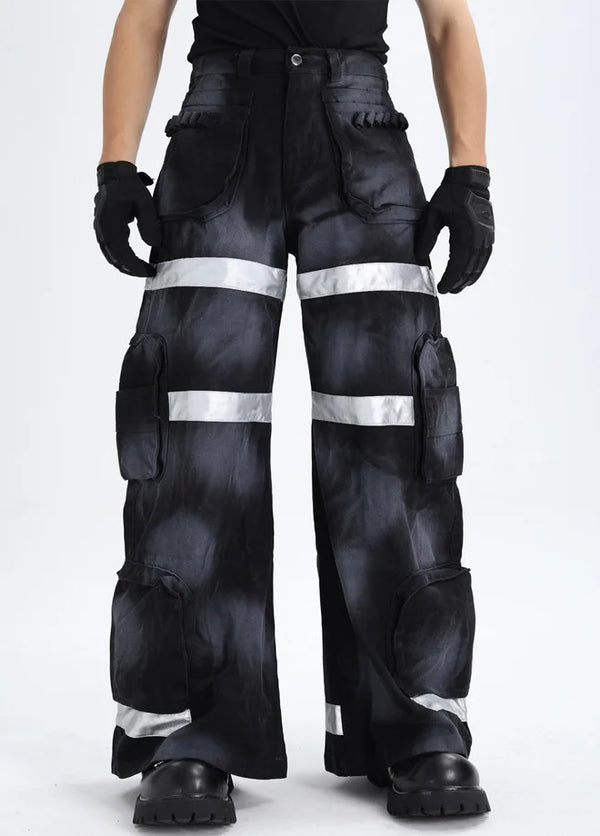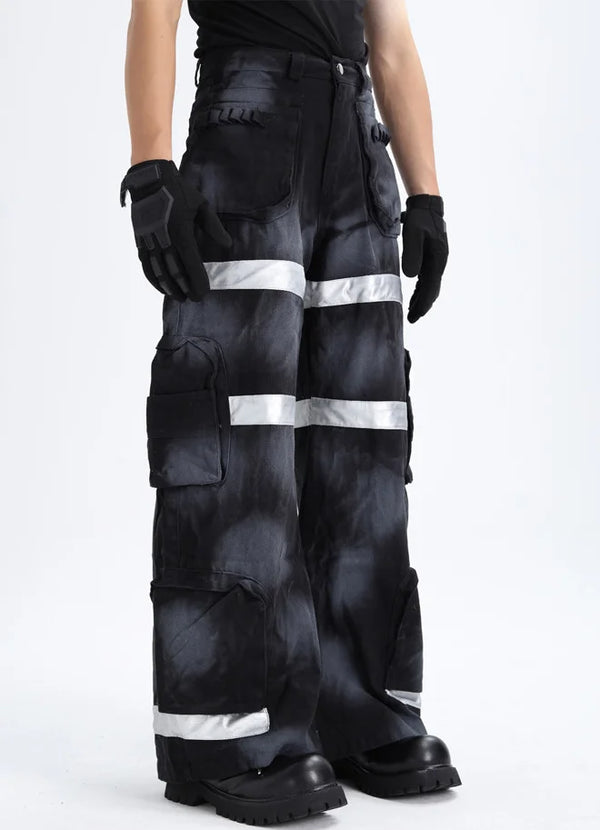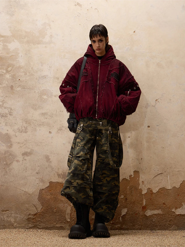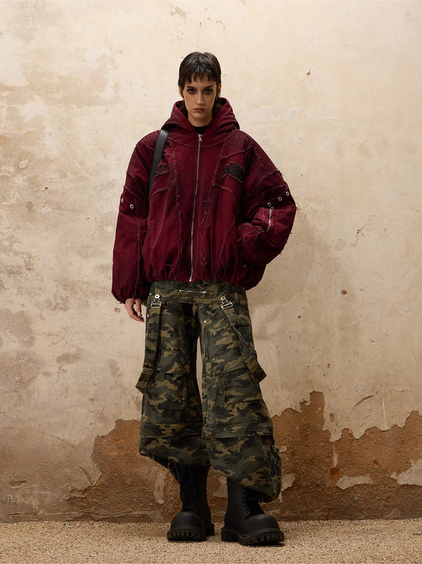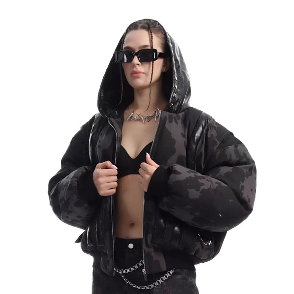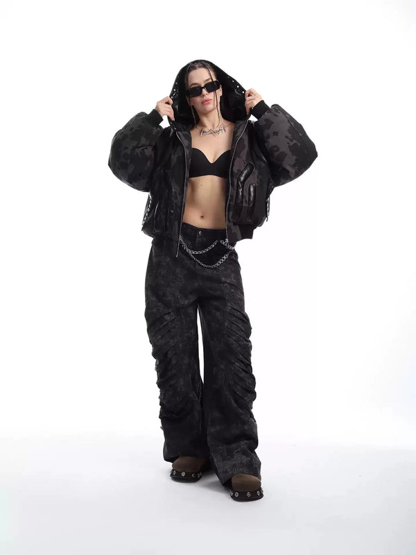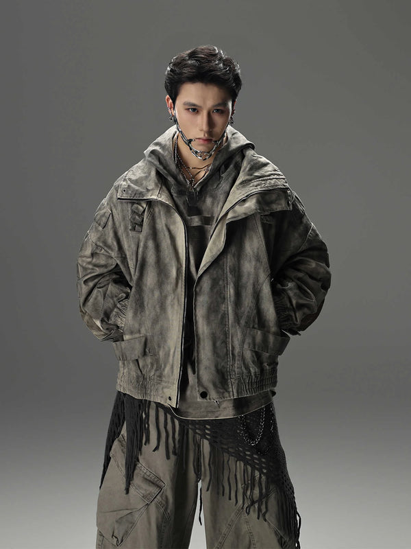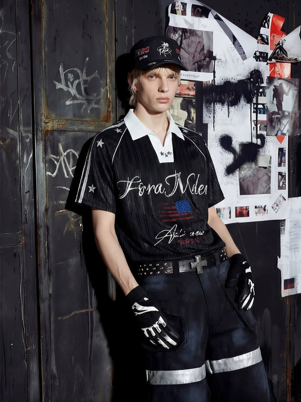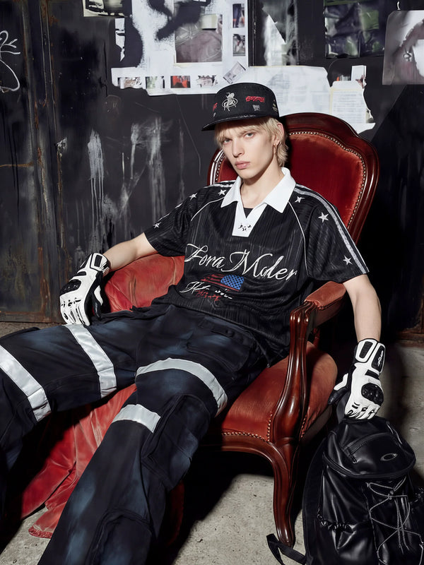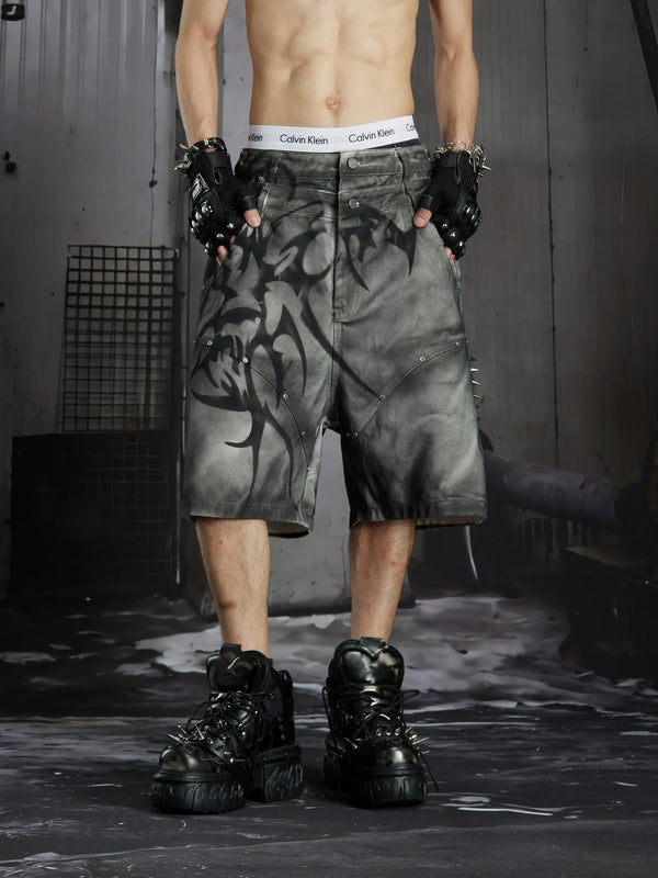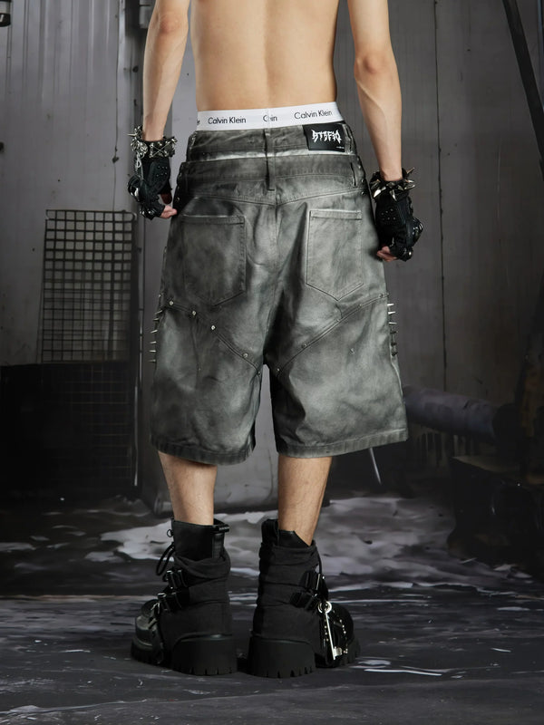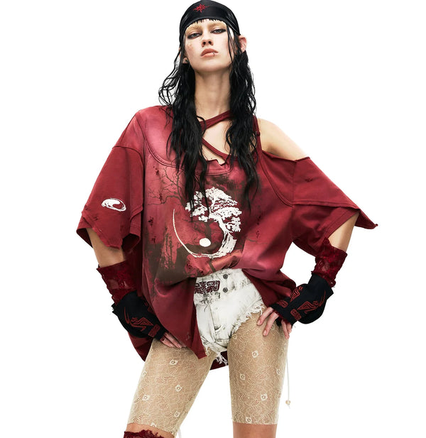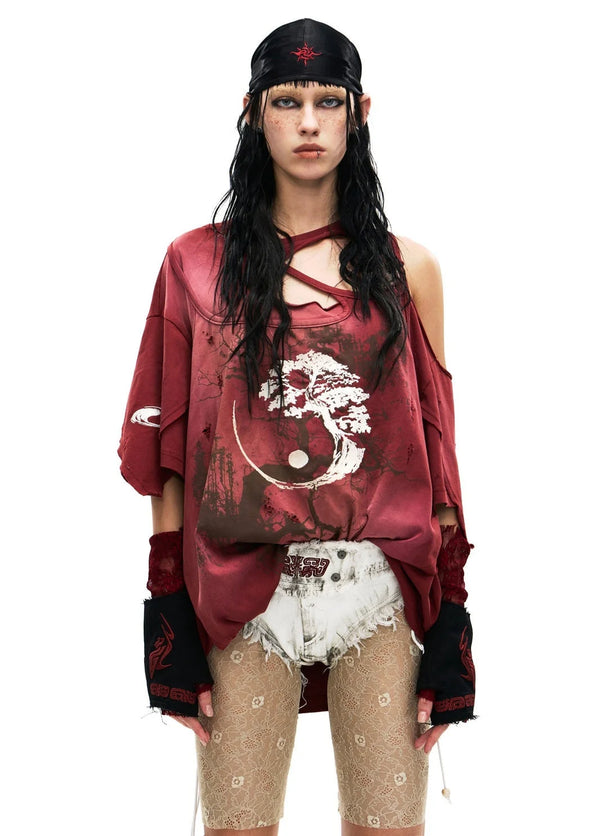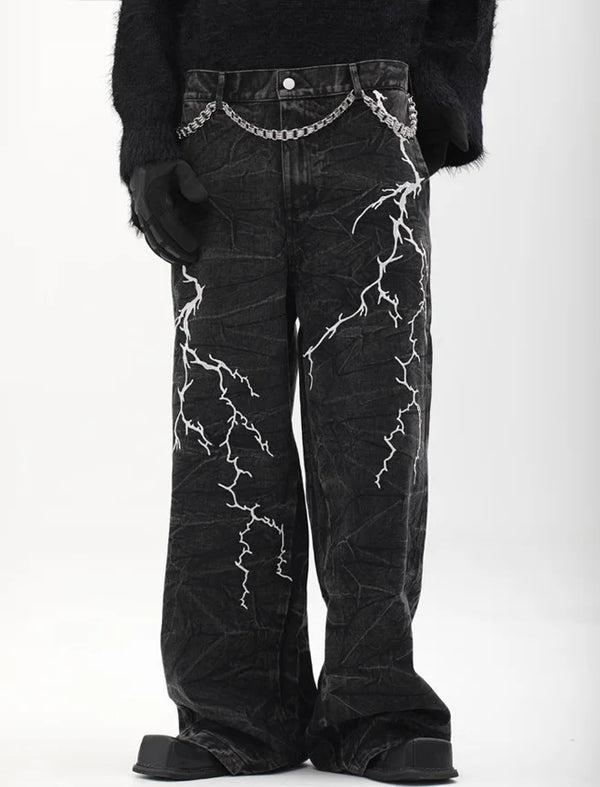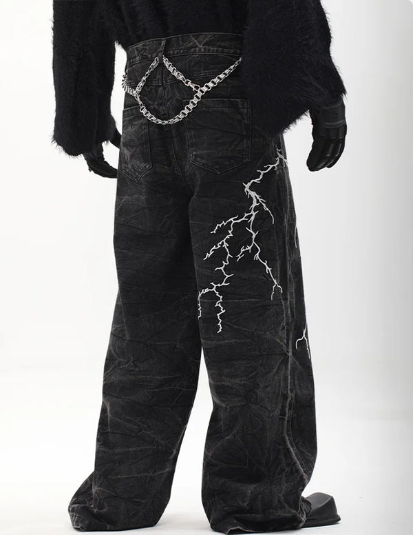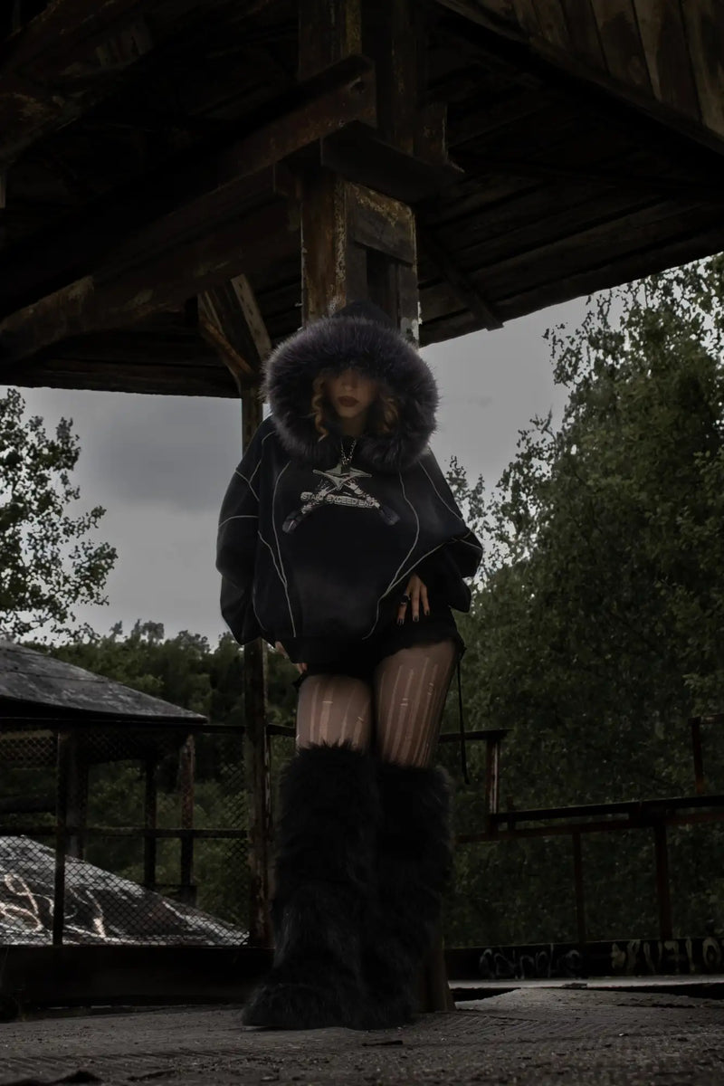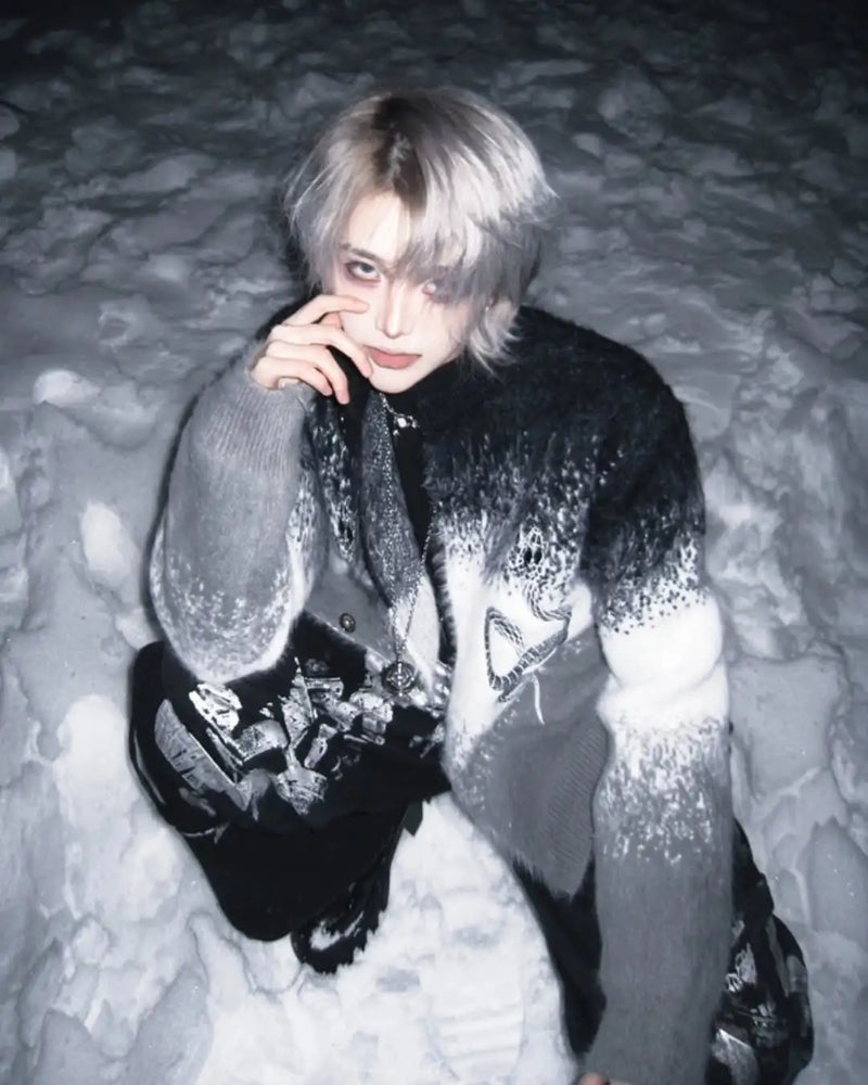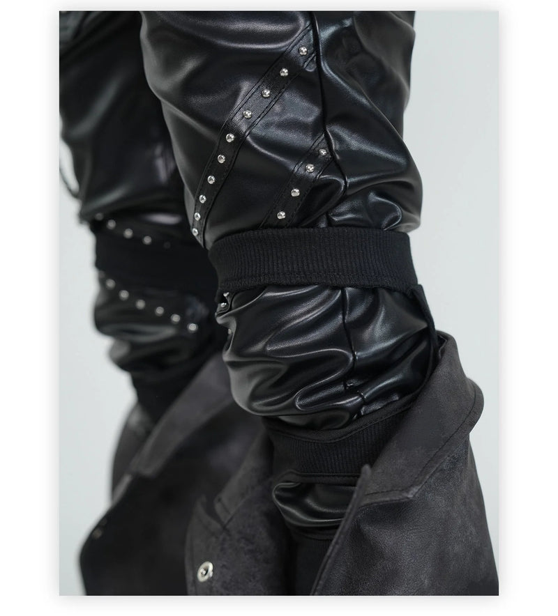
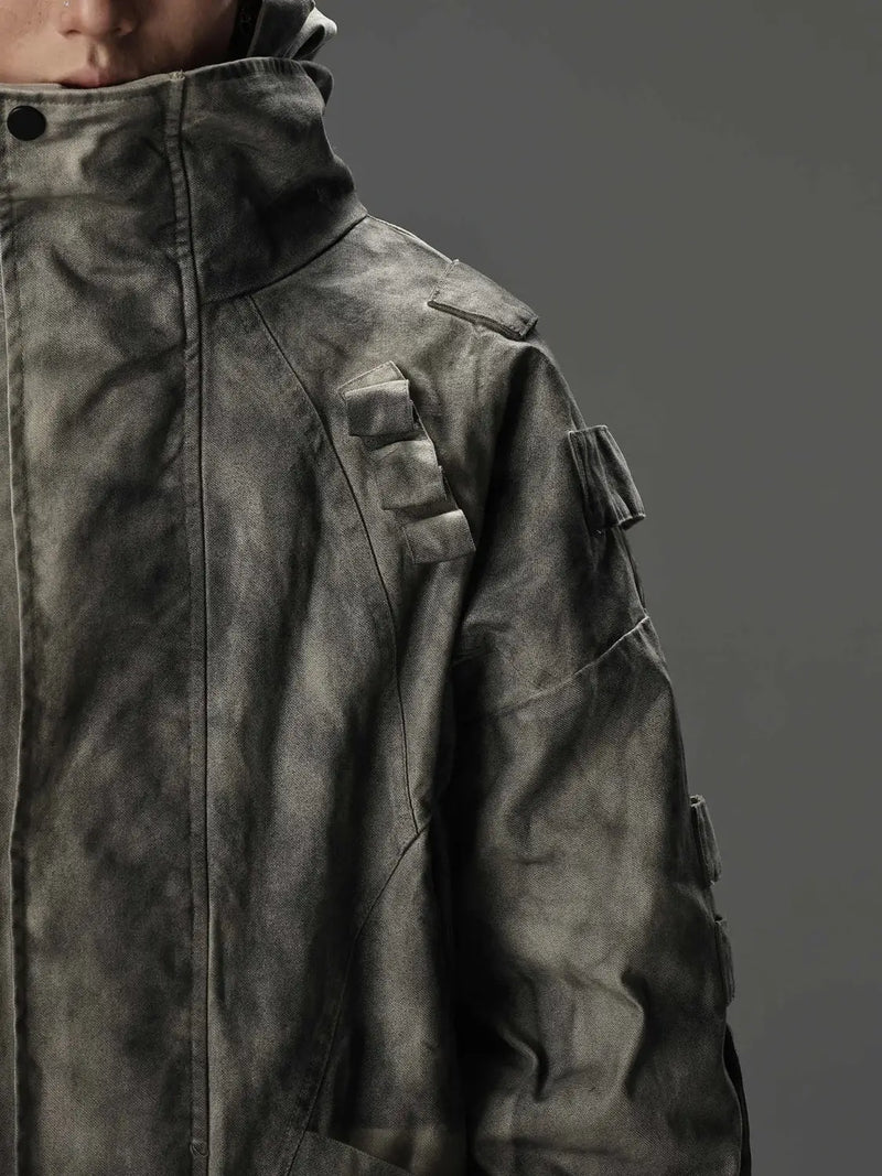
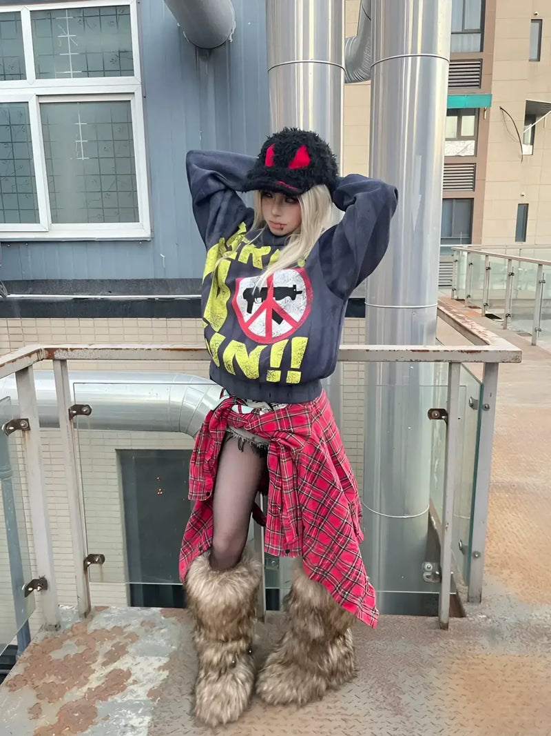
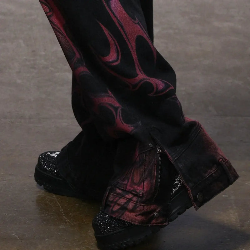
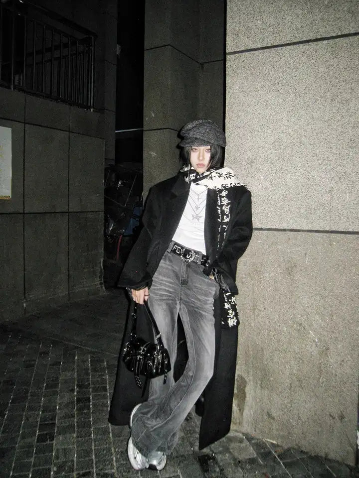

Seoul wears four colors. Cream. Black. Olive. Charcoal. Plus a single accent color per outfit, not two. Walk through Hannam-dong, Apgujeong or the Galleria Foret in spring and you see it in every second shop window and on every third passer-by — the same palette, freshly cut.
The German streetwear reflex is the opposite: three colors up top, two below, four in the sneakers, one as a “statement”. Eight colors in one outfit, and none of them carries the outfit. Seoul does it the other way around — few colors, clear hierarchy, every tone takes on a function. The outfits look more expensive because the eye has less work to do.
This guide breaks the Korean color logic down into four core tones plus an accent rule, ties it to Korean color analysis (Personal Color, which has spilled into Germany as a TikTok trend since 2023), maps the palette onto the key Seoul brands, translates it to outerwear, pants and tops, and names the six mistakes that tip the system over instantly.
How a Seoul outfit reads in practice — fourteen seconds, not one tone too many:
Origin
Who shapes Korean Streetwear color trends — and where do the 4 colors come from?
The Seoul palette is not a trend cycle, it is the result of a very old Korean color discipline that has crossed with Western workwear since around 2015. The root lies in Obangsaek (오방색), the traditional five-color system of white, black, blue, red, yellow — but modern Seoul streetwear has reduced that to four desaturated tones, because the city now lives a different light situation: twenty-four floors of concrete, neon signs, subway light, and a climate that is grey for half the year.
What tipped the vocabulary for good was the brand wave from 2015 on. thisisneverthat opened the workwear cream block, ADER Error brought the desaturated cyan accent logic, Andersson Bell the dusty earth tones, LE 17 SEPTEMBRE the radical pure neutrals. All four labels produced the same picture within three years — and with it the impression that “Korean streetwear” has a color language of its own. It does. But as a deliberate designer decision, not as folklore.
The logic all four labels share: few colors, each with a job. Cream as the base tone, Black as the anchor, Charcoal as the bridge, Olive as the only earth tone. If a fifth color is allowed in, then only as an accent — a cap, a scarf, a sneaker sole. Never two accents at once. This rule takes apart almost every German “streetwear outfit” at first glance.
Definition
What are the 4 Seoul colors — and why are they enough?
The Seoul palette is not a mood, it is a four-slot system. Every slot is a role, not a favorite color. Once you understand the roles, you can rebuild any outfit in the city — even without a single Korean label in your closet.
4
Core colors
1
Accent per outfit
0
Logos > hand-sized
What the four slots can do:
- Cream / Ecru / Bone — the base tone. Warms the whole outfit up, loosens the silhouette. Usually sits on the layer right in front of the outerwear: a knit, a knit polo, a workwear jacket.
- Black — the anchor. Takes control of the outfit at the bottom or as outerwear. In Seoul never matte-glitter, but soft and a little washed out — more indigo-deep black than patent black.
- Charcoal / asphalt grey — the bridge. Stands between Cream and Black, softens the contrast. Wide-leg pant, hoodie, or the inner layer under a Cream jacket.
- Olive / Sage / Khaki — the only earth tone allowed in. Usually carries the outerwear (field jacket, padded coat) or a cargo pant. Never as a top — Olive on Olive on Olive tips the outfit toward hiking.
Four slots, each with a handful of variations — that is enough for a whole season. Once you wear the system, you notice: you buy less and combine more. That is the real discipline.
Palette
The 4 core tones in detail — Cream, Black, Olive, Charcoal
Every tone is a small family of neighboring values. Cream is not white. Black is not patent. Olive is not army green. Charcoal is not mid-grey. The dividing lines are narrow, and that is exactly where the Korean look comes from — because the eye notices immediately whether someone took the right tone from the family.
Personal Color
Korean Color Analysis — why Seoul checks the skin tone before every outfit
If you have searched TikTok for “Korean color analysis Berlin” or “Personal Color Hamburg”, you hit the same Korean system that Seoul streetwear runs under the hood. 퍼스널컬러 (Personal Color) assigns every skin tone to one of four seasons — Spring, Summer, Autumn, Winter — and defines which of the four streetwear colors your skin actually takes on. This is not an esoteric surcharge, but a simple contrast check between skin tone, undertone and fabric.
How the four Personal Color types translate into the Seoul palette:
- Spring (warm-light) — skin tones with a peach undertone, light hair, warm eyes. Cream and a warmer Olive carry best. Hard black dampens the face, Charcoal only as a pant, not up top.
- Summer (cool-light) — pink-tinged skin, ashy undertone, blue or grey eyes. Bone-cream and Charcoal are home. Olive more toward sage, black soft (never optical black next to the face).
- Autumn (warm-deep) — golden undertone, often brown eyes, a Mediterranean or Asian skin range. Olive and Charcoal are main colors here. Cream moves toward ecru, black needs a warm Cream layer nearby.
- Winter (cool-deep) — high contrast: dark hair, light skin, clear eyes. Black and pure Cream work right away. Olive is allowed, Charcoal optional. This is the type the Seoul palette suits “naturally”.
A studio check in Seoul (Color Pop, House of Hue, Personal Color Seoul) takes 45 minutes and costs around 80–120 euros. In Berlin, Hamburg or Düsseldorf there are now German-Korean consultants for it (e.g. colorsbythao in Düsseldorf, Color Studio in Berlin). Once you have it, you never buy the wrong Cream again.
Accent rule
Which accent color is allowed in — and when
Accent colors are not forbidden in Seoul, they are regulated. One accent color per outfit, not two. Small in fabric volume, low in saturation, far from the face (cap, shoe, bag, scarf). Anyone who puts on a bright red pant is not in Seoul, but in a spring showroom in Düsseldorf.
1
Accent per outfit
<15 %
Fabric share of the accent color
3
allowed accent families
The three accent families Seoul actually wears:
- Burgundy / Oxblood / Brick — the warmest permission. Carries a cap, a scarf, or a knit underneath. Works in all four Personal Color types because the saturation is throttled.
- Dusty Navy / Slate Blue — the cool permission. Often in shoes, sneakers, occasionally as a field jacket. Next to Charcoal it reads almost as an extension, next to Cream as a clean accent.
- Soft Caramel / Tobacco — the middle permission. Leather jacket, boots, shoulder bag. Connects Cream and Olive and gives the outfit warmth without tipping into color.
Brands
Korean Streetwear brands & their color signature
Each of the big Seoul labels has a favorite corner within the four slots. If you know your way around, you recognize the brand before the logo — by the color code, not by the lettering. Six brands that speak this language most clearly:
- thisisneverthat — Cream + Black + Olive. Workwear block, heritage cut, a recurring “T” logo as small as possible. The clean middle of the palette.
- ADER Error — Cream + Black, plus a desaturated cyan or lavender as a signature accent. Misalignment print and broken logos. The brand that turned the accent rule into a stylistic device.
- Andersson Bell — Cream + Olive + Caramel, occasionally Brick. The dustiest corner. Knitwear, workwear, quiet patterns. Pre-trend earth tones.
- LE 17 SEPTEMBRE — pure neutrals. Cream, Bone, Charcoal, Black. Zero accent, zero print. If you want an outfit that cannot fail, you shop here.
- 87MM (mmlg) — Bone + Navy + Caramel. A studied style block, very readable to a German eye. Knit-polo culture.
- pushBUTTON — Black + Cream, combined with a single statement color per collection (one season Burgundy, one season chocolate). Accent discipline as brand DNA.
What all six labels share: they do not change the palette every season. They change cut, fabric and construction within the same color family. That is the break from the German streetwear tradition, in which every collection needs a new favorite color.
Gender split
Women vs men in Seoul — the gender split of the palette
The four slots are identical, the application logic is not. Men in Seoul wear the Charcoal and Black block harder, the outerwear mostly in Olive or Black, and the accent color more often in the shoe. Women wear Cream a whole layer more prominently, pull Olive into the knit more often, and use the accent color mostly in the scarf, in the knit, or in knit heels — rarely in the footwear itself.
One concrete difference: a men's outfit in Seoul often relies on a Charcoal pant + Cream knit + Olive field jacket — Charcoal carries, Cream and Olive spread across two layers. A women's outfit in the same palette runs more as a Cream pant + Cream knit + Charcoal outerwear — the main layer is tonal in Cream, the Charcoal sits only on the outside. This is not set in stone — but the statistical majority in Hannam-dong and Apgujeong runs this way.
What both versions share: no two layers in the same color without depth variation. Cream on Cream only works if one tone is warmer (Ecru) and the other cooler (Bone). Tonal stack means: two layers in the same family, but of different depth. That is the real skill level of the palette, and both genders use it.
Outerwear
Outerwear — jackets & coats in the Seoul palette
The outerwear carries the most color and decides the outfit first. Three outerwear tones make up 80 percent of the city: Olive (field jacket, padded coat), Charcoal (wool coat, padded vest) and Black (leather, bomber). Cream outerwear is the top class — hard to pull off, because it dictates everything on the inner layer.
Sherpa collar bomber as the Cream translation, vintage leather bomber as the Black anchor. Both carry the palette without an accent color — the outfit underneath may then be Charcoal or Olive, plus an optional accent color in bag or shoe.
Tonal stack
Pants & tops — the tonal-layering rule
Under the outerwear the palette runs as a tonal stack. Wide-leg pant in Charcoal, knit in Cream, or the other way around: Cream pant, Charcoal knit. What Seoul almost never does: a colored knit over a black pant. The knit may be one tone warmer or cooler than the pant — it may not come from a different color family.
The wide-leg pant in Bone/Ecru carries the lower slot, the cable-knit zip cardigan in Cream the upper — the same slot, two depths. Over this stack any of the three outerwear families fits (Olive field, Charcoal wool coat, Black leather bomber). A small accent color (Burgundy knit beanie, Caramel boot) is enough to close the outfit.
Season
Korean Streetwear in summer vs winter — where the palette shifts
The four slots stay all year. What shifts is the saturation. In summer Seoul opens the palette toward Bone, Sand and a lighter sage variant of Olive — everything feels half a step lighter, because the daylight bleaches out anything darker. In winter it is exactly the other way: Olive deepens toward dark forest sage, Charcoal moves closer to Black, Cream turns Bone-warm instead of pure.
How that plays out in winter — fabric, layer, movement:
What tips the palette over
The 6 most common color-trend mistakes — what Seoul would never wear
The palette forgives no half-steps. The following six mistakes are the ones we see most often — in German streetwear communities, in resale drops, in “Korean-inspired” lookbooks quoted secondhand.
Getting started
The first 4 pieces in your Seoul palette — the entry point
If you build the palette from zero, you do not buy four outfits, but four pieces — one per slot. With these four you already have eight to twelve legal outfit combinations. A season needs no more than that.
Deeper in
Deeper into Seoul — brands, winter, layering, rainproof
The colors are half the code. The other half are cut, layer and season. These four spokes take the system apart — if you want the whole stack, read them one after another.
If you do not have the brand map in your head, it is best to start with brands — that is where the twelve labels sort by size, color signature and price class.
Conclusion
Four colors, one system — why Seoul gets further with less
Korean Streetwear color trends are not a season carousel. They are an old, tightly held system of four slots, shifted only in saturation from season to season. Once you understand the slots, you build combinable for many years.
FAQ
Frequently asked questions about Korean Streetwear color trends
Which four colors are the Korean streetwear palette?
What is Korean color analysis and how does it connect to streetwear?
Who are the most important Korean Streetwear brands for this palette?
Does the Seoul palette work the same for men and women?
Which accent color is allowed in without breaking the palette?
How does the palette shift between summer and winter?
What is the difference between Korean Streetwear and Japanese / Harajuku color logic?
What do you think?
Tell us on @fuga_studios
About the author
Philipp Fuge — Founder · Berlin
Founder of Fūga Studios. Writes the journal himself. Berlin · Shanghai · Tokyo · Poznań — four cities, one logic.