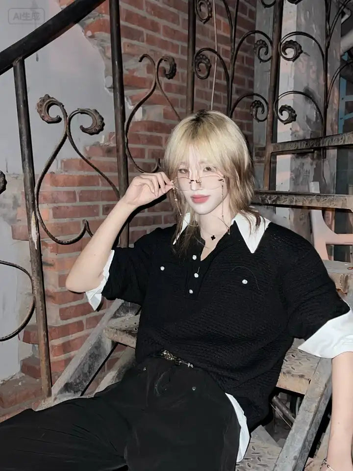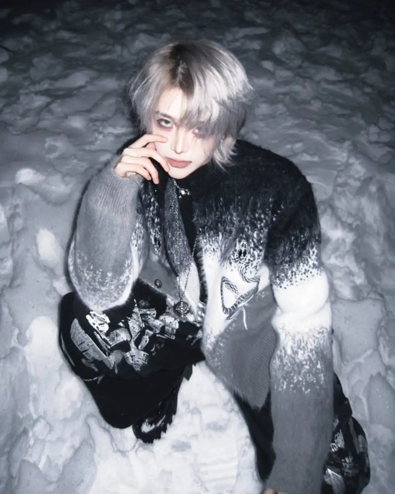

You did everything right. Doc Martens, baby tee, cardigan on top, silver chain, wide-leg jeans. And the mirror still looks like a catalog outfit, not like the girl on the Pinterest board you have been saving for weeks. The difference is not in the pieces. It is in the color. Her black is washed out, your black is new. Her red is Bordeaux, your red is red.
The Soft Grunge color palette consists of five core colors: Washed Black, Bordeaux, Dusty Rose, Anthracite and Washed Denim. On top of that come two or three secondary tones like Mauve, Olive and cream, which lighten the look without breaking it. What matters is not the color itself but its saturation: every tone looks like it has already been washed thirty times. If you need the style as a whole first, the Soft Grunge Fashion Guide explains the basics. This article covers only the colors, and concretely enough that you can shop with it.
Definition
What is the Soft Grunge color palette?
The Soft Grunge color palette is a group of muted, dark and slightly pink-cast tones that together create the impression of worn, faded clothing. It comes from the Tumblr era around 2013 and 2014, when girls and boys mixed hard nineties Grunge with pastel, romantic elements. The result is a palette that is dark without being hard.
The word “soft” does not refer to light colors. It refers to the edge. A black shirt in the Soft Grunge context is no less black than a Gothic shirt, it is just washed softer, broken slightly toward gray, and it hangs next to a Bordeaux cardigan instead of next to a mesh top with a pentagram. The palette lives off the contrast between a dark base and one single soft tone that looks like someone threw pink into a tub of gray water.
So anyone who wants to understand Soft Grunge colors has to answer two questions at once: which tone, and in which condition? A Bordeaux that shines is not Soft Grunge. A Bordeaux that looks matte and slightly stained is exactly that.
5
Core colors in the Soft Grunge palette
60/30/10
Distribution of base, mid-tone and accent
0
Neon colors that fit the palette
The zero on the right is not an exaggeration. Soft Grunge is one of the few aesthetics that tips over completely with a single neon accent. The reason lies in the logic of the palette: everything in it is supposed to look old. Neon cannot look old. It contradicts the basic idea, no matter how small the surface.
The core colors
The five core colors of the Soft Grunge palette
Five tones are enough. Once you know them, you can sort every piece in the store in seconds: fits or does not fit. The order below is also the order in which you should buy them if you are starting from zero. Black first, Dusty Rose last.
Most beginner mistakes happen at number three. Dusty Rose is the color that separates Soft Grunge from hard Grunge, and at the same time the color that tips over the fastest. One tone too light and the look becomes Pastel Goth. One tone too saturated and it becomes Y2K. The right version looks like someone left a pink shirt hanging in the sun for a year.
Hex codes
Soft Grunge colors with hex codes
The hex codes here are reference points, not rules. Fabric reflects differently than a screen, and washing shifts every tone a few steps toward gray. They still help with comparing: hold a product photo next to the code and you see immediately whether the color sits inside the palette or outside it.
- Washed Black #1C1B1B: not #000000. Real Grunge black has a hint of gray or brown, because it comes from washing, not from the dye bucket.
- Anthracite #3B3A3C: the heathered tone for knit and sweat. Combine it with Washed Black and you get depth without color.
- Bordeaux #5A1F27: matte, dark, with no share of orange. A Bordeaux that tips into brick red belongs in the nineties palette, not here.
- Dusty Rose #B8919A: pink with a clear share of gray. The tone screens like to show too light. When in doubt, buy one step darker.
- Mauve #7E6270: the middle between Bordeaux and Dusty Rose. Rarely a main color, often a cardigan or beanie.
- Washed Denim #6F7F94: faded blue with gray. The closer to gray, the softer the look.
- Olive #5B6449 and cream #E6DFD3: the two secondary tones. Olive for jackets, cream for knit. Both sparingly.
What stands out about this list: there is no white. Pure white is the brightest surface an outfit can have, and Soft Grunge does not tolerate a brightest surface. Where other styles set a white shirt, Soft Grunge sets cream or a very light gray. That is the one rule almost nobody knows and that saves almost every look.
Base
Which black belongs in the Soft Grunge palette?
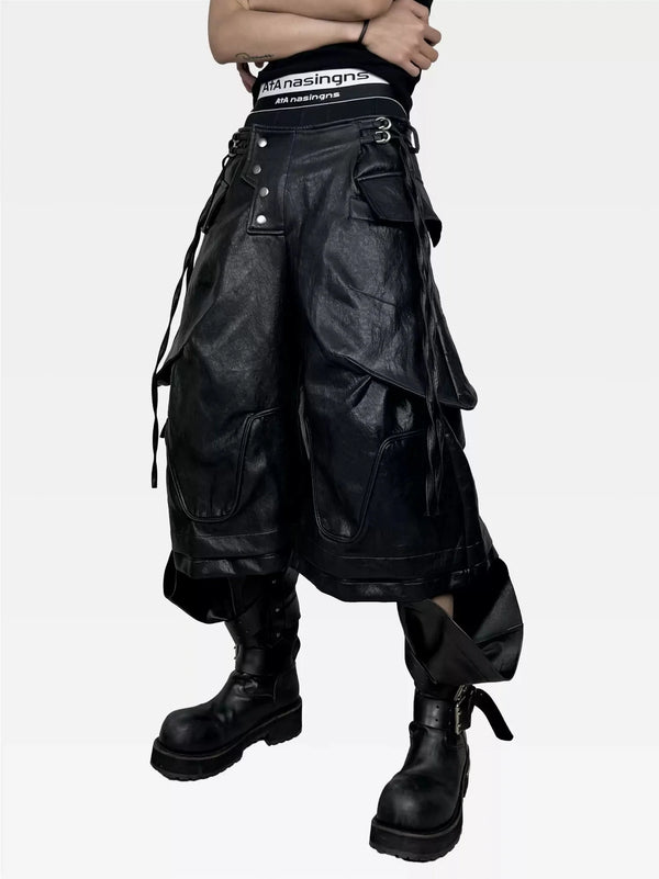
Black is not simply black. A freshly bought, deep black shirt in thick jersey looks like a foreign body in the Soft Grunge context, because it is too rich. The look needs a black that swallows light instead of throwing it back. You get there three ways: real washing (acid wash, stone wash, garment dye), thinner fabric, or simply time.
The rule: if you hold a black piece next to a gray one and the difference looks hard, the black is too new. If the transition looks soft, it fits. Washed Black always has a small share of gray, brown or green that you only see in daylight. Exactly that share is what makes the color wearable next to Bordeaux and Dusty Rose.
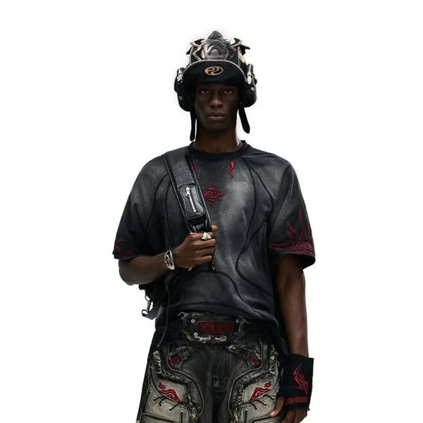
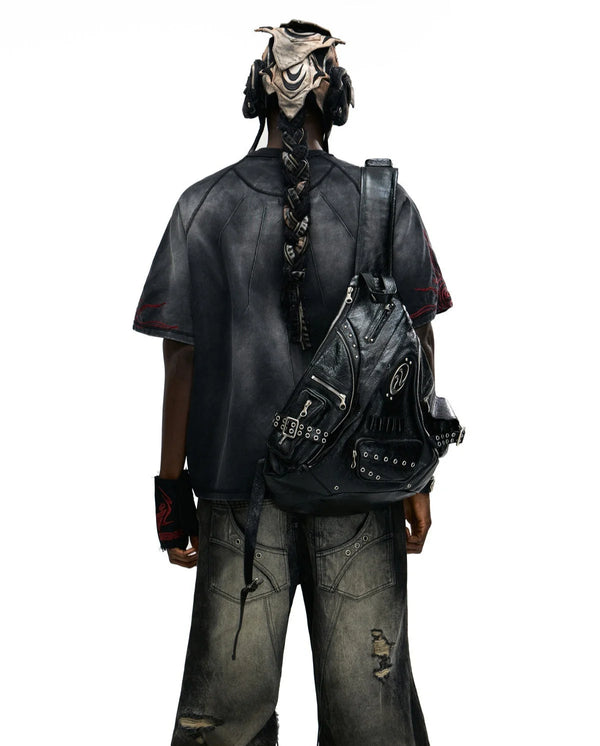
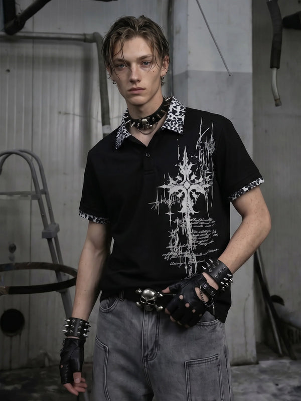
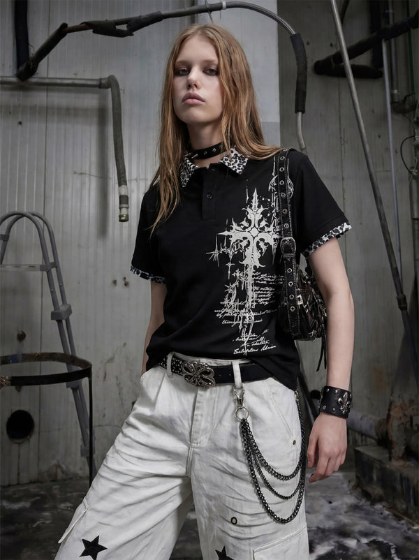
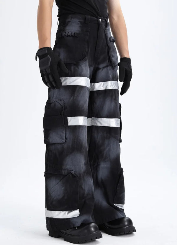
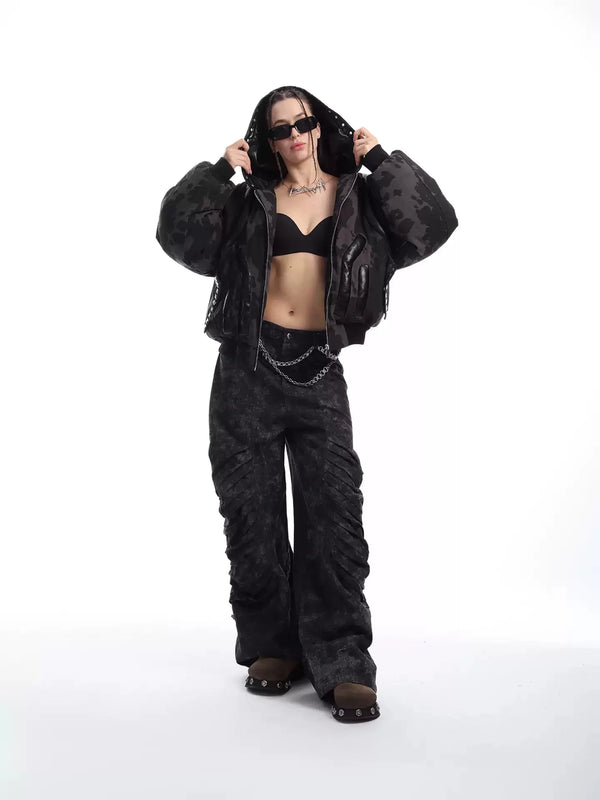
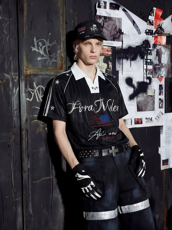
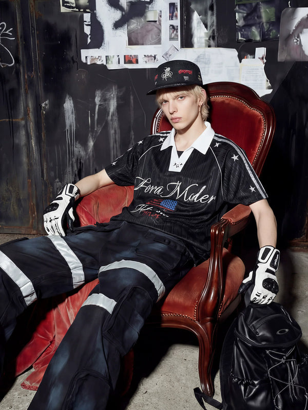
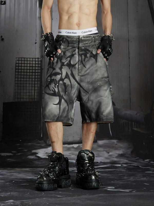
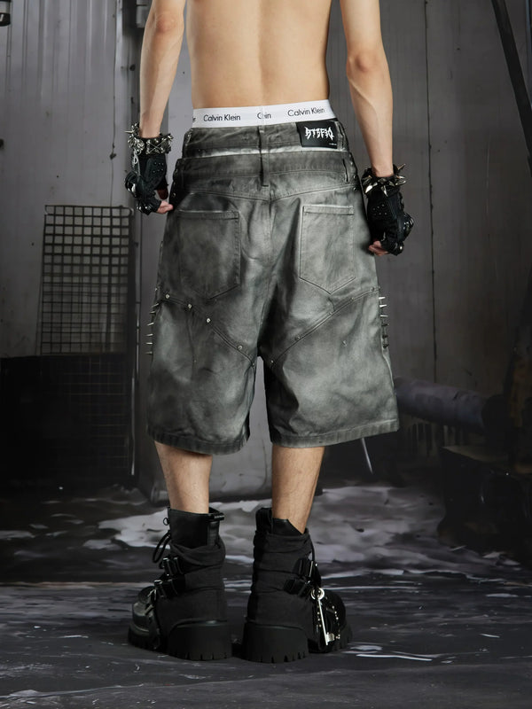
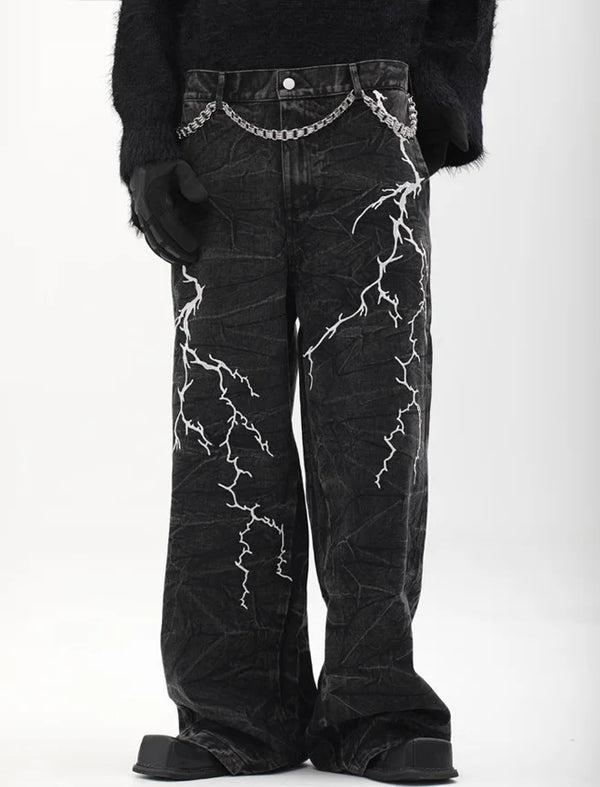
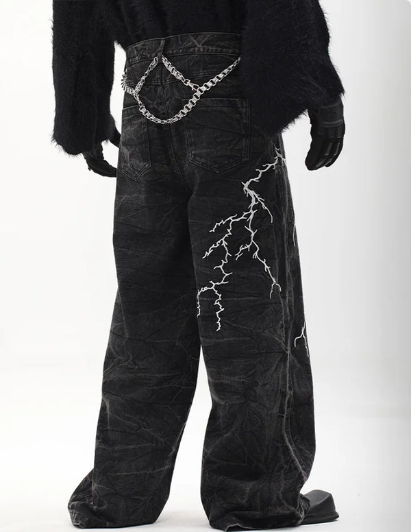
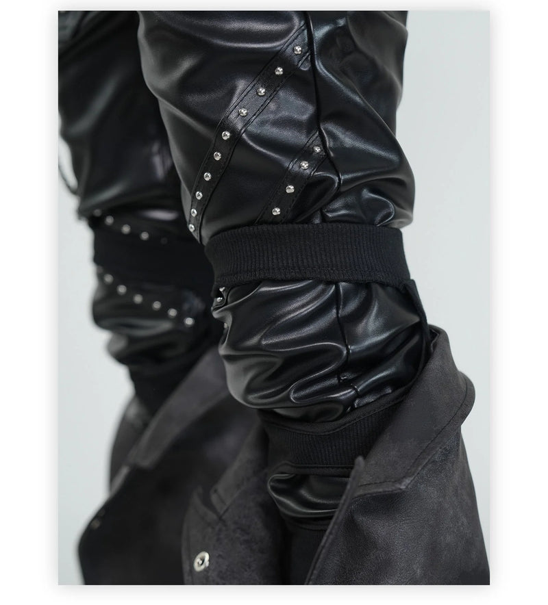
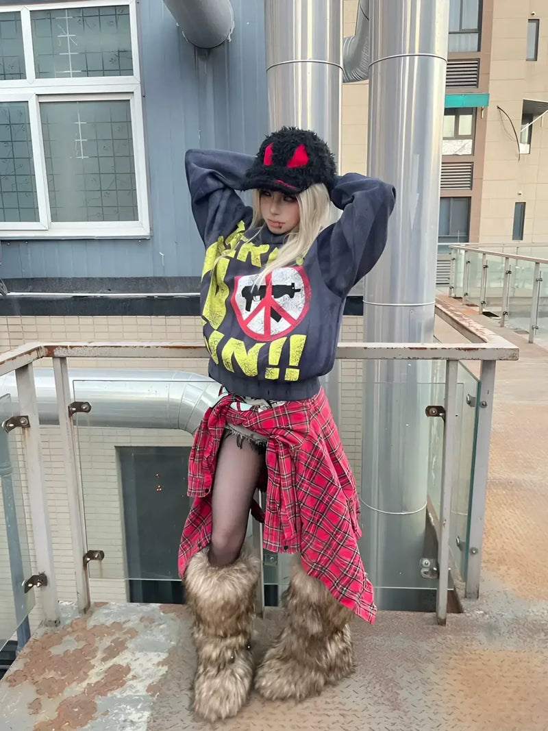
Both pieces show what Washed Black means in practice: the fabric is broken, the tone is no longer rich, and the graphic looks washed along with it instead of printed on. A top like that is the anchor the rest of the palette hangs on. Without that base, Bordeaux has nothing to set itself against.
The heart
Bordeaux and Dusty Rose: burgundy, Dusty Rose, black as a triad
If the Soft Grunge color palette has a core, it is the triad of burgundy, Dusty Rose and black. The three colors cover three temperatures: cold (black), warm-dark (Bordeaux), warm-light (Dusty Rose). Together they make a look that is romantic without turning sweet, and dark without feeling threatening.
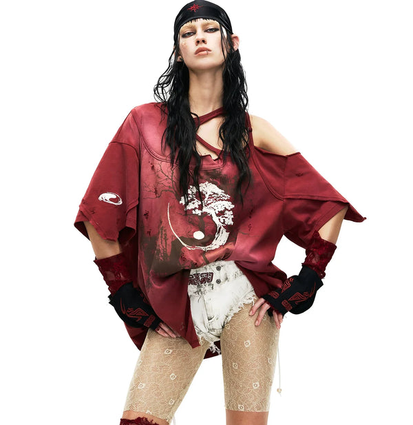
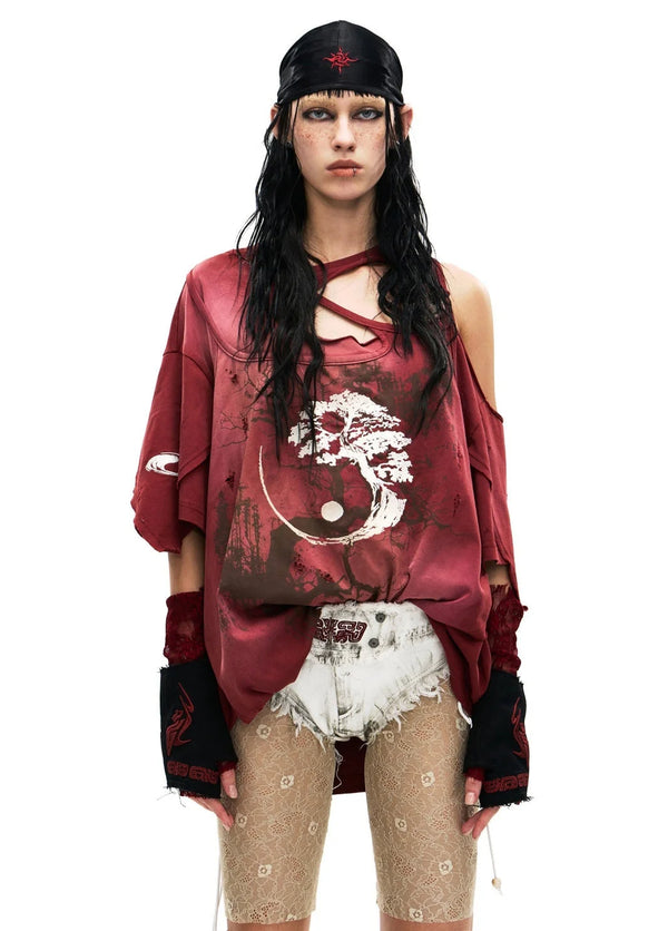
In almost every Soft Grunge outfit Bordeaux takes the role of the mid-tone. A cardigan, a longsleeve, a pleated skirt or a beanie: one piece in Bordeaux and the outfit has a direction. Two pieces in Bordeaux and it becomes a themed costume. Dusty Rose comes after that, smaller, as a baby tee under the cardigan, as a hair tie, as a sock over the boot.
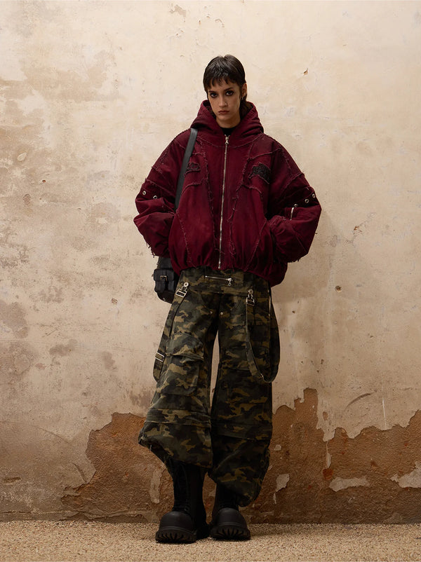
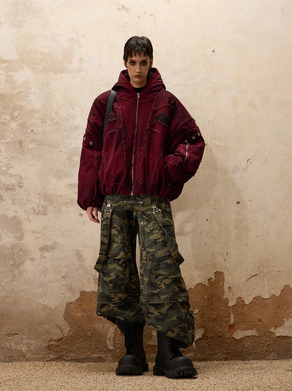
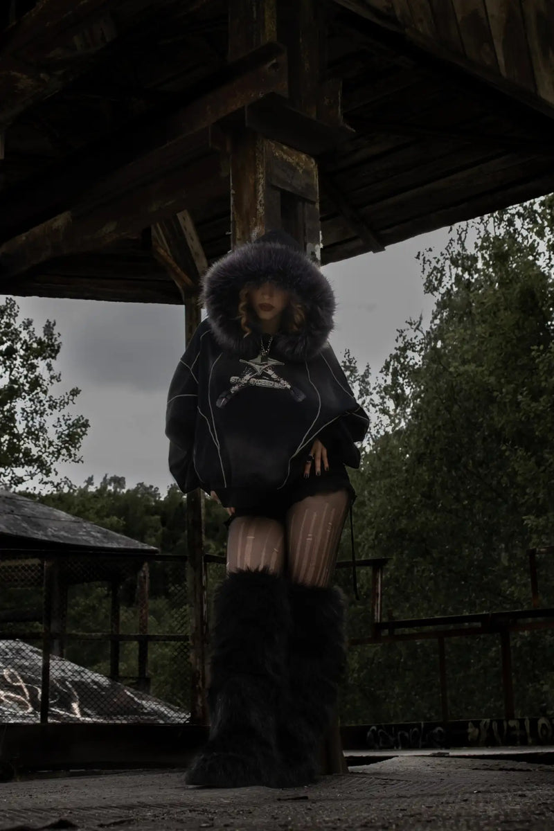
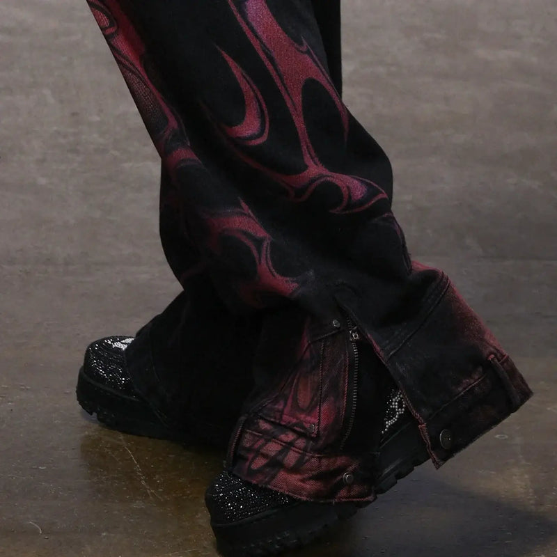
What becomes visible in the image: a brown tone works as a mid-tone too, as long as it is broken. In the Soft Grunge palette brown is the cousin of Bordeaux, a bit more earthy, a bit less romantic. If you find Bordeaux too feminine, you reach for Washed Brown and get the same effect with less red.
The cool half
Washed Denim and gray: the cool half of the palette
The warm tones get the attention, the cool ones carry the load. Washed Denim and gray are present in almost every Soft Grunge look, mostly as pants, sometimes as a jacket, rarely as a top. Their job: they give the outfit surface without adding color. A Bordeaux cardigan over light stonewash jeans reads as Soft Grunge immediately. The same cardigan over deep blue raw denim jeans reads as office.
The decisive value is saturation again. The more gray in the blue, the better. Jeans that almost read as a gray tone and only show their share of blue in sunlight are the perfect Soft Grunge pants. Jeans in a strong mid-blue pull the look toward Y2K.
Gray takes the same job in knit and sweat. A heathered anthracite hoodie is the most versatile surface the palette has: it works under Bordeaux, over Dusty Rose, next to Washed Denim. If you only want to buy one single sweat piece, buy it in anthracite, not in black.
Origin
Nineties Grunge color palette vs. Soft Grunge color palette
The question “what is the Grunge color palette?” gets two different answers, depending on whether you mean Seattle 1992 or Tumblr 2014. The nineties palette is earthy: olive, flannel red, mud brown, moss green, wash gray. It comes from secondhand stores and workwear. It does not want to be anything except practical and cheap.
The Soft Grunge color palette takes that base and swaps the warm earth tones for soft red-pink tones. Flannel red becomes Bordeaux. Moss green becomes anthracite. Mud brown becomes Dusty Rose. What stays is the washed black and the faded denim. The difference is the direction: nineties Grunge points outward and says “whatever”. Soft Grunge points inward and says “sad, but kept together”.
@fugastudios Battle scars as a fashion statement 🔥 When your fit survived the apocalypse and kept it pushing #fugastudios #fashiontiktok #fypシ #alternativefashion #darkfashion #opiumcore ♬ Originalton - Fuga Studios
The video shows the distressed side, meaning the point where the nineties palette and the Soft Grunge palette meet: washed black, visible wear, no saturated color in the frame. From here it goes either toward hard (more olive, more rip) or toward soft (more Bordeaux, more pink). The difference between the two directions is described in detail in the comparison Soft Grunge vs. Hard Grunge.
The one color
Which color is Grunge? The answer is not a color
Anyone looking for the one Grunge color usually gets “black” or “olive” as the answer in forums. Both are half right. Grunge has no signature color like Gothic (black) or Y2K (baby blue and pink). Grunge has a signature condition: faded. Every color can be Grunge if it looks like it spent ten years in a closet without a door.
For Soft Grunge that is even more true. If you absolutely want to name a single color, it is Bordeaux, because it is the color no other dark style occupies in this form. But Bordeaux alone, without Washed Black underneath and without Dusty Rose next to it, is just a wine red sweater. The palette comes out of the ratio, not out of the single tone.
The sentence also explains why so many palette generators fail at Soft Grunge. They deliver five hex codes and leave out the saturation. Five perfect codes in shiny satin do not make a Soft Grunge outfit. Five slightly wrong codes in washed cotton do.
Distribution
The 60-30-10 distribution in the Soft Grunge outfit
The distribution matters more than the selection. Sixty percent of the visible surface belongs to the dark base, meaning Washed Black, anthracite or very dark denim. Thirty percent belong to the mid-tone, meaning Bordeaux, Washed Denim or Mauve. Ten percent are left for the accent: Dusty Rose, cream or silver hardware.
In practice that means: pants and jacket dark (sixty), cardigan or longsleeve in Bordeaux (thirty), baby tee or accessory in Dusty Rose (ten). Turn the percentages around and make Bordeaux the base, and you get a look that reads more like Dark Academia. Push Dusty Rose up to thirty percent and you land at Pastel Goth.
The bottom almost always carries the largest surface and with it the base. That is why it pays to invest here first. Jeans with real washing in the right saturation make three cheap tops wearable. The other way round, no Bordeaux cardigan saves pants in the wrong blue.
The order is deliberately set against instinct. Almost everyone buys the top first, because it works best in photos. But a top is thirty percent of the surface. The pants are sixty. If you take the palette seriously, you start at the bottom.
Season
Soft Grunge colors by season: spring to winter
Yes, there is a Soft Grunge palette for spring, and it is not bright. The difference between the seasons is not in the brightness but in the weight of the tones. In spring the focus moves from Bordeaux to Mauve and from anthracite to light stonewash. In summer cream comes in as a surface, mostly as a tank top or a thin tee. Fall is the home of the palette: Bordeaux, olive, Washed Black, all at once.
Winter pulls the palette together. Less Dusty Rose, more anthracite, more knit, and the Bordeaux surface grows from the cardigan to the coat. If you want to wear Dusty Rose in winter, you do it through the beanie or the scarf, never through a large piece.
The test works for every season, because it does not judge the color but the ratio. That is exactly the mistake of most spring palettes online: they judge tones one by one and overlook that a tone in the Soft Grunge palette is only as good as its neighbor.
Men
Soft Grunge color palette for men
The palette is the same, the weighting is not. With men Washed Brown often takes the place of Dusty Rose, and Bordeaux moves from the top into the beanie or the flannel. The dark base grows to seventy percent. Denim stays, but turns gray rather than blue. The result is the same look, just with less red and more gray.
If you are a man and want to keep the Dusty Rose component, you do it through small surfaces: a pink print on a black tee, a detail in the seam, a chain pendant. That is not a compromise but the right weighting for a body that usually has more surface and therefore needs less accent.
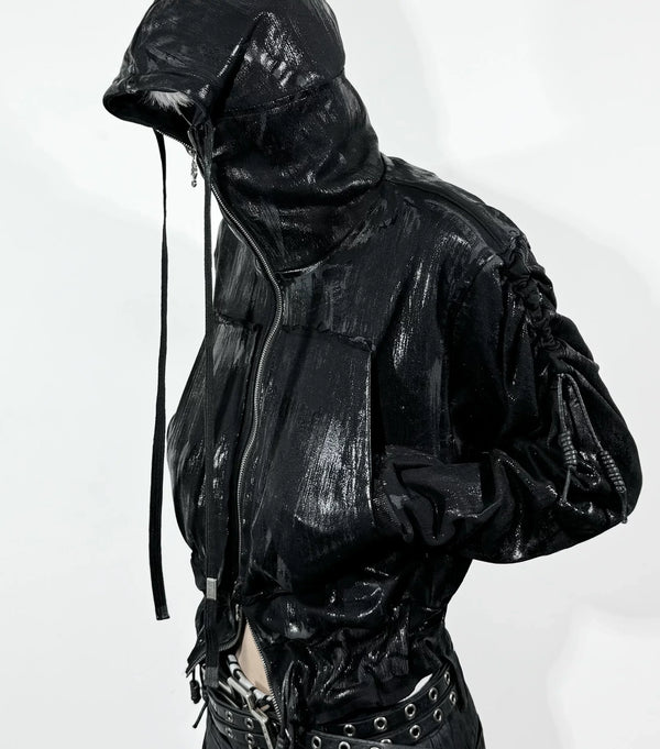
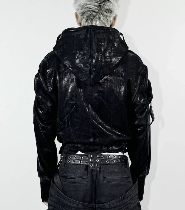
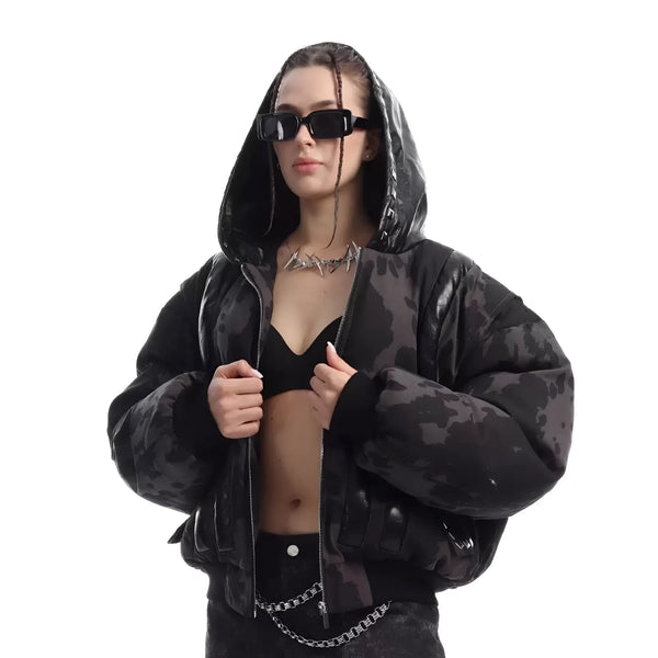
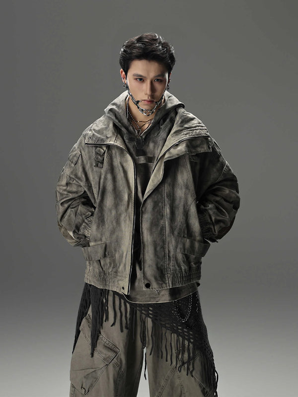
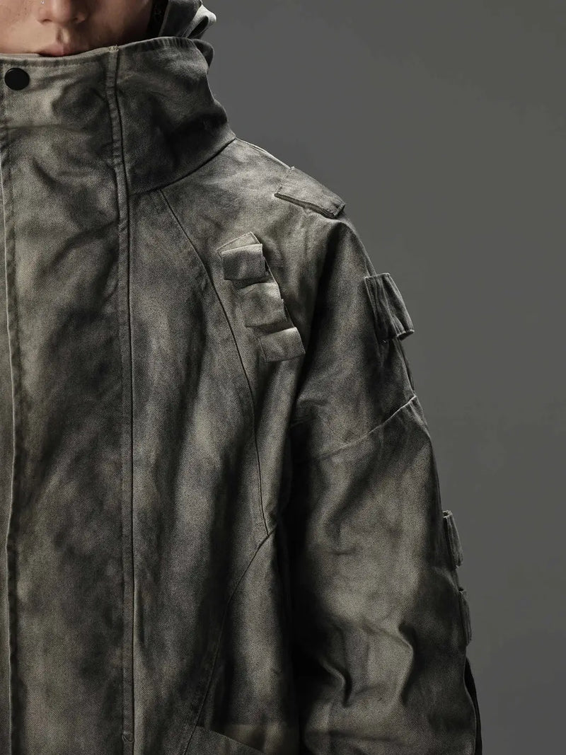
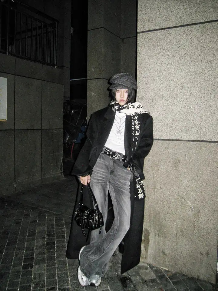
The two jackets cover the two men’s tones the palette needs most besides black: acid wash gray and broken brown. Both work over a Washed Black tee, both take a Bordeaux beanie, and neither of them has a saturated surface. More on the men’s version of the style, with a focus on cut instead of color, is in our article on Y2K Grunge Outfits, which covers the denim side in detail.
Accents
Accent colors: what is allowed in the Soft Grunge palette and what breaks it
Three accents are safe: silver, cream and olive. Silver through hardware (chains, rings, belt buckles, eyelets) is the only shine the palette tolerates, because it is cold and has no color. Cream as a small surface brightens without glowing. Olive brings the nineties root back without disturbing the soft character.
Three accents break the palette immediately: neon in any form, pure white as a surface, and saturated primary colors like royal blue or signal red. Gold is critical too, because it is warm and pulls the palette toward boho. If you want to wear gold, take tarnished, matte gold in a very small amount. Shiny gold belongs in a different aesthetic.
@fugastudios POV: You're the final boss and the outfit actually slaps 🔥 Gothic Warrior Denim Set got that main character energy fr#fugastudios #darkfashion #gothicstyle #OOTD #fyp ♬ Originalton - Fuga Studios
In the video you can see how silver hardware works on washed denim: it sets points without adding color. That is the principle of every Soft Grunge accent. It may draw attention, but it must not extend the palette. An accent that brings a new color into play is no longer an accent but a sixth core tone, and six are too many.
Mistakes
Mistakes in choosing Soft Grunge colors
Most mistakes come not from wrong colors but from right colors in the wrong condition or in the wrong amount. The list below collects the five we see most often. Once you know them, you do not really need the hex codes anymore.
All five mistakes have the same origin: people treat Soft Grunge colors like a list instead of like a ratio. The palette is not a catalog of permitted tones. It is an instruction for how much of which tone stands next to which other one, and in what condition.
Material
The palette in material: washing, knit and silver hardware
In the Soft Grunge palette color is never separate from material. Bordeaux in shiny satin is a different tone than Bordeaux in washed cotton, even if the hex code is identical. Knit makes every color softer, because the surface breaks the light. Denim makes it cooler. Leather makes it harder. If you want to master the palette, you learn the materials along with it.
Silver hardware is the one constant in that. It is not a material in the sense of fabric, but it is a color value: cold, bright, without saturation. A belt with a silver buckle, a chain, a ring. Those points are the ten percent accent when Dusty Rose does not fit, and they work the same for men and for women.
If you want to check after shopping whether the palette works, lay all the pieces next to each other on the floor and photograph them from above. If one surface stands out in the photo, that is the mistake. If your eye wanders evenly across everything and only catches briefly on the silver hardware, the Soft Grunge color palette is complete.
FAQ
Common questions about the Soft Grunge color palette
The following questions come up most often in searches and comments about the Soft Grunge palette. The answers are short. Anything that needs more room is further up in the article.
Which colors belong to the Soft Grunge color palette?
Is there a Soft Grunge palette for spring?
Which hex codes fit Soft Grunge colors?
Do I need a color palette generator for Soft Grunge?
Is Bordeaux or Dusty Rose more important for the look?
Does white fit in the Soft Grunge palette?
Anyone who has read this far knows more about Soft Grunge colors than most palette boards online. The knowledge is simple, the application takes practice. The rest happens in front of the mirror and in daylight, not on the screen.
What do you think?
Tell us on @fuga_studios
About the author
Philipp Fuge — Founder · Berlin
Founder of Fūga Studios. Writes the journal himself. Berlin · Shanghai · Tokyo · Poznań — four cities, one logic.