
Glamoratti isn't "'80s cosplay with gold chains." Read the term that way and you've already misread it — and shopped for it wrong.
Pinterest Predicts named "Glamoratti" a 2026 aesthetic: tailored shoulder, opulent fabrics, chunky jewelry, visible wealth — but cut for 2026. It's the direct answer to ten years of Quiet Luxury and minimalism. Where quiet luxury whispered, Glamoratti speaks loud. Where minimalism left things out, Glamoratti builds on top.
Anyone selling Glamoratti as "the more it sparkles, the better" has confused the code with a disco party. This guide sorts out what Glamoratti really is as an aesthetic: where the term comes from, what the visual language is made of, how the five types differ, how that translates into materials and lines, and which six mistakes tip the look into costume.
What that looks like in twelve seconds of movement:
Origin
Where Glamoratti comes from — Pinterest Predicts, the '80s echo, and why 2026
Glamoratti isn't an organically grown subculture term. It comes from the Pinterest Predicts 2026 report, in which Pinterest translated a search behavior into a category: the pin movements around "80s power dressing," "chunky gold jewelry," "sculpted shoulder" and "decade of decadence" exploded in 2025, so the phenomenon got a name.
The name itself is a mashup of "Glam" and an Italian-sounding diminutive that reads as wealth — a coined term, not a movement. But the search behavior it describes is real. '80s tailoring, wide-shoulder blazers, gold jewelry with volume, opulent fabrics like satin and wool, wide-leg trousers with a pleat: all of these pieces have climbed in triple-digit percentages since early 2025.
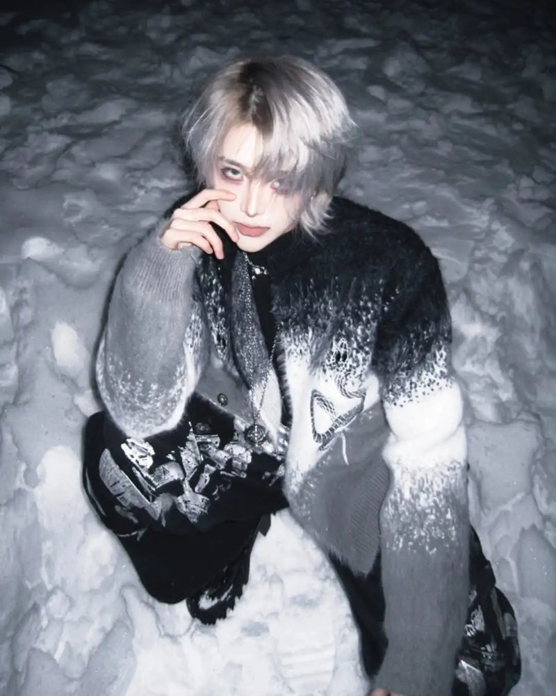
The visual echo goes back to Armani in the early '80s, Mugler in the late '80s, and the whole Reaganomics power dressing of the Wall Street era. What sets Glamoratti apart: it's not a 1:1 repeat. The shoulder sits, but not extreme. The cut is tailored, but not tight. The gold is there, but not everywhere. It's '80s volume with 2026 discipline — and it's exactly that discipline that separates aesthetic from costume.
Definition
What Glamoratti is — and what it isn't: the 5 codes of the aesthetic
Glamoratti doesn't work through single pieces but through five codes that together make up the language. When all five land, an outfit reads as Glamoratti. When three are missing, it's '80s cosplay. When all five get too loud, it's a disco party.
1
loud piece of hardware per outfit
2
fabric layers with substance
5
Archetypes
0
visible logos
These four numbers are the quick check. An outfit that carries several hardware statements at once — chunky necklace plus statement earring plus belt buckle all at the same time — is no longer Glamoratti. It's "'80s homage with bling overload." In plain terms: loud, without the volume carrying any statement anymore.
What counts as Glamoratti, concretely:
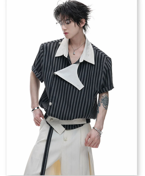
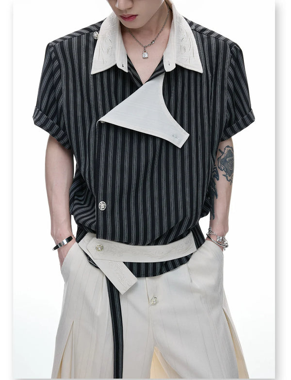
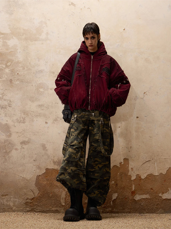
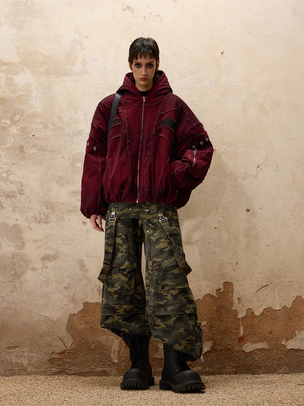
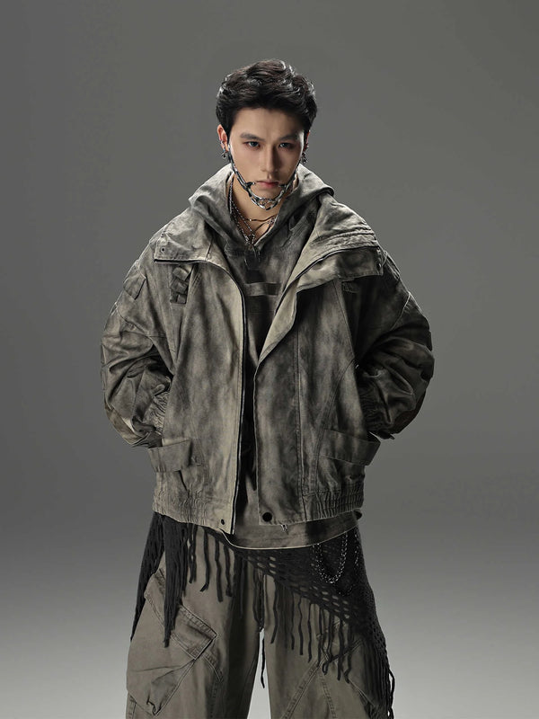
- Sculpted shoulder — blazer, coat, bomber with a shaped shoulder line. Not extreme like Mugler, but visibly built. If your shoulder can't be seen in the photo, the first word of the language is missing.
- Opulent fabrics — wool, satin, tweed, polished cotton, crepe. Fabrics with hand and drape. Polyester shine is dead, heavy matte substance is alive.
- Wide-leg or pencil as the plinth — the bottom line is clearly either wide and falling or close-fitting. Boot-cut and skinny are not Glamoratti language.
- Gold as the primary metal language — chunky necklace, bold earring, cuff bracelet, belt buckle. One of them per outfit as the statement. Silver exists, but only as a bycatch.
- One layer of wealth signal — fur collar, satin lining, a visible seam construction, a stiletto, a fascinator. Something that says "no expense was spared here." But only one.
- Tailored, not tight — Glamoratti follows your body's line without clinging to it. If the blazer folds in the photo, it doesn't sit right.
If three of these six points are missing, it's not Glamoratti — it's an '80s memory attempt. And there's one rule that holds the whole system together:
Visual language
The visual language — materials, colors, lines
Glamoratti has its own palette that feeds on the '80s wealth image but is combined differently in 2026. The main colors aren't "colorful" — they're rich. Deep black, broken cream, saturated burgundy, muted champagne gold, tobacco brown. Pastel is out. Neon is out. What remains are colors that occur naturally in wool and satin.
The fabrics are the heart of the code. Crepe for the blazer, satin for the blouse or lining, wool for the coat, polished cotton for the trousers. What they all share: hand and drape. You see and feel that the fabric has weight. Glamoratti doesn't work in thin, cheap fabrics — the hand of the material is 50 percent of the statement.
The lines are clear: block on top, plinth below. The blazer builds the shoulder as a block, the trousers fall as a plinth. In between sits the waist — sometimes defined by a belt, sometimes just implied by the cut. What's avoided: jagged silhouettes, too many layers without hierarchy, asymmetry from the avant-garde spectrum. Glamoratti is built, not deconstructed.
5 types
The 5 types — from editorial power to after-hours glam
Glamoratti isn't one look — it's five that overlap at the edges. Lay Pinterest boards, Vogue editorials and street-style feeds side by side and you see these five types cleanly separated. Each with its own hardware density, its own fabric mix.
Which of the five suits you depends less on taste than on your wardrobe depth and where the outfit lands. If you don't own a single sculpted-shoulder piece yet, start with Editorial Power. If you already have a good coat, you can step straight into Soft Decadence. How this splits between women and men comes next.
Gender split
Glamoratti women vs men — the cut split
The five codes are the same. Sculpted shoulder, opulent fabric, wide-leg plinth, gold hardware, one wealth signal — applies to every body. What differs is the line. Where the waist is usually defined on women, on men it often stays falling straight.
Women's version: shoulder sculpted, waist defined by belt or cut, then wide-leg or pencil skirt below. Blouse in satin or crepe, one chunky necklace, one statement earring. Stiletto or heeled boot. The wealth layer often sits in the lining or on the collar.
Men's version: blazer with a full shoulder, pinstripe or wool mix, then wide-leg trousers with a pleat. Solid-color blouse, gold belt buckle, one ring or one chain as the only jewelry statement. Loafer or polished boot. The wealth layer sits in the fabric itself — wool crepe instead of polyester is 50 percent of the statement here.
Both need the same shoulder discipline and the same maximum-one-loud-hardware rule. What varies is the line at the waist — not the vocabulary.
Brands
The brands that write Glamoratti — from Armani to Khaite
Glamoratti didn't invent a brand. The aesthetic is a composition of the '80s power heritage — what runs as Glamoratti in 2026 comes from the same six or seven houses, again and again. Understand the vocabulary and you can build Glamoratti looks without any big names at all.
The houses that wrote the Glamoratti vocabulary — chronologically:
- Giorgio Armani — in Milan since 1975. The relaxed power suit, the soft-yet-structured shoulder, the whole "rich casual" vocabulary is Armani. When a Glamoratti outfit feels loud and relaxed at once, it's Armani-adjacent.
- Thierry Mugler (1980s era) — the extreme sculpted shoulder, the wasp waist, the dramatic cut. Mugler set the volume — Glamoratti dials it down to 60 percent but keeps the skeleton.
- Claude Montana (1980s era) — the hard sculpted-shoulder cut, the dramatic line, the whole "power Parisian" vocabulary. Montana pushed the shoulder so far that Glamoratti today can still play the controlled half of it.
- Versace (Gianni era) — the loud hardware, the gold, the Mediterranean wealth image. Glamoratti quotes Versace on jewelry and belt, not on print — the famous prints stay outside.
- Donna Karan — power dressing for women that works day and night. The "seven easy pieces" logic is the template for building a Glamoratti wardrobe.
- Tom Ford @ Gucci — velvet, satin, maximum glam with discipline. The "rich after dark" iteration comes from there.
- Bottega Veneta (Lee era) — the new substance language. No logo, lots of hand on the fabric, a quiet volume with a lot of money behind it. Glamoratti among boomers and older lands here.
- Khaite and The Row — the contemporary translators. When Glamoratti shows up in Vogue in 2026, the caption is usually one of these two labels.
If you want to wear Glamoratti without paying designer prices, look for these houses on the resale market or for DTC brands that translate the vocabulary competently.
Category · Outerwear
The jacket — sculpted shoulder, draped volume
The jacket carries the Glamoratti outfit. It's the largest surface, the most dominant fabric, the primary carrier of the shoulder statement. This is where it's decided whether your outfit becomes Glamoratti or an '80s Halloween.
Three jacket types work: the wool-crepe blazer with a sculpted shoulder (Editorial Power), the wool coat with a falling drape (Soft Decadence), and the structured bomber in wool or velvet (Metallic After-Hours). Leather jackets only work if they're tailored — biker cuts are out, shoulder construction is mandatory.
If you don't own a sculpted-shoulder blazer yet, that's your first move. Everything else in the outfit hangs on it — the shoulder is 50 percent of the visual language.
Category · Bottoms
Trousers — wide-leg, tailored, sitting on the waist
Skinny has been out since the Glamoratti wave. What ran as an "elegant trouser" in 2018 tips into workwear today. The new fit rule: wide or narrow, but never in between — and always on the natural waist, never low-rise.
Working Glamoratti bottoms are wide-leg with a pleat (wool, crepe, pinstripe) or pencil with a clean line (crepe, satin, wool mix). What doesn't work: anything with stretch, anything with visible zipper construction, anything in polyester shine. The hand of the fabric has to be heavy.
If you want to build a trouser that fits four of the five Glamoratti types, take wool-crepe wide-leg in black or deep burgundy. That's the common denominator — works with blazer, bomber, coat, and even with a satin blouse right over it.
Category · Tops & Dress
Tops, dress and hardware — where shine and cut sit
The top layer is the stage where the Glamoratti statement lands — or where it tips. A badly fitting satin blouse makes the whole outfit cheap, a well-fitting crepe top holds the look together even without jewelry.
The rule up top: crepe, satin, wool knit or polished cotton. Form over print. Solid-color pieces in deep tones beat any statement print. The same goes for the dress: a well-cut pencil or slip dress in burgundy or black is a complete Glamoratti look with no further help.
If you want to test the Velvet Burgundy look, take a burgundy crepe blouse under a black blazer. That's the easiest entry into the after-hours iteration — no risk if it doesn't click.
Category · Hardware
The jewelry layer — gold, chunky, one statement per outfit
Jewelry and hardware are the spot where the Glamoratti outfit tips most visibly — one way or the other. Wrong choice, and the whole outfit reads as bling imitation. Right choice, and the single piece carries the whole outfit.
What works: one chunky necklace OR one statement earring OR one cuff bracelet OR one belt buckle. Not two of them, never three. Gold tone over silver, saturated over polished, geometric over playful. A good entry point: a 14-karat gold-plated cuff bracelet or a flat curb chain around the neck.
If you wear exactly one hardware piece per outfit and nothing else, you've already won half the look. In Glamoratti, one loud voice is always louder than three mid ones.
Styling logic
How to actually wear Glamoratti — the three-point logic
A Glamoratti outfit works through exactly three points: shoulder, hardware statement, plinth. Shoulder first (sculpted blazer or coat), then the one loud piece of hardware (necklace, belt, earring), then the plinth below (wide-leg or pencil). Once those three sit, everything in between is variation.
“A good Glamoratti outfit has three points you see at first glance. More than three and the eye doesn't know where to look. Fewer than three and it reads as business casual.”
In practice that means: sculpted wool blazer plus one chunky gold necklace plus wide-leg pinstripe trousers. Or velvet coat plus statement earring plus pencil skirt. Never all three statements loud at once. If the shoulder is extreme, hardware and plinth stay calm. If the hardware carries the statement, shoulder and plinth are controlled.
We've put the full breakdown with photo examples in its own article:
But Glamoratti doesn't stand alone — it overlaps at several edges with other wealth aesthetics. Quiet Luxury shares the fabric hand, Old Money shares the tailoring discipline, Businesscore shares the pinstripe vocabulary, Opium shares the block-shoulder logic. Get Glamoratti down and you can read these neighboring codes and mix them deliberately.
Here are the most important neighbors — each with its own guide, if you want to go deeper:
Wealth coding
Glamoratti vs. Quiet Luxury — what "wealthy" means to look like in 2026
One of the most common questions around the aesthetic: what separates Glamoratti from Quiet Luxury? Both have to do with wealth signals. Both avoid open logos. Both work with good fabrics. The difference lies in the volume — and in the intent.
Quiet Luxury says "I have money, I don't need to show it." Glamoratti says "I have money, and I use it as material." Where Quiet Luxury hides logos, Glamoratti shows construction. Where Quiet Luxury sets on cream and taupe, Glamoratti goes into burgundy and tobacco. Where Quiet Luxury stays minimal, Glamoratti builds the layer up — controlled, but visible.
When a woman looks "wealthy" in the Glamoratti code, the effect comes from three spots: fabric hand (crepe or wool, never polyester), shoulder construction (sculpted, not flat), and exactly one statement (necklace, belt, or earring). The other 80 percent of the outfit is calm.
What does not work
The 6 mistakes that tip Glamoratti into costume
Glamoratti has six spots where it reliably tips over — no matter how expensive the individual Pieces are. If you avoid only one thing, make it mistake number one.
Action
How to start in Glamoratti — the first 4 pieces
You don't need 30 pieces to wear Glamoratti. You need four that will be in 80 percent of your outfits. Everything else builds around them — and gives you room to vary without breaking the code.
In order: a sculpted-shoulder blazer in black wool crepe (your biggest investment — lasts 10 years if you buy well). A wide-leg wool trouser in black or deep burgundy, on the natural waist. A chunky gold necklace or a cuff bracelet as the only hardware statement. A stiletto or a polished boot. Optional as a fifth piece: a satin blouse in cream or burgundy — but only once the four sit.
Outfits for real
Glamoratti for real — how it lands on the street
Before you build your own outfit, look at how others wear it. The five types from the section above look different in the feed than in lookbook photos: tighter, dirtier, less perfect — and that's exactly why they work as a template for real dressing.
It's the fastest way to check whether Glamoratti sits on your body type at all — before you spend money.
To close
Glamoratti is an attitude, not a costume
If you take one thing from this guide, take this: Glamoratti doesn't work through single pieces but through five codes plus one discipline. Get the codes down and you build a hundred outfits from twenty pieces. Buy only pieces and you have a full closet with three playable looks.
The whole logic of this guide reduces to one sentence:
The aesthetic will keep growing in 2026 — Pinterest Predicts rarely misses on trend forecasts, and the Pinterest search history shows a steady upward curve. But you don't have to wait until every influencer wears it to make sense of it. Start with the one look that best fits your wardrobe. What you don't know, you learn by wearing.
And that's the point: Glamoratti reads in theory like a corset of rules, but in practice it doesn't feel that way. Once you've got the five codes down, every further outfit is a variation on the same four or five building blocks — not a new invention.
FAQ
Frequently asked questions about the Glamoratti aesthetic
The questions we often get by DM and email — short, clear, no detours.
What is Glamoratti style — briefly explained?
What is the most popular aesthetic in 2026?
What are the four main aesthetics of 2026?
What sets Glamoratti apart from Poetcore?
Is '80s fashion back in 2026?
Does Glamoratti work for men too?
Which shoes go with Glamoratti?
Is it still fashionable to wear a fascinator in 2026?
What do you think?
Tell us on @fuga_studios
About the author
Philipp Fuge — Founder · Berlin
Founder of Fūga Studios. Writes the journal himself. Berlin · Shanghai · Tokyo · Poznań — four cities, one logic.