
All the talk says Poetcore is „just Cottagecore in cream.“ They are wrong. A linen shirt plus a knit vest guarantees as much Poetcore as horn-rimmed glasses guarantee a doctorate — which is nothing.
Poetcore was named one of the big 2026 aesthetics by Pinterest Predicts in September 2025. In February 2026, Vogue Arabia followed. In March it walked the spring-summer runways. The logic comes from travellers, library fellows and archive collectors who treat their wardrobe like a collected edition: muted earth tones, layers of second- and third-hand, a touch of hand-worn patina.
Anyone selling Poetcore as a „Cottagecore reboot with books“ hasn’t understood the vocabulary. Cottagecore dreams of the farmhouse, Poetcore of the reading table on the train to Lisbon. This guide clears up who called it, what really belongs to it, how the 5 iterations differ, how it translates into coats / trousers / tops, what you need in your closet, and which 6 mistakes tip your outfit into carnival.
How it reads day to day — an outfit in 12 seconds:
Definition
What is the Poetcore aesthetic — and why does Pinterest say it will be big in 2026?
Poetcore is an outfit system of four fixed building blocks. When all four land, the look reads as Poetcore. When one is missing, it tips instantly into something else — Cottagecore, Old Money, Dark Academia, or worse: literary cosplay with horn-rimmed glasses.
85 %
muted earth tones
3
material languages (wool · linen · corduroy)
5
Iterations
2
vintage pieces per outfit
These four numbers aren’t a gut feeling. They are the test. An outfit that breaks a quota — 50 percent earth tones plus white sneakers, or a synthetic glossy coat instead of wool, or everything new in a matching set from the same label — is no longer Poetcore. It is „literary-inspired streetwear.“ Which in plain terms means: bookshop opening with a brand seam stitched on the outside.
What specifically counts as Poetcore aesthetic:
- Muted earth tones — parchment, charcoal, oxblood, moss green, sand. Pure white is Old Money, not Poetcore. Parchment has a faint yellow cast.
- Natural fabrics with hand-worn patina — wool, linen, corduroy, unbrushed cotton. Synthetic gloss kills the look in a single photo.
- Wide shoulders, quiet trousers — an oversized knit vest or blazer with dropped shoulders. Slim fit is Businesscore, not Poetcore.
- At least one used piece — a grandfather coat, a flea-market shirt, a mail-order tweed. Fully new reads as an influencer order.
- Accent in brass or antique-silver jewellery — a small brooch, a vintage watch, a signet ring. Never high-gloss gold.
- Leather shoe instead of sneaker — loafer, derby, ankle boot with a lugged sole, penny loafer with a sock. An Air Force 1 is not Poetcore, in any colour.
If you’re missing three of these six points, it is no longer Poetcore — it is inspiration. There is one rule that holds all six together:
Origin
Who called Poetcore — and how long has it really existed?
Poetcore as a term comes from Pinterest Predicts 2026, the annual trend report Pinterest published in September 2025. The report stated verbatim that Gen Z and Millennials would adopt a new aesthetic in 2026, inspired by world wanderers — khaki bermuda shorts, adventure references, a literary undertone.
In February 2026, Vogue Arabia followed and explained how the look is establishing itself in fashion hubs from London to Tokyo. In March, Who What Wear listed the first 34 concrete pieces. The spring-summer 2026 collections sent the vocabulary down the runways before the Pinterest wave had even reached TikTok.
The vocabulary existed before, of course. Dark Academia prepared the library atmosphere. Cottagecore established the natural fabrics. Old Money kept the tweed codes alive. Poetcore’s achievement isn’t invention but compression: muted palette plus literary stance plus vintage requirement plus a deliberately built travel cue. That makes Poetcore the first aesthetic to go viral through the Pinterest algorithm — not through an influencer drop.
5 iterations
The most iconic Poetcore looks — the 5 iterations
Poetcore isn’t one look — it’s five that overlap at the edges. Lay the Pinterest boards, the Vogue Arabia images and the spring-summer runways side by side and you see these five iterations cleanly separated. Each with its own palette, its own fabric density, its own occasion.
Which of the five fits you depends less on taste than on your city, your season and how far you walk each day. How it splits between women and men comes next.
Gender split
Poetcore for men vs women — where it really differs
The rules are the same. Earth tones, natural fabric, vintage requirement, soft volume — apply to every body. What differs is the line. Where men wear the corduroy coat as a dropping layer, on women the coat often sits closer, almost like a second skin. Same pieces, different effect.
Women’s version: the knit vest becomes the main surface, the waistband sits higher, the skirt comes in as an alternative to the wool trousers. A floor-length wool skirt plus a fitted roll-neck is the feminine translation of the Library Scholar. Jewellery shifts toward the cameo brooch, a beaded necklace with small stones, a vintage pendant on a cord.
Men’s version: more volume up top, more layers. Shirt, knit vest, blazer, coat — four layers aren’t a risk but the standard. The trousers stay wide and knee-dropping. Jewellery reduced to a vintage watch and a signet ring. If the man wears a brooch, it goes on the coat’s outer pocket, not on the lapel.
Both need the same earth-tone quota and the same vintage discipline. What varies is the distribution — not the vocabulary.
Brands
Poetcore brands — which labels really write Poetcore
Poetcore has no brand of its own. It’s a composition from the quiet-luxury spectrum plus a vintage pool — what the Pinterest images show comes from the same eight or nine labels, over and over. Anyone who understands the vocabulary can build Poetcore looks entirely without a top-label reference.
The brands that wrote the Poetcore vocabulary — chronologically:
- Lemaire — in Paris since 2014. Christophe Lemaire and Sarah-Linh Tran defined the quiet drape silhouette and the muted earth tones. When a Poetcore outfit feels too „grown up,“ it’s Lemaire-adjacent.
- The Row — Ashley and Mary-Kate Olsen since 2006. Strict cut vocabulary, wool and cashmere in sand and charcoal. The quiet-luxury grammar comes from here.
- Toteme — Stockholm, since 2014. Scandinavian reduction: wide coat, soft knit, no print. Exactly the opposite of logo fashion.
- Khaite — New York, since 2016. Catherine Holstein brings in the romantic note — mohair, drape, slightly rebellious cuts without a logo.
- Bode — Emily Bode Aujla since 2016. Vintage patchwork and heirloom shirts — the literary heritage vocabulary in the Poetcore outfit comes straight from here.
- Massimo Alba — Milan, since 2009. Italian linen, soft corduroy blazers, washed wool. The summer-Poetcore material comes from Massimo.
- Loewe (the Jonathan Anderson era, 2014-2024) — craft as a statement. Anatomical leather accents, oversized coats, literary editorials. The Pinterest boards quote Loewe in nearly every third pin.
- Cos & Arket — the mainstream bridge. Cos since 2007, Arket since 2017 — both translate the Lemaire vocabulary into pocket-affordable without betraying the palette.
Anyone who wants to wear Poetcore without paying designer prices searches the resale market for these brands, vintage stores for grandfather trenches and waxed jackets, or DTC brands that translate this vocabulary competently.
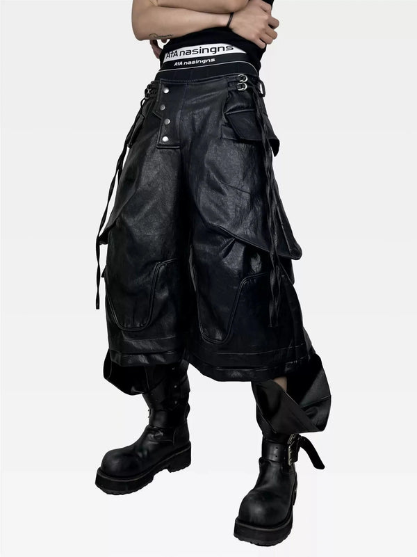
Category · Outerwear
Poetcore outerwear — trench, wool coat, sherpa bomber
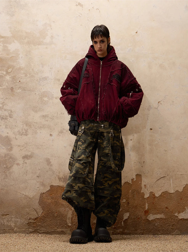
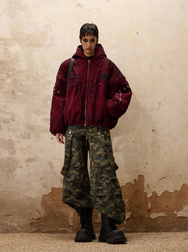
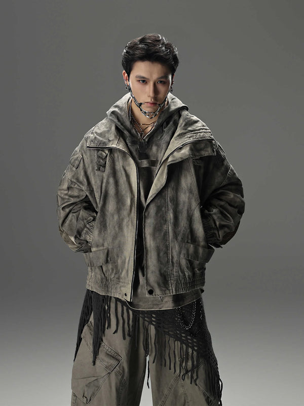
The coat carries the Poetcore outfit. It’s the largest surface, the most dominant fabric, the primary bearer of the silhouette. This is where it’s decided whether your beige outfit becomes Poetcore or office wear in cream.
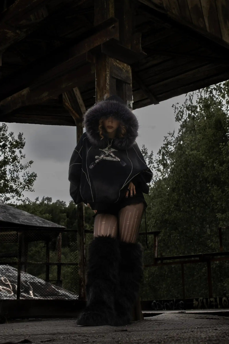
Three outerwear types work in Poetcore: a sand wool coat with a dropping cut (Library and Romantic Editor iteration), a waxed jacket or corduroy blazer (Travelogue Wanderer), a sherpa bomber as a transitional solution. Leather bombers come in when they look matte and vintage-worn.
If you don’t yet have a soft wool coat or a sherpa jacket in your closet, that’s your first move. Everything else in the outfit depends on it.
Category · Bottoms
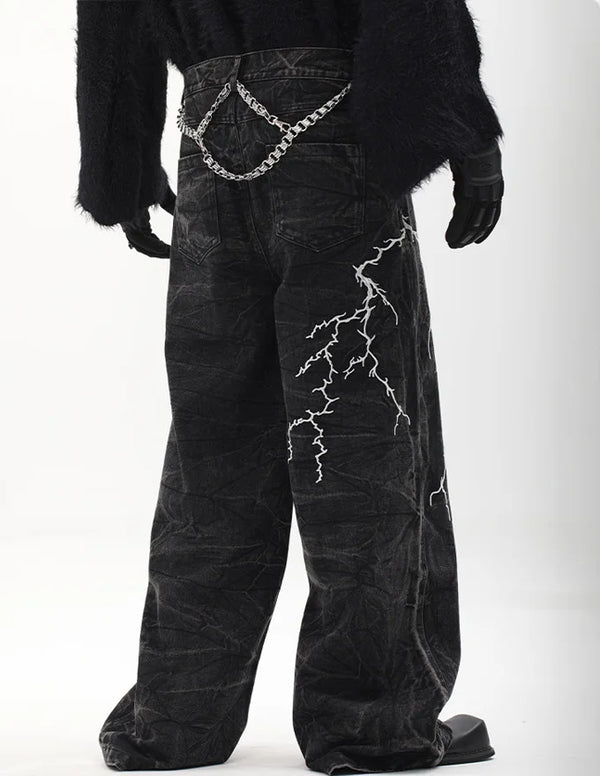
Poetcore trousers — wide-leg, pinstripe, khaki bermuda
Skinny is out in Poetcore. What Pinterest calls for in 2026 has a waistband on the waist and a wide leg that falls onto the leather shoe. Three trouser types carry the load: wide wool trousers in winter (pinstripe or plain), wide linen trousers in summer, khaki bermuda as a transitional code. The new fit rule: volume up top, volume below, a clean waistband in between.
Working Poetcore bottoms are matte, mid-weight and sit high. Avoid anything that shines (synthetic twill with wash-stretch is dead) and anything too narrow (slim wool trousers read as sale suit trousers, not as Poetcore).
If you want to build one pair of trousers that fits every one of the five Poetcore iterations, take wide-leg in parchment or sand. That’s the common denominator.
Category · Skin layer
Poetcore tops — knit vest, cardigan, oxford shirt
The skin layer is the quiet component — and precisely for that reason it stands out when it sits wrong. In Poetcore you almost never wear a print T-shirt under the coat. It’s an oxford shirt, a striped polo shirt, a wool crew-neck or a thick knit vest. Soft, plain or with a discreet stripe, without a logo print.
The rule: soft below, plain or discreetly striped, body-relaxed. Printed shirts (band logo, graphic print, statement lettering) tip the outfit straight into streetwear or Old Money cosplay. A plain parchment knit vest says more „Poetcore“ than any literary motif print.
If you want to test the cardigan look, take an open wool cardigan over a thin shirt and pair it with wide-leg. That’s the simplest entry toward Library Scholar — no risk if it doesn’t work out.
Styling logic
How to actually style Poetcore — footwear, layering, the patina rule
A Poetcore outfit works through exactly one detail: how much patina is visible. 60 percent new, 40 percent used — works. The other way round — also works. 100 percent new — doesn’t work. No one spelled the rule out, but every Pinterest top pin follows it.
„Poetcore is not a collection. It’s a layer system of heirloom, sale find and a single premium piece. Flip the ratio and you get Old Money cosplay instead of Poetcore.“
In practice that means: a vintage corduroy blazer over a new oxford shirt plus worn wool trousers plus a used loafer. Or a new knit vest over an old polo shirt plus khaki bermuda plus old penny loafers. Never four new pieces from the same label.
On the shoe: loafer and derby carry the look. A vintage ankle boot for the Travelogue Wanderer. Espadrille or penny loafer with a sock in summer. Sneakers are out on principle — even in white, even in beige. A sneaker’s silhouette doesn’t match the dropping, soft cut of the trousers.
We've put the full breakdown with photo examples in its own article:
But Poetcore doesn’t stand alone — it overlaps at several edges with other quiet aesthetics. Dark Academia shares the tweed codes, Old Money shares the wool-coat silhouette, Cottagecore shares the linen, Light Academia shares the parchment palette. Anyone fluent in Poetcore can read these neighbouring codes and mix them deliberately without slipping into cosplay.
Here are the four most important neighbours — each with its own guide, if you want to go deeper:
Seasonal
Poetcore in summer vs winter — khaki bermuda vs tweed layers
In winter Poetcore is easy. Wool coat, pinstripe trousers, knit vest, oxford shirt, loafer. Four layers if needed, all in muted earth tones, all working. The challenge comes in summer, when the outer layer — the largest visual surface — falls away.
Summer Poetcore works through what was under the coat. Khaki bermuda replaces the wool trousers. A linen shirt replaces the oxford shirt. A penny loafer with a short sock or a woven espadrille carries the look. The knit vest stays — but woven thinner, almost like a dense mesh polo.
The year-round solution also comes as hardware: pieces that adjust their layer thickness themselves. Reversible cardigans, for example — warm wool knit inside, thin weave outside. Or a sherpa bomber with a removable collar that turns from a winter coat into a transitional sweater.
What does not work
The 6 most common Poetcore mistakes — what you must NOT do
Poetcore has six spots where it reliably tips over — no matter how expensive the individual pieces are. If you avoid just one thing, make it mistake number one.
Action
How to start in Poetcore — the first 4 pieces
You don’t need 30 beige things to wear Poetcore. You need four that will be in 80 percent of your outfits. Everything else builds around them.
In order: a sand or parchment wool coat (your biggest investment — it lasts 10 years if you don’t buy cheap). Wide wool trousers in parchment or charcoal. A thick knit vest or an open cardigan in sand. Penny loafers or a derby in matte leather. A small vintage brooch or a signet ring as an optional fifth — but only once the four are set.
Outfits for real
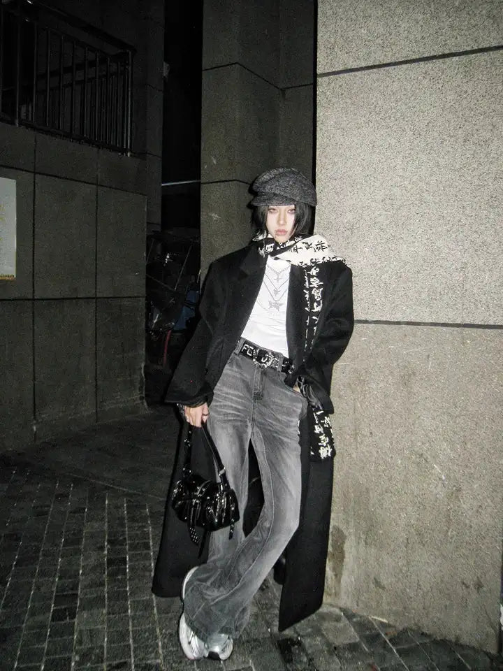
Poetcore outfits for real — how it looks on the street
Before you build your own, look at how others wear it. The five iterations from above look different in the feed than on Pinterest boards: closer, more worn, less staged — and that’s exactly why they work.
This is the fastest way to check whether Poetcore sits on your body type at all — before you spend money.
To close
Poetcore is a stance — not a Pinterest filter
If you take one thing from this guide, take this: Poetcore doesn’t work through pieces but through rules. Get the rules down and you build a hundred outfits from twenty items. Buy only pieces and you have a full closet without a single outfit that sits.
The whole logic of this guide reduces to one sentence:
The rules have been stable since September 2025 and will stay that way — as long as Pinterest shows the pin data it shows. But you don’t have to wait until you know them all by heart. Start with the one iteration that fits you best. What you don’t know, you learn by wearing.
And that’s the point: Poetcore reads in theory like a corset of rules, but in practice it doesn’t feel that way. Once you have the code down, every further outfit is a variation on the same four or five building blocks — not a new invention.
FAQ
Frequently asked questions about the Poetcore aesthetic
The questions we often get by DM and email — short, clear, no detours.
What is the Poetcore style, briefly explained?
What are the four big aesthetic categories?
What is Aesthetic Poetry — and does it have anything to do with Poetcore?
Which other aesthetics will be big in 2026?
Is Corecore a Gen Z thing — and where does it meet Poetcore?
What’s the correct name for the „Rich Girl aesthetic“?
Does Poetcore work even if I don’t read or travel?
What do you think?
Tell us on @fuga_studios
About the author
Philipp Fuge — Founder · Berlin
Founder of Fūga Studios. Writes the journal himself. Berlin · Shanghai · Tokyo · Poznań — four cities, one logic.